Overview
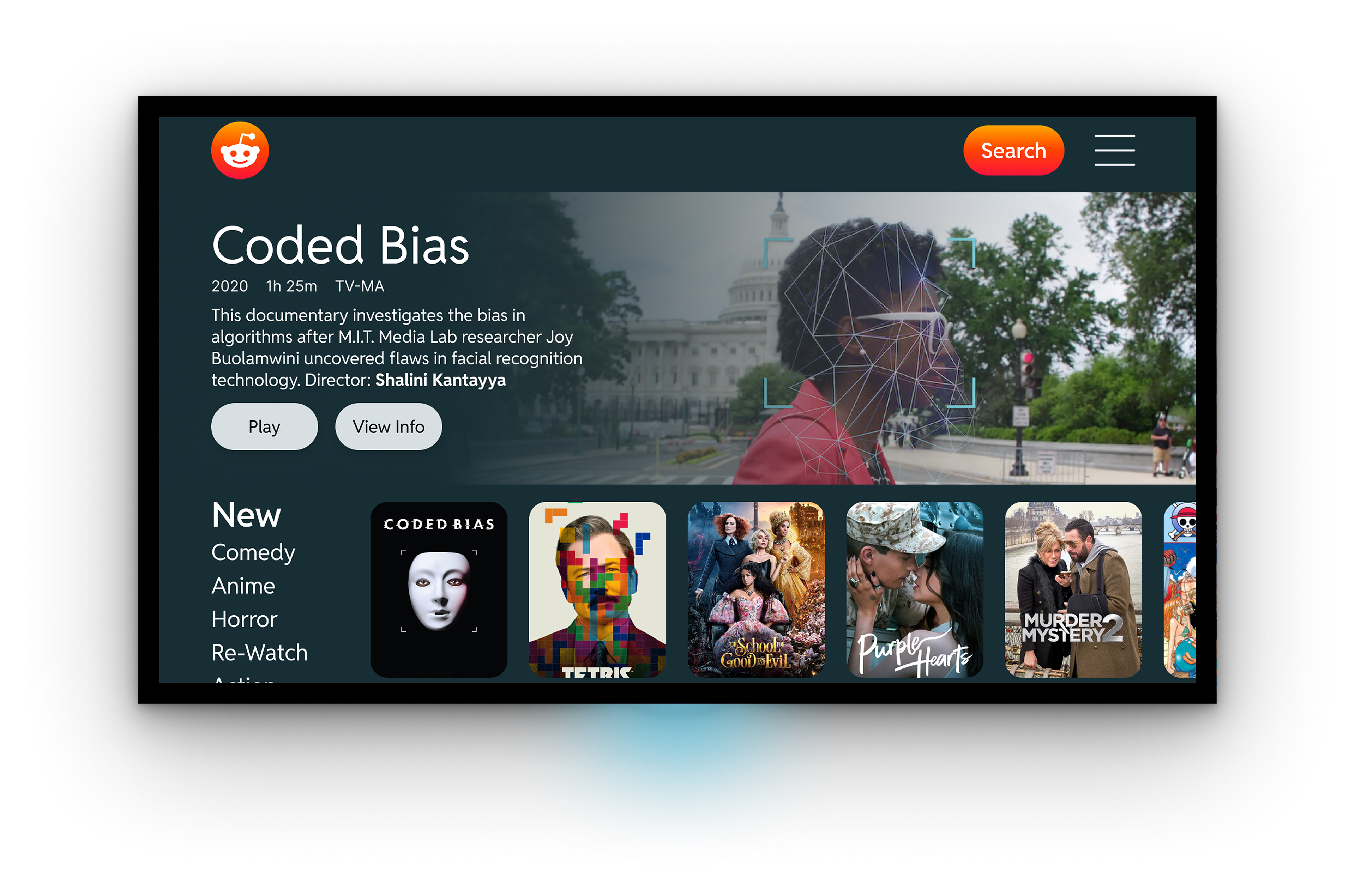
This project focused on designing a streaming app for Smart TVs and mobile based on a real brand, and adhering to their brand guidelines
Project
Streaming Video Service UI Design
Role
Visual Designer
Timeline
3 weeks
Goal
Design a streaming service that feels consistent with Reddit's brand while providing a great viewing experience.
Process
1. Competitive Analysis
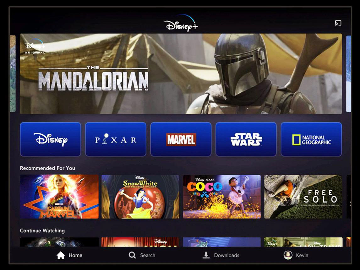
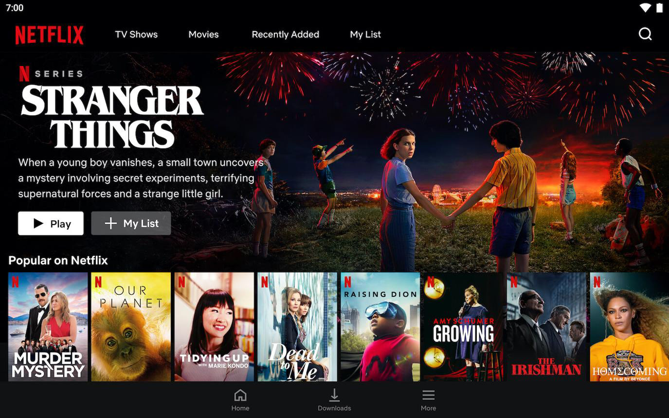
To understand common navigation patterns and visual conventions used by streaming platforms before designing Reddit's streaming experience.
Key Insights
• Users expect content to be organized into horizontal categories.
• Large artwork helps users quickly recognize content.
• A consistent card layout makes browsing easier.
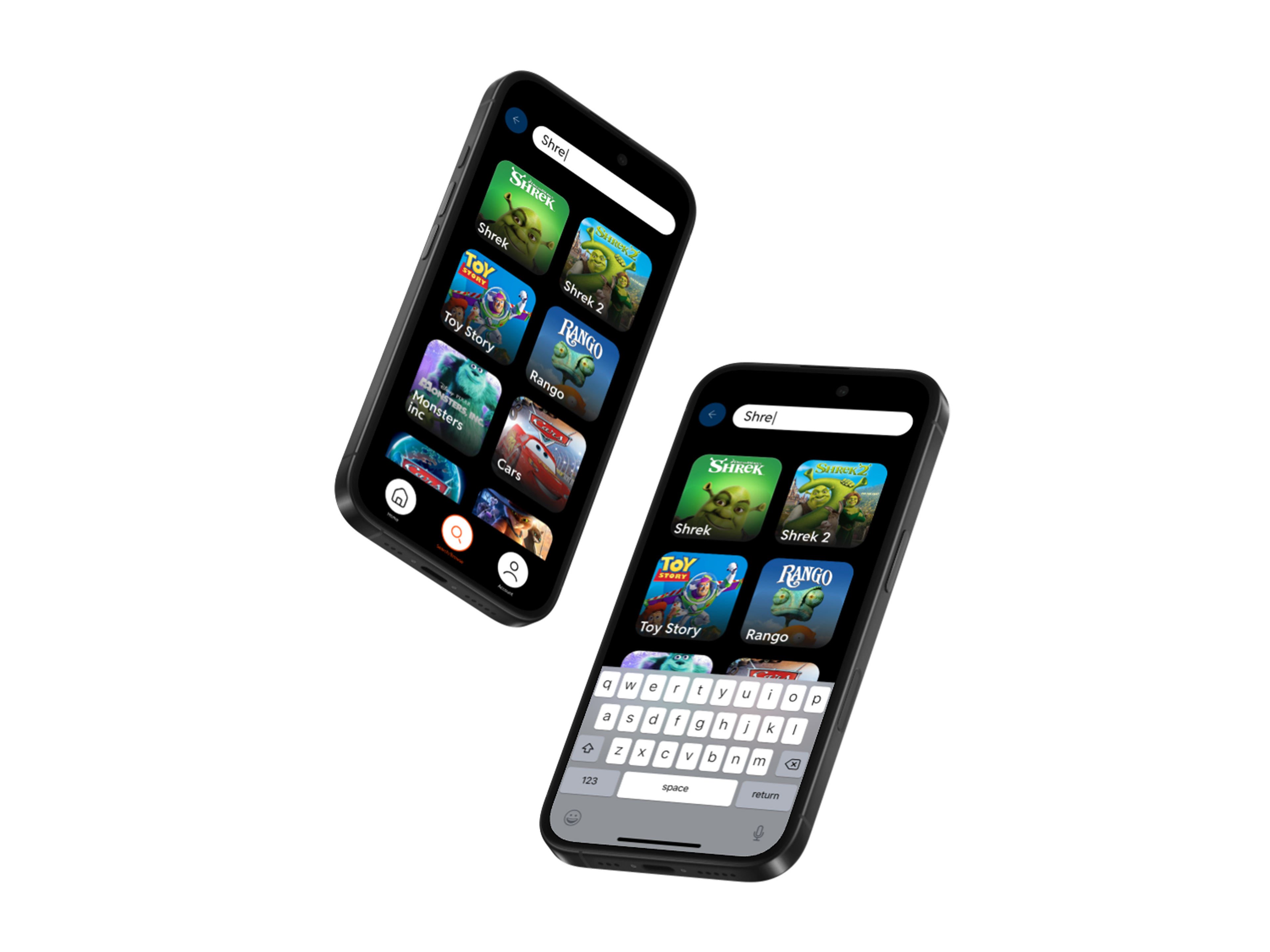
• Search should be accessible from anywhere in the app.
• Navigation should require minimal effort, especially on TV where users rely on a remote.
2. Ideation
Sketching
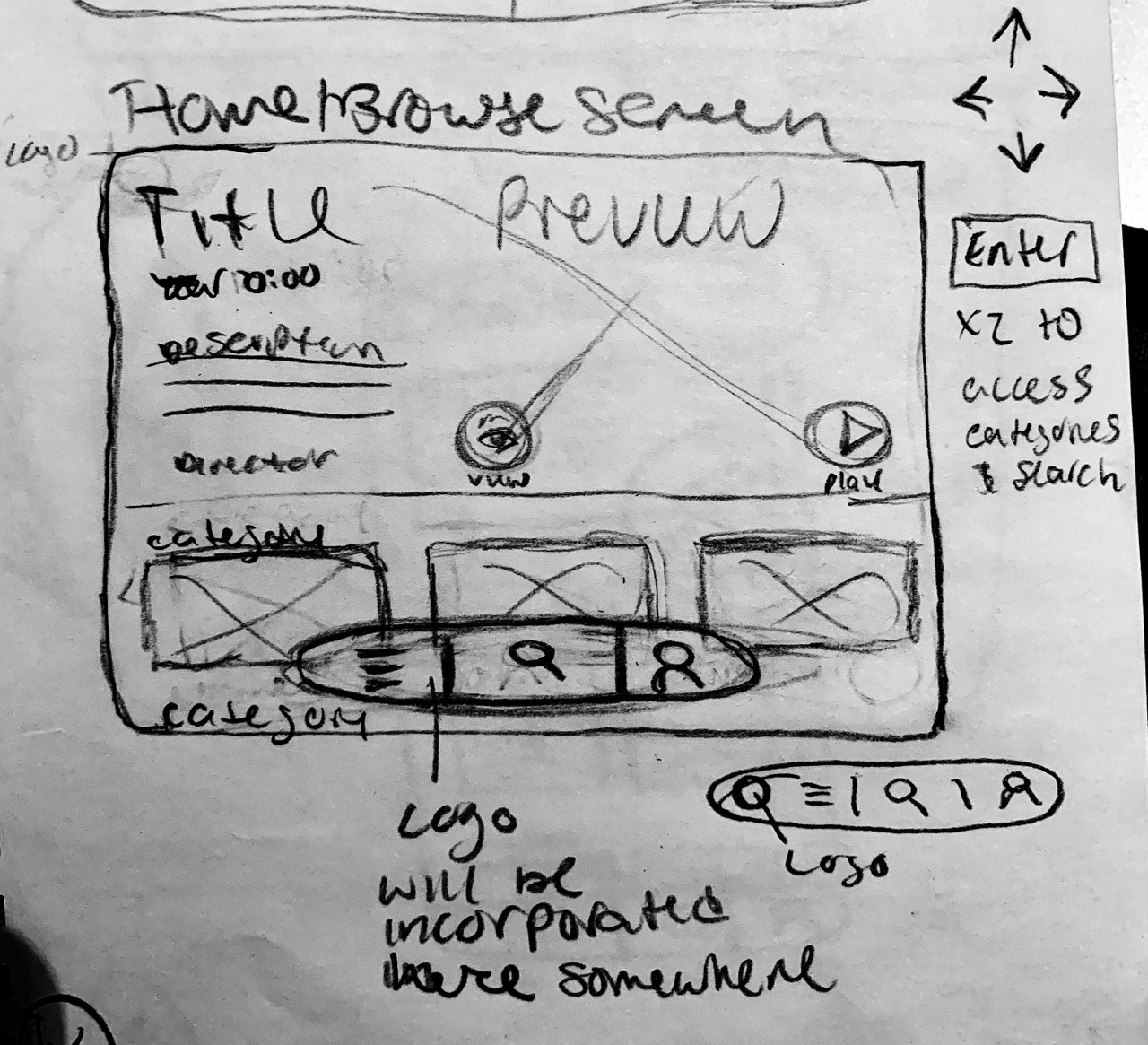
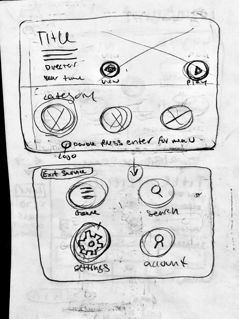
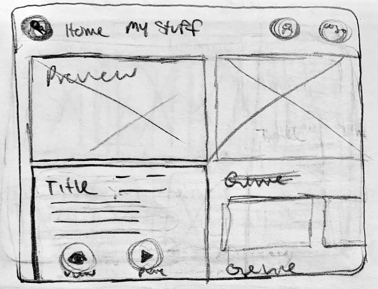
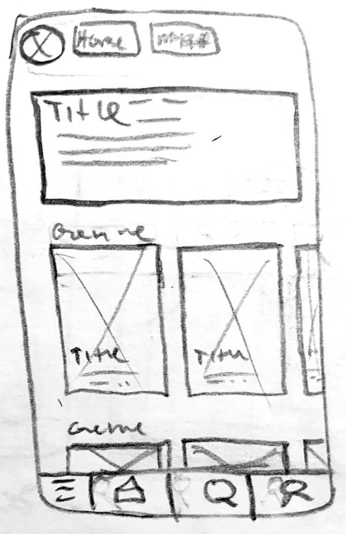
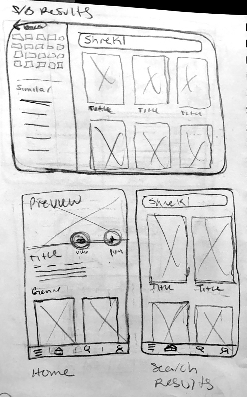
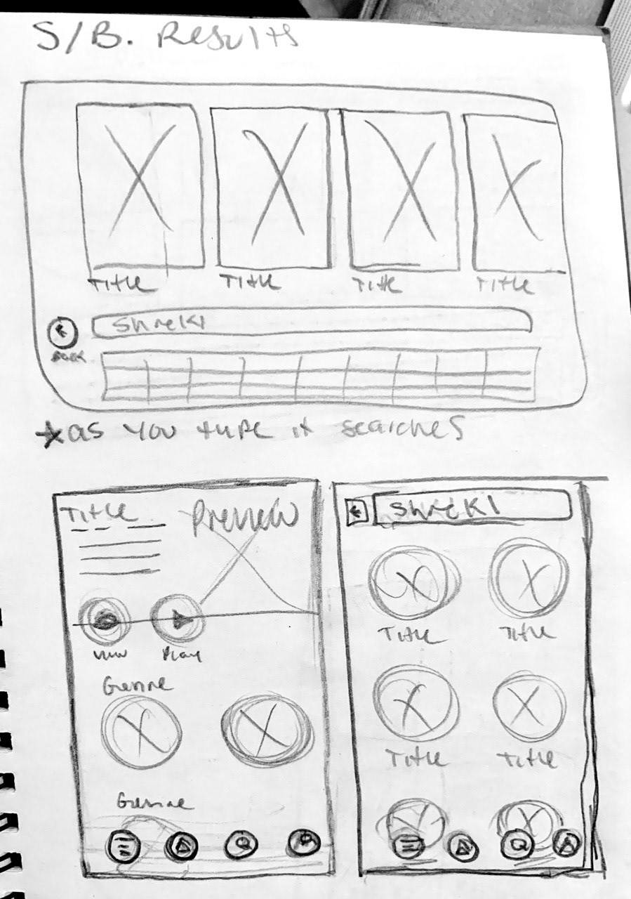
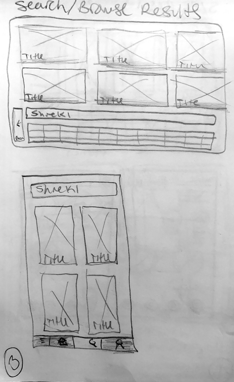
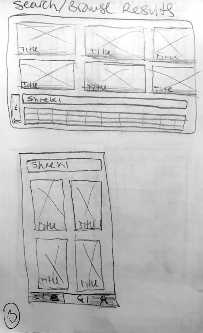
I sketched wireframes for the Tv and Mobile Screen
Mid Fidelity TV Wireframes
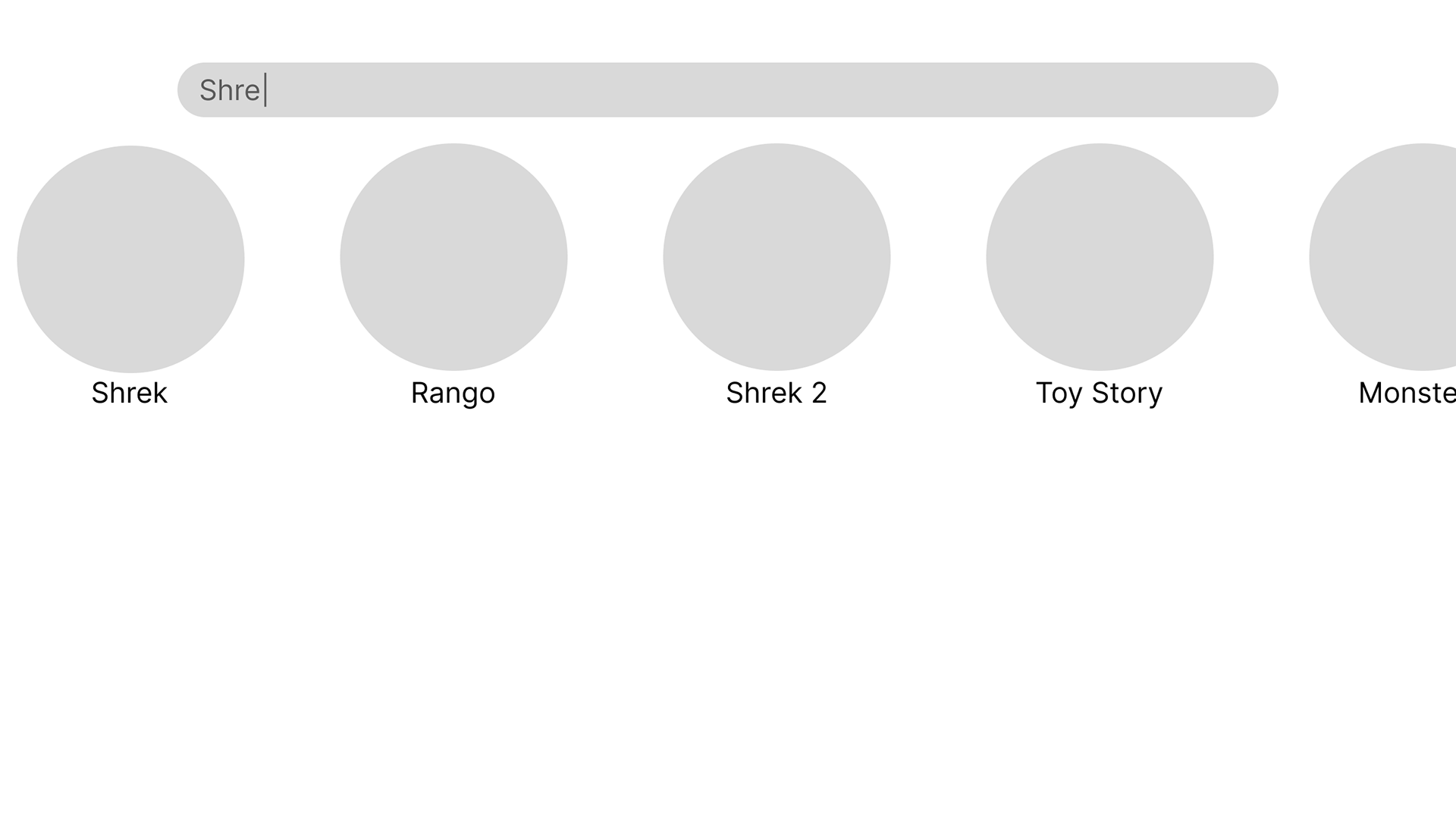
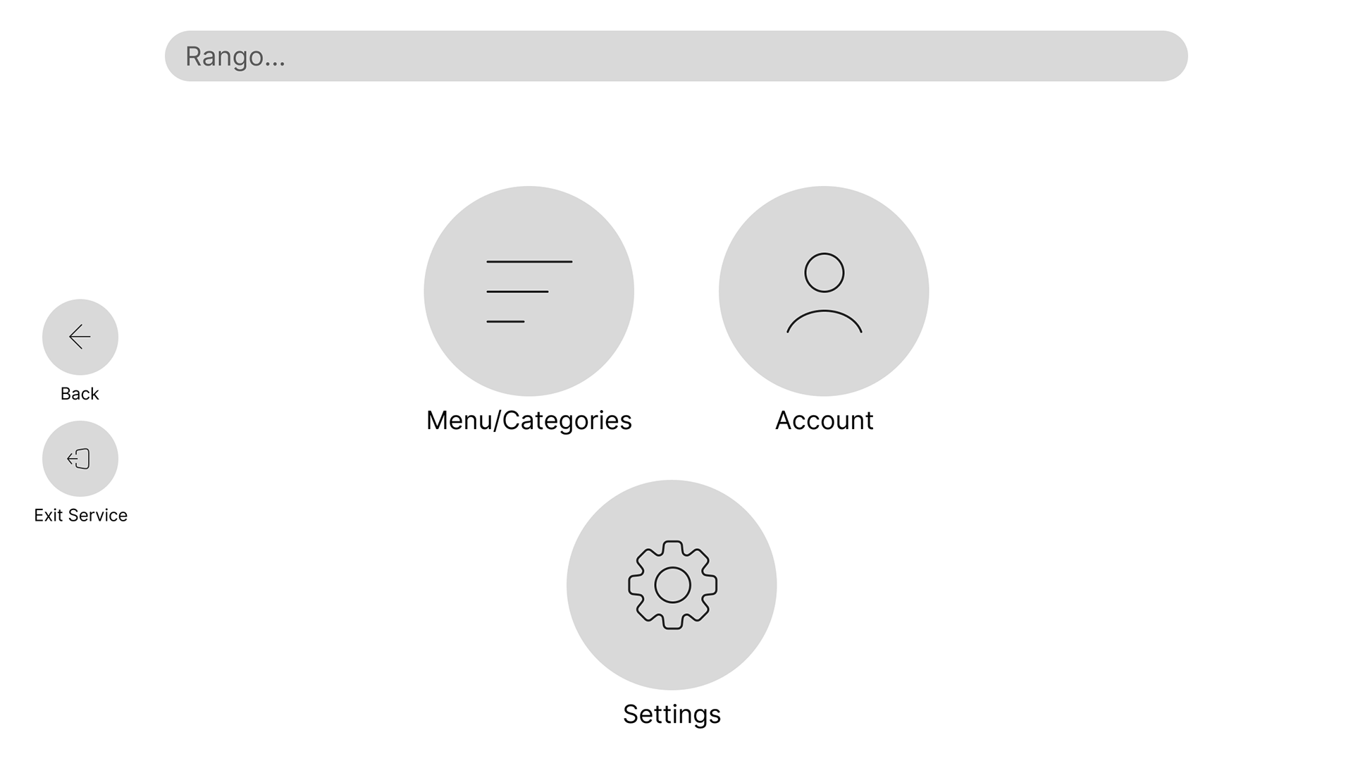
After sketching I created mid-fi wireframes for both type of screens.
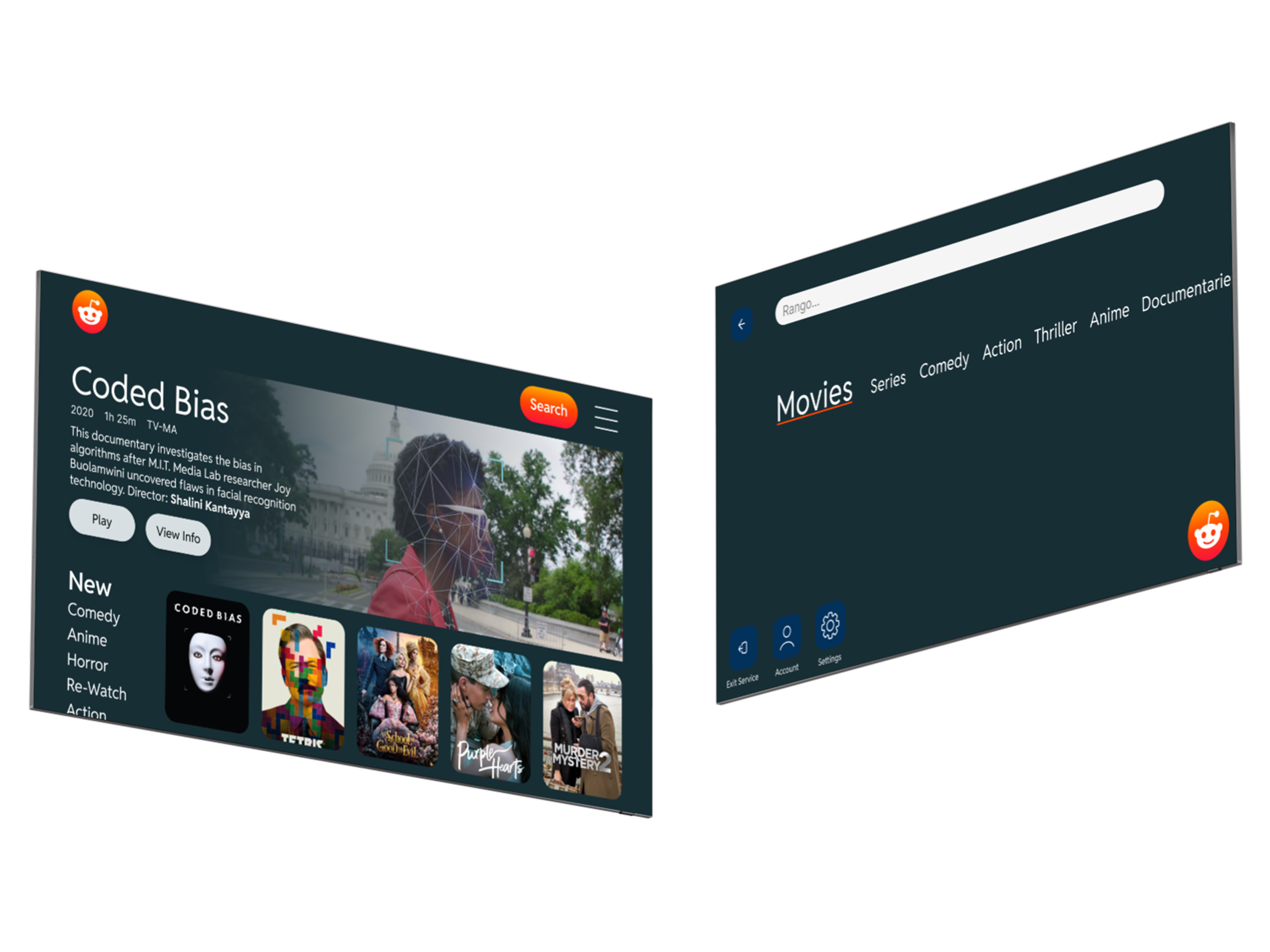
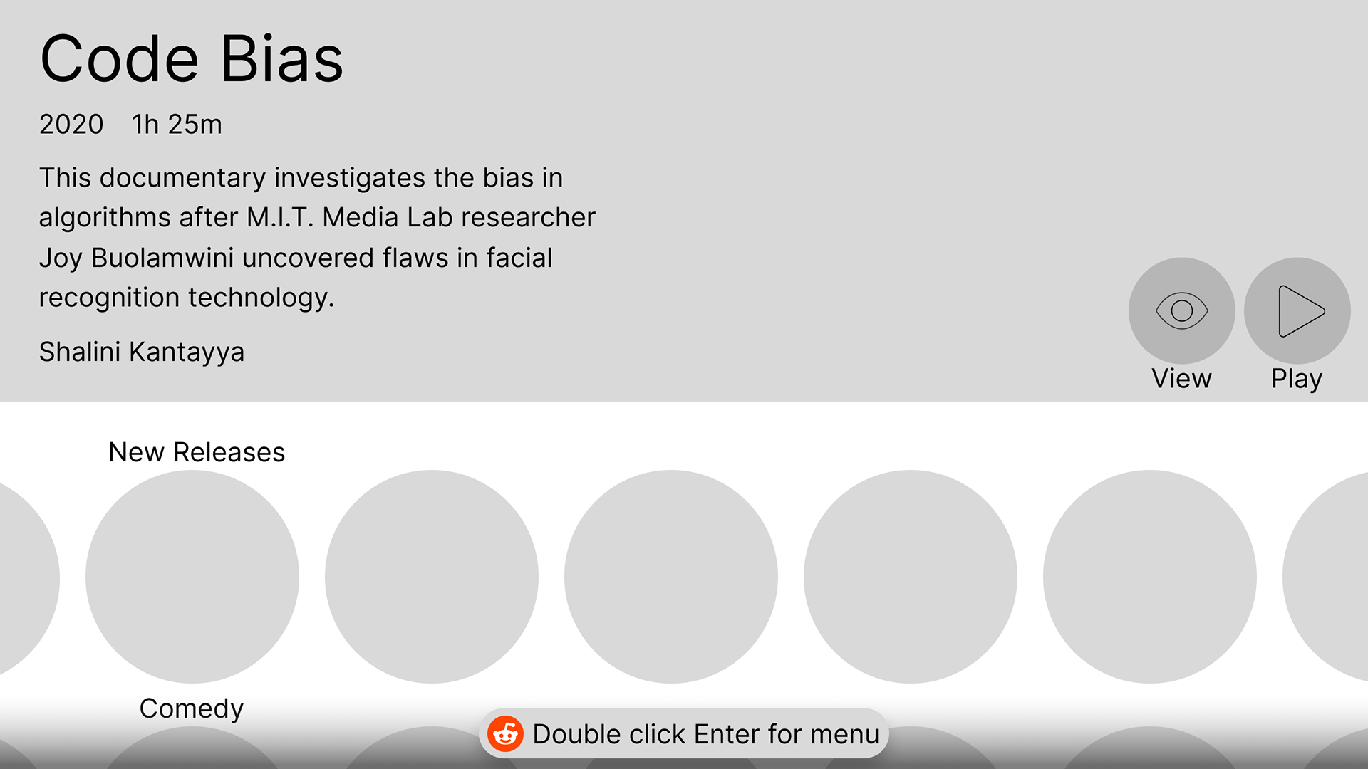
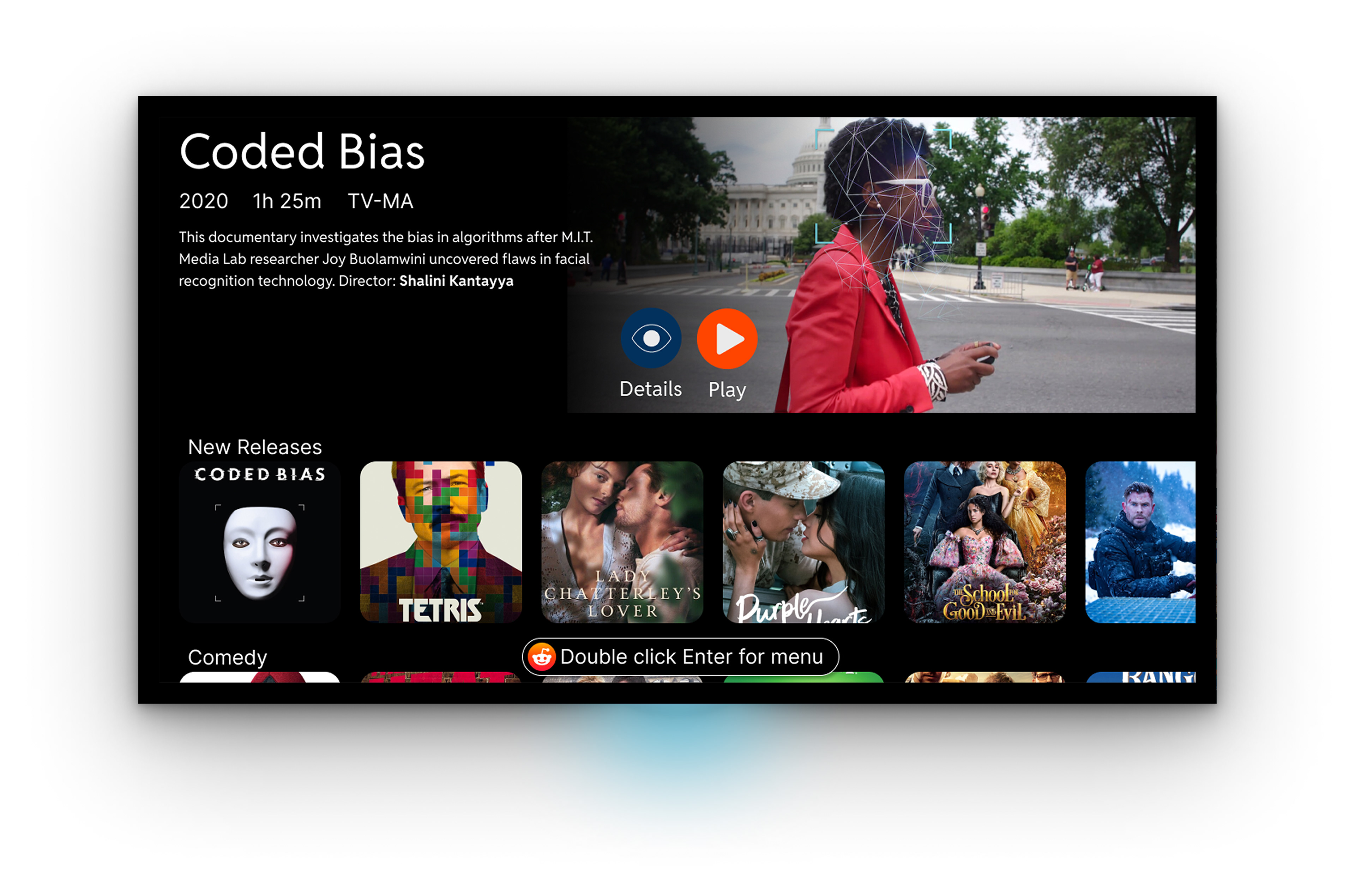
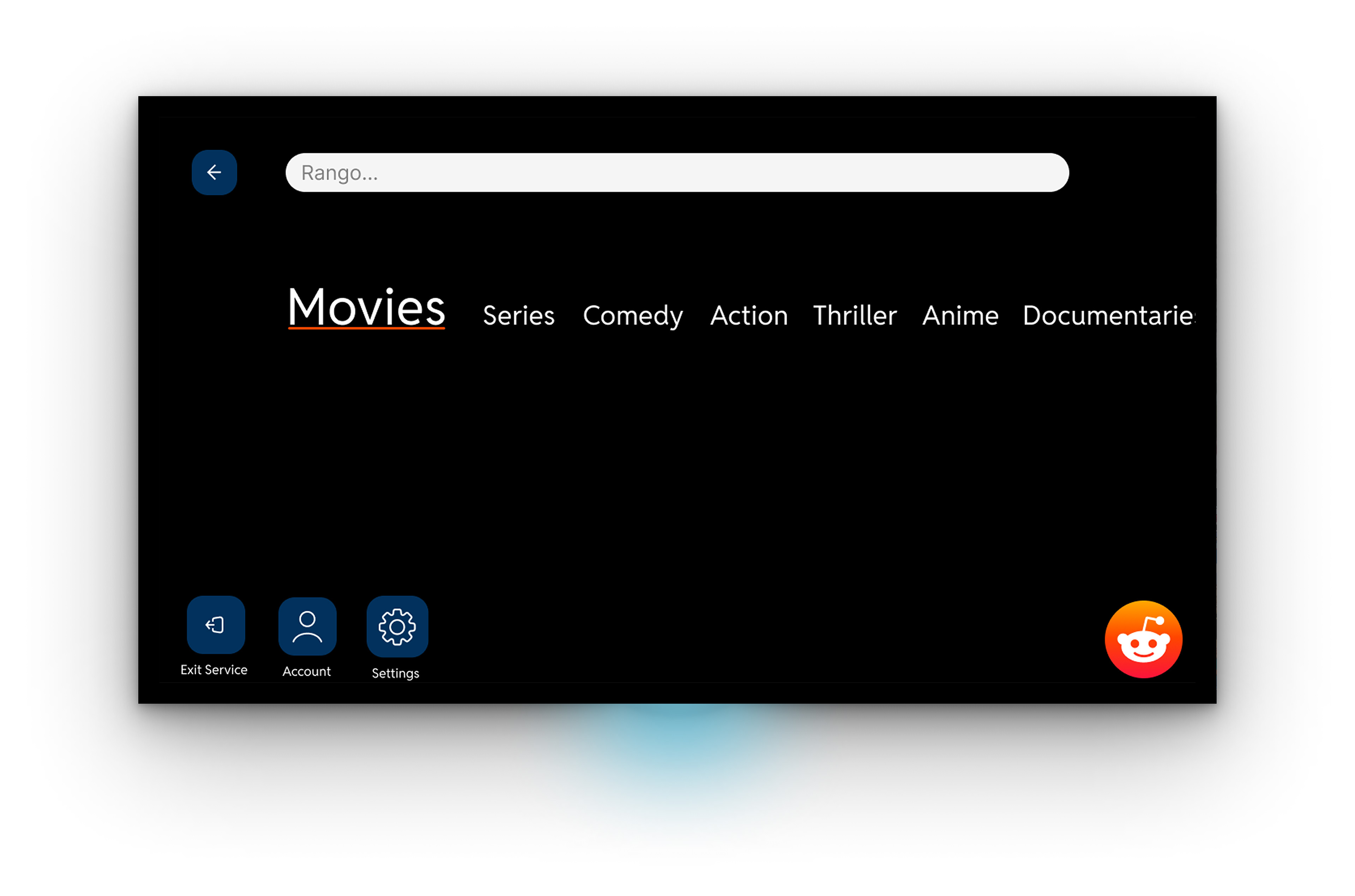
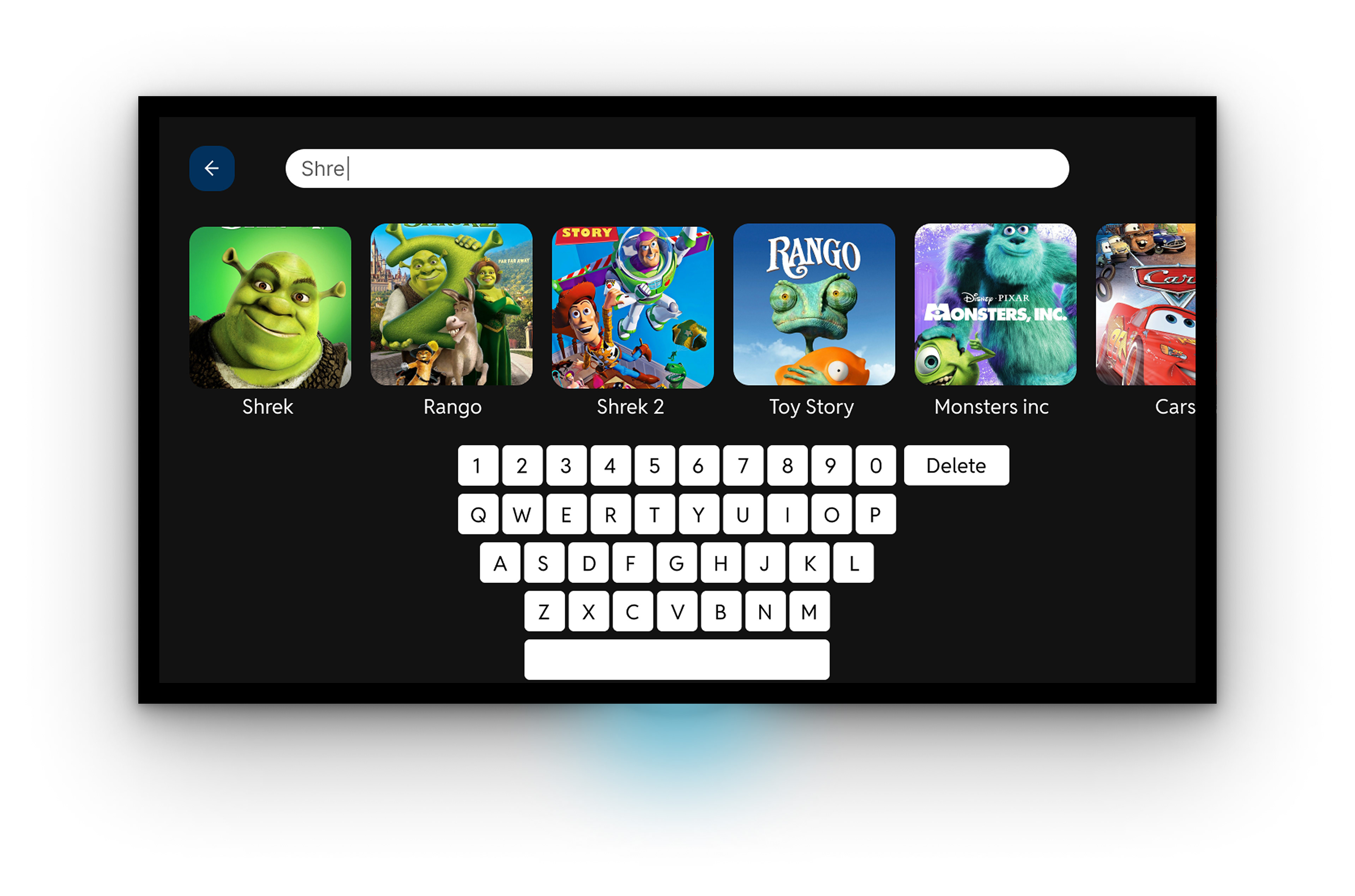
Since I had to keep in mind the user would be using a remote, I wanted them to access search on any screen with ease. To solve this problem, the user would double tap enter to access search and categories.
Mid-fidelity Mobile Wireframes
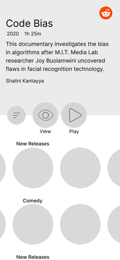
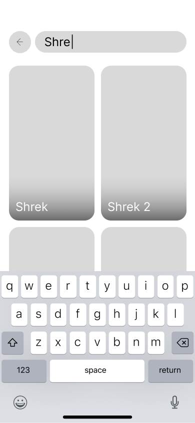
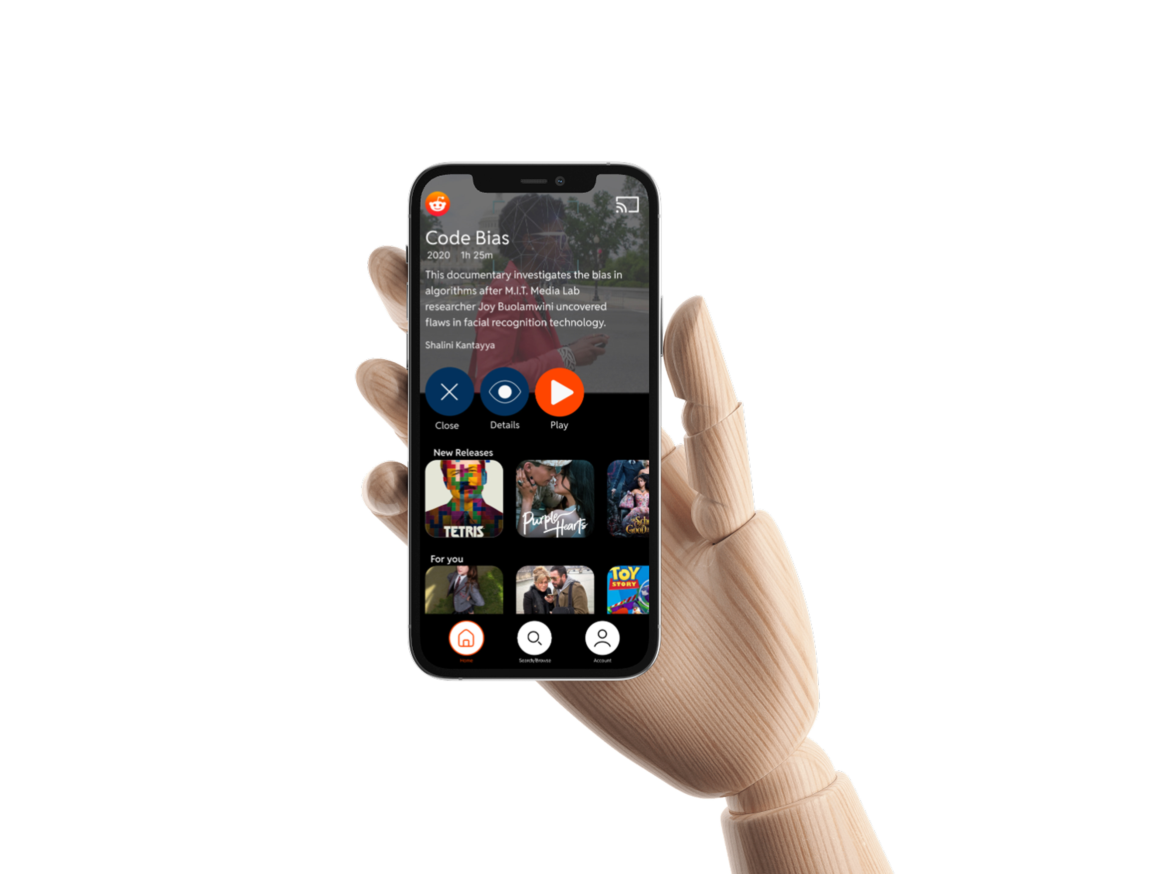
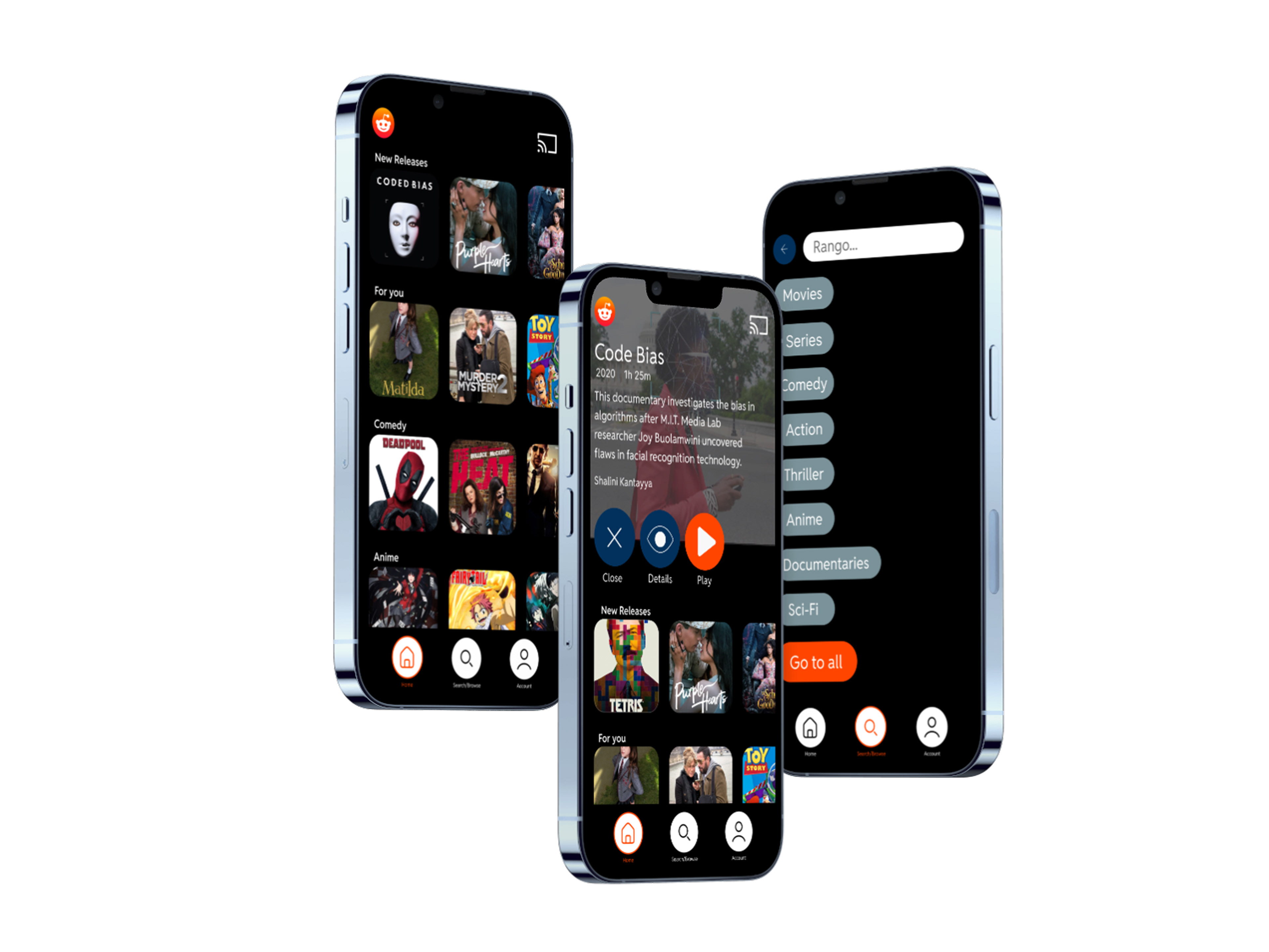
I used smaller image placeholders so users could see more than just one section of movies and see what would be coming next.
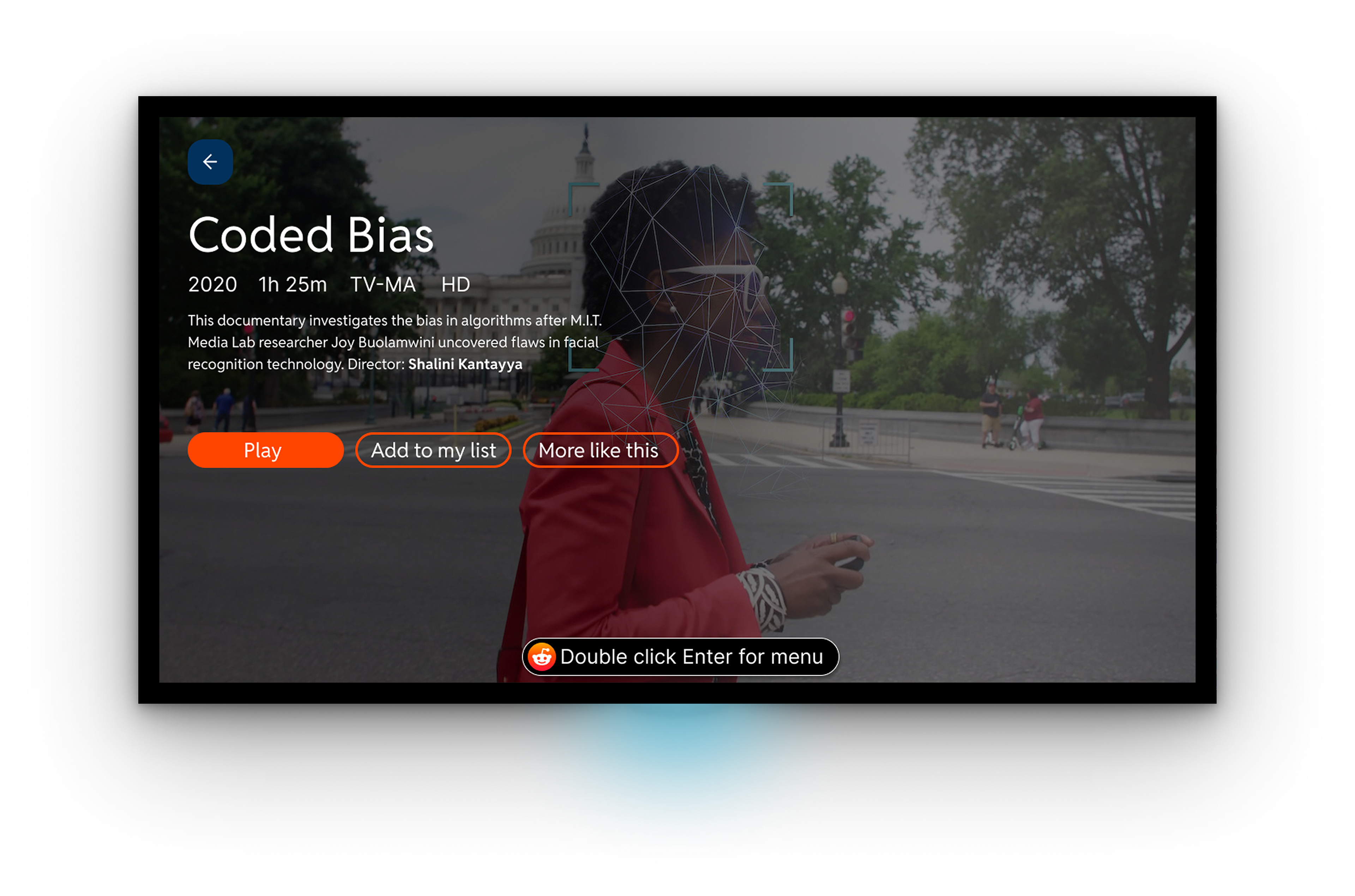
High Fidelity TV Wireframes
I ended up using square images to keep consistency across the whole app, and to show categories once the user goes to the menu instead of having to click in it for easier access.
I made sure to use brand colors, and the Reddit Sans font consistent through out screens in both the TV and Mobile wireframes.
High Fidelity Mobile Wireframes
Reflection
Coming back to this project I wanted to re-iterate the home page of the tv screen. I saw what I could improve:
- Hero section
- Awkward placement of menu access
- Bigger pictures
- Content overload
Challenge
How was I going to:
• Show users what genre is being viewed
• What genre was to come next without having to do anything
• Doing all of this without reducing the size of the hero section
• Improving
I solved this by putting genres as a list, allowing users to see what they are looking at, and what genre was next before they scroll.