Role
UX/UI Designer
Timeline
Spring 2026
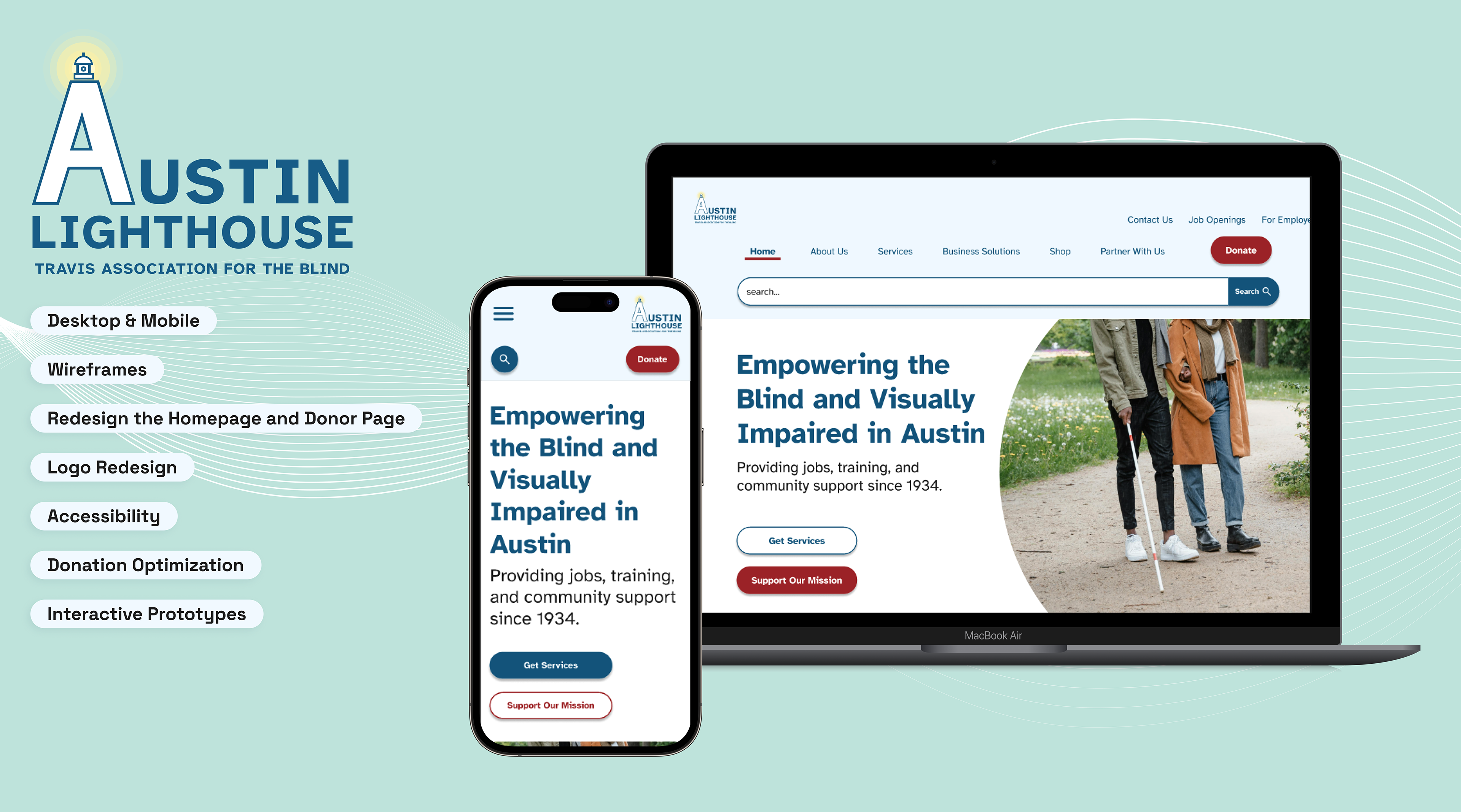
Project Goal
• Redesign Home and Donation page
• Focus on Accessibility and Clarity
• Mobile First Design
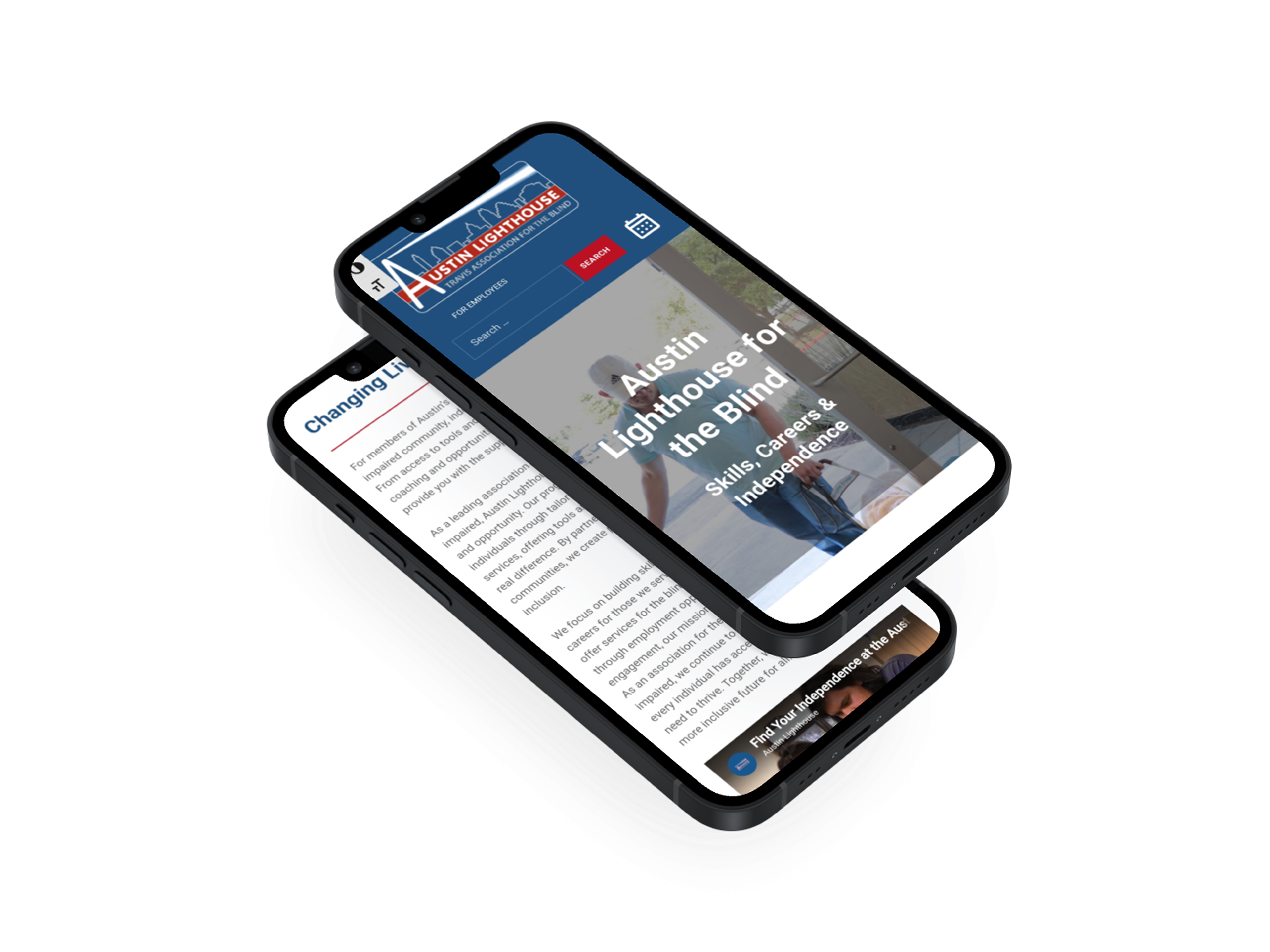
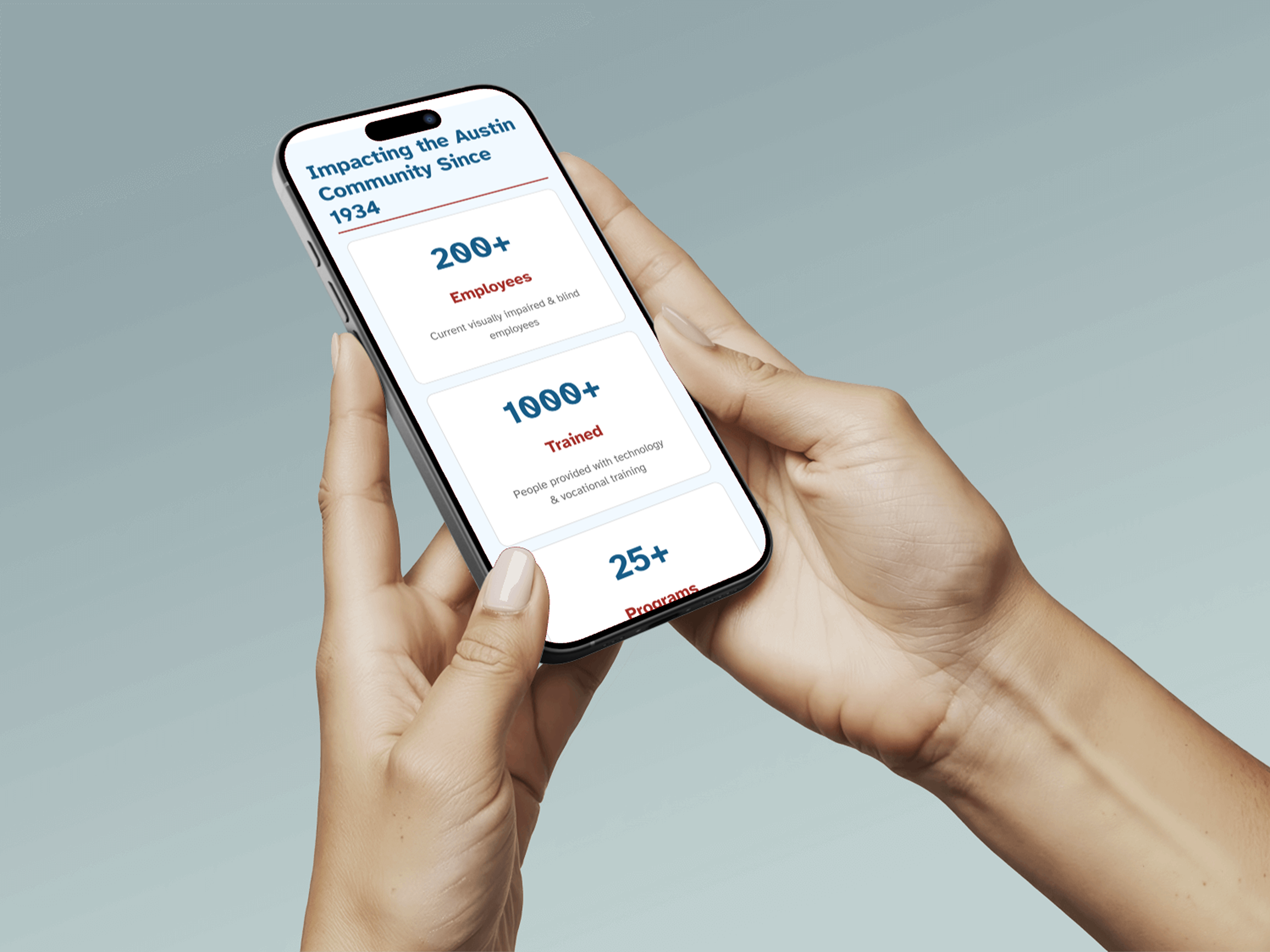
Before Redesign of Homepage
My Role
I served as a UX/UI designer on this project, with a primary focus on visual hierarchy, homepage structure, and user-centered critique. I helped shape the homepage by evaluating layout decisions from the user’s perspective and contributed feedback across the team’s work by identifying areas where designs felt too text-heavy, visually unclear, or difficult to scan.
Mindy Istre - UI Designer & Public Relations
Olha Blahoi - UX Researcher & Data Analyst
Sochima Uzuegbunam - UX Strategist & Product Designer
Olha Blahoi - UX Researcher & Data Analyst
Sochima Uzuegbunam - UX Strategist & Product Designer
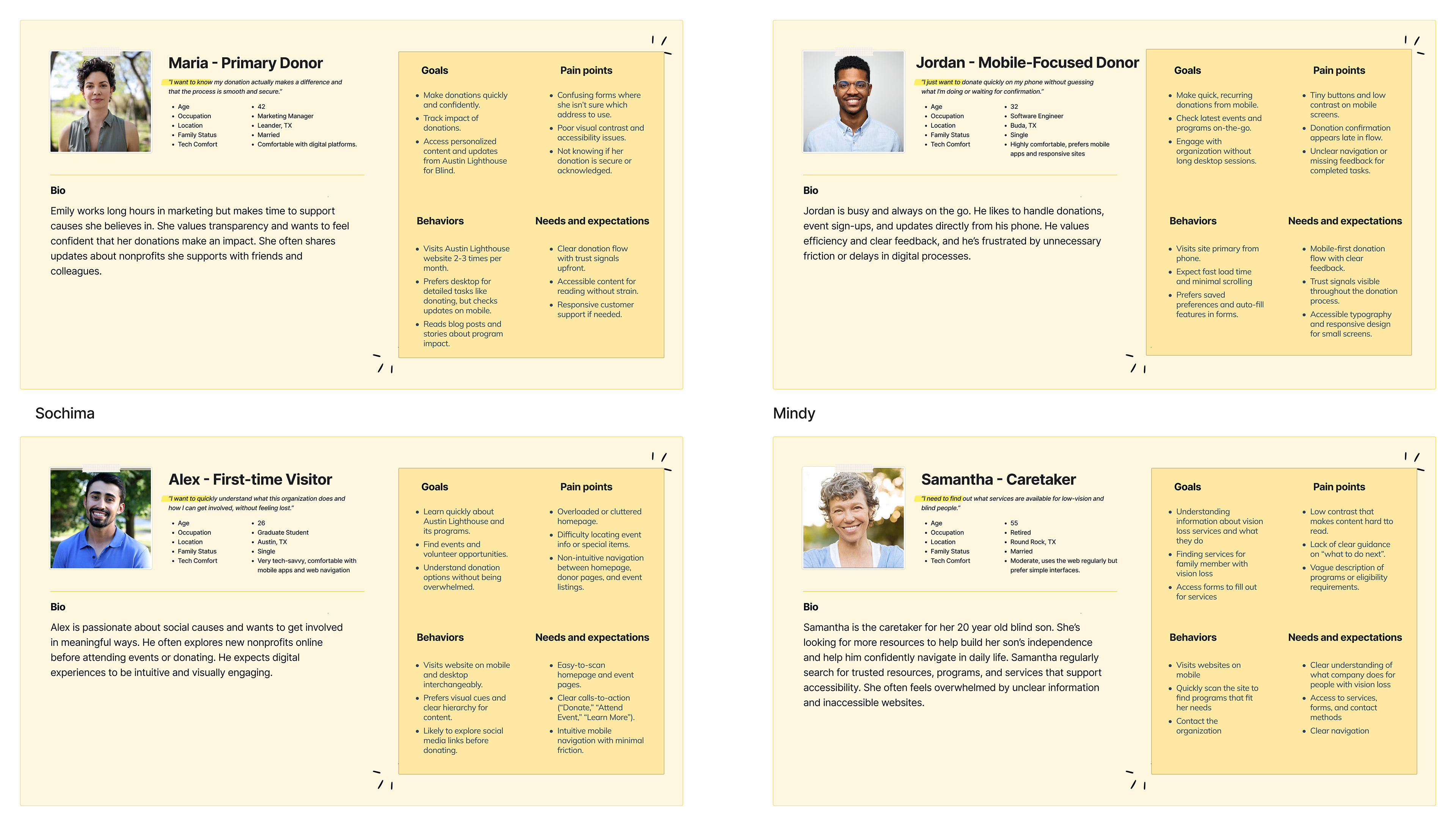
Research and Insights
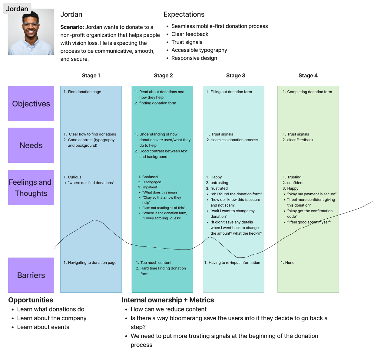
I helped conducted a heuristic evaluation, competitive analysis, and a usability test, along with personas and journey maps to empathize with the users frustrations.
Key findings
• Text-heavy content
• Unclear labels and headers
• Weak hierarchy
• Screen reader would skip over descriptive text and important information.
Insights
• User needs content broken down so they can digest and scan information faster
• Labels and headers need to be clear and not leave the user wondering what something means
• Stronger hierarchy so users can navigate confidently
• Screen reader needs to have better hierarchy so users know what is important
These insights influenced my approach to the homepage. I focused on strengthening visual hierarchy, making content easier to scan, and evaluating design decisions from the user’s perspective. My goal was to help create a homepage experience that felt clearer, more engaging, and easier to navigate.
Ideation
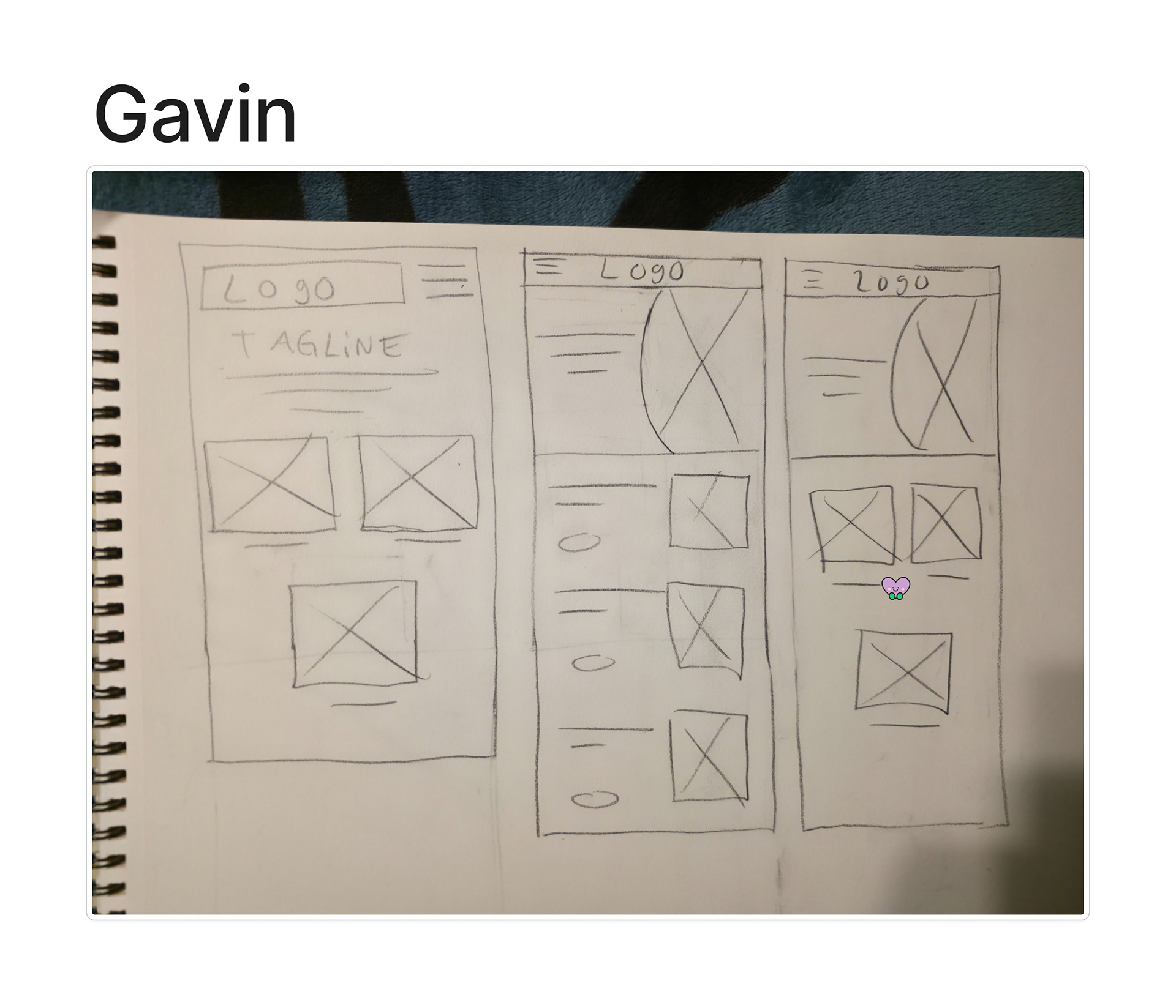
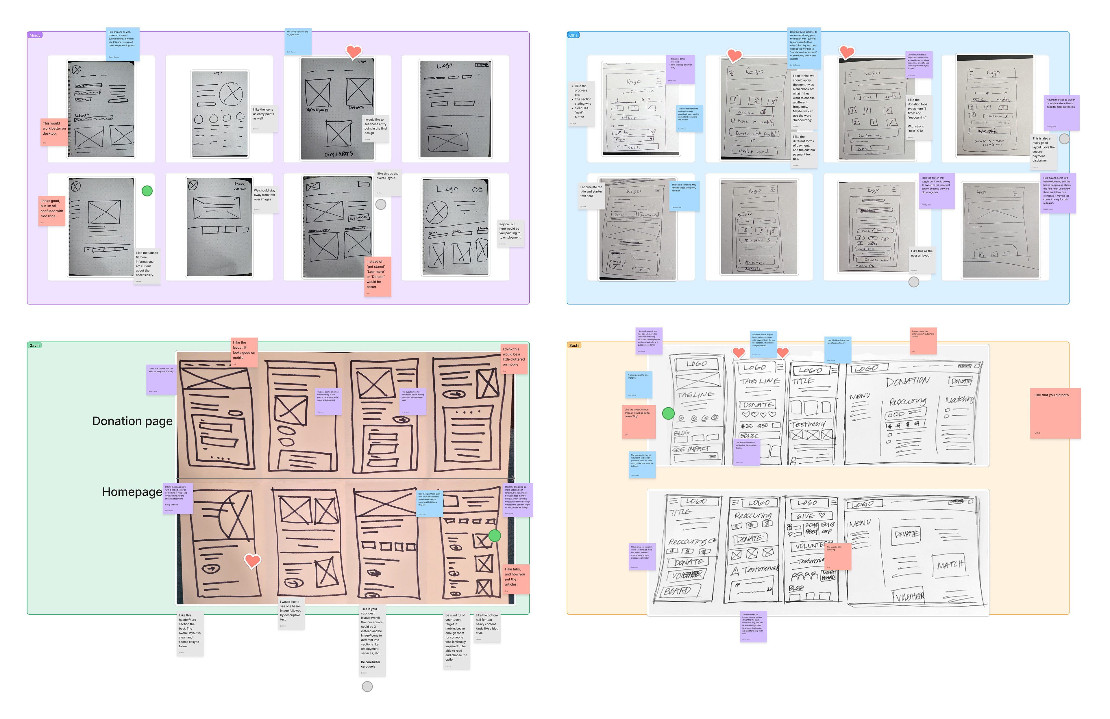
My team and I used Crazy 8s to quickly generate a range of ideas for the site. After sketching, we used dot voting to identify the strongest elements across everyone’s low-fidelity concepts. We then combined the most effective ideas into a new set of low-fi screens, which helped us move toward a more unified design direction.
Low-Fidelity Wireframes
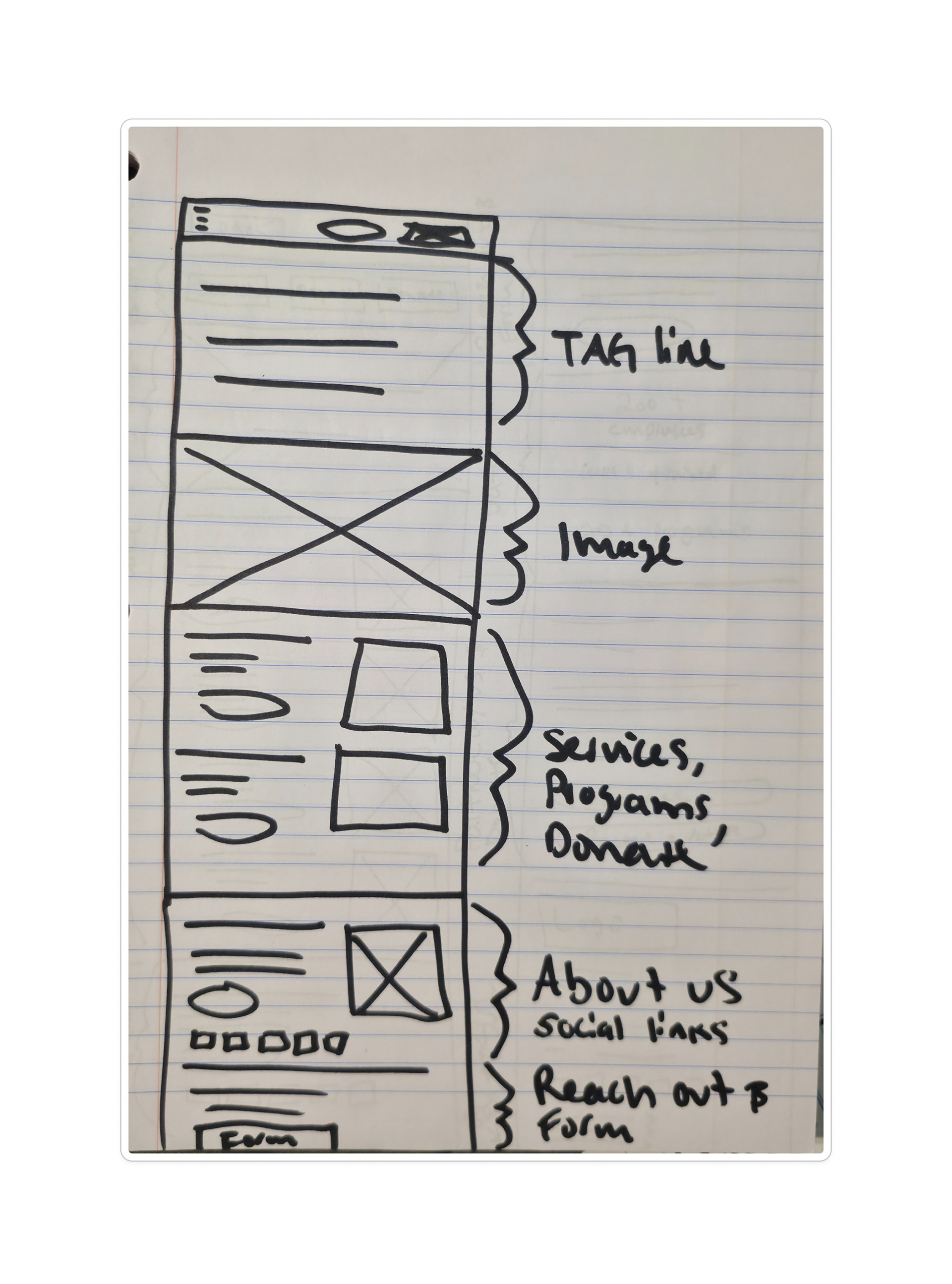
I generated more low-fi ideas for the homepage so I could have a direction I wanted to go.
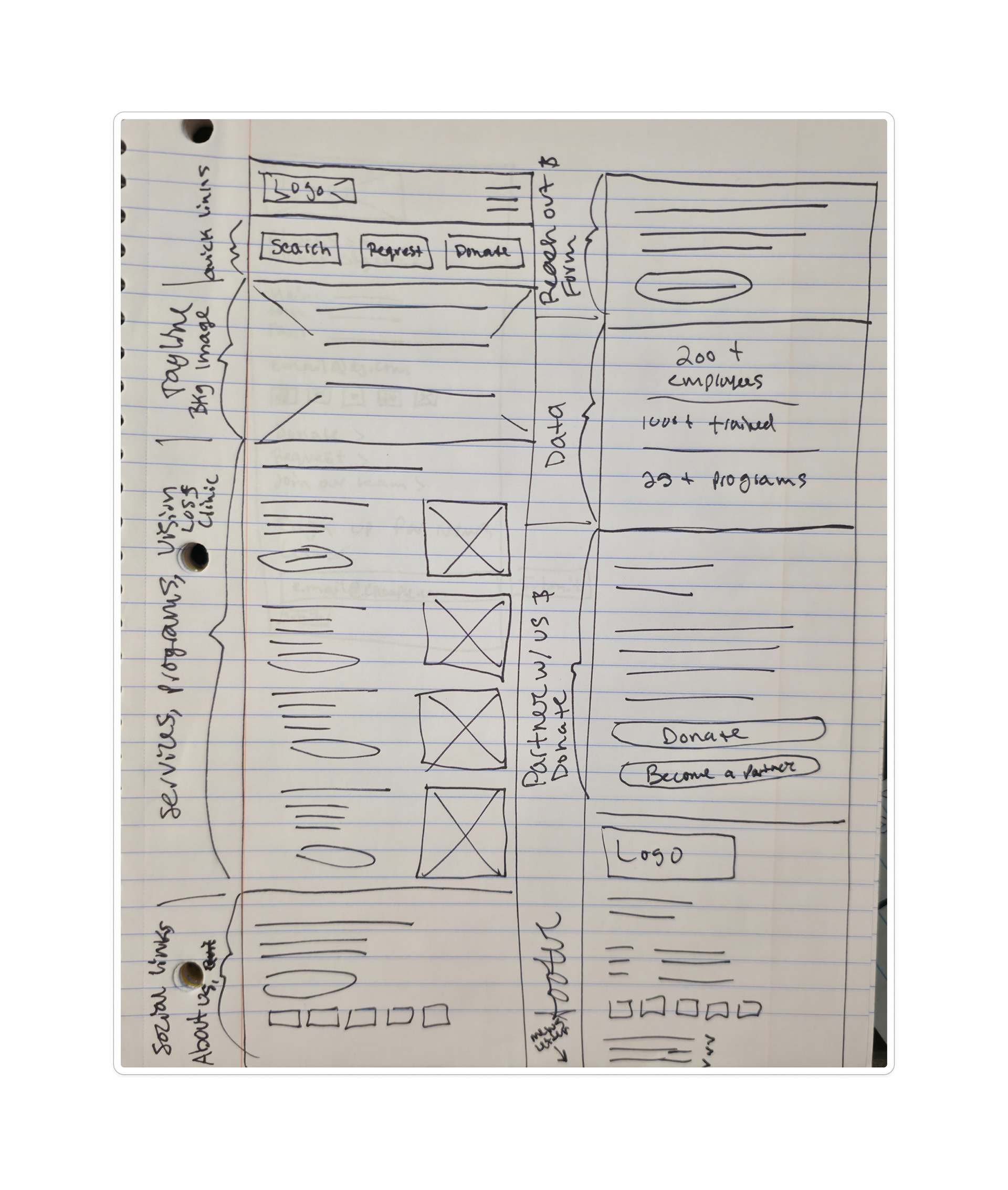
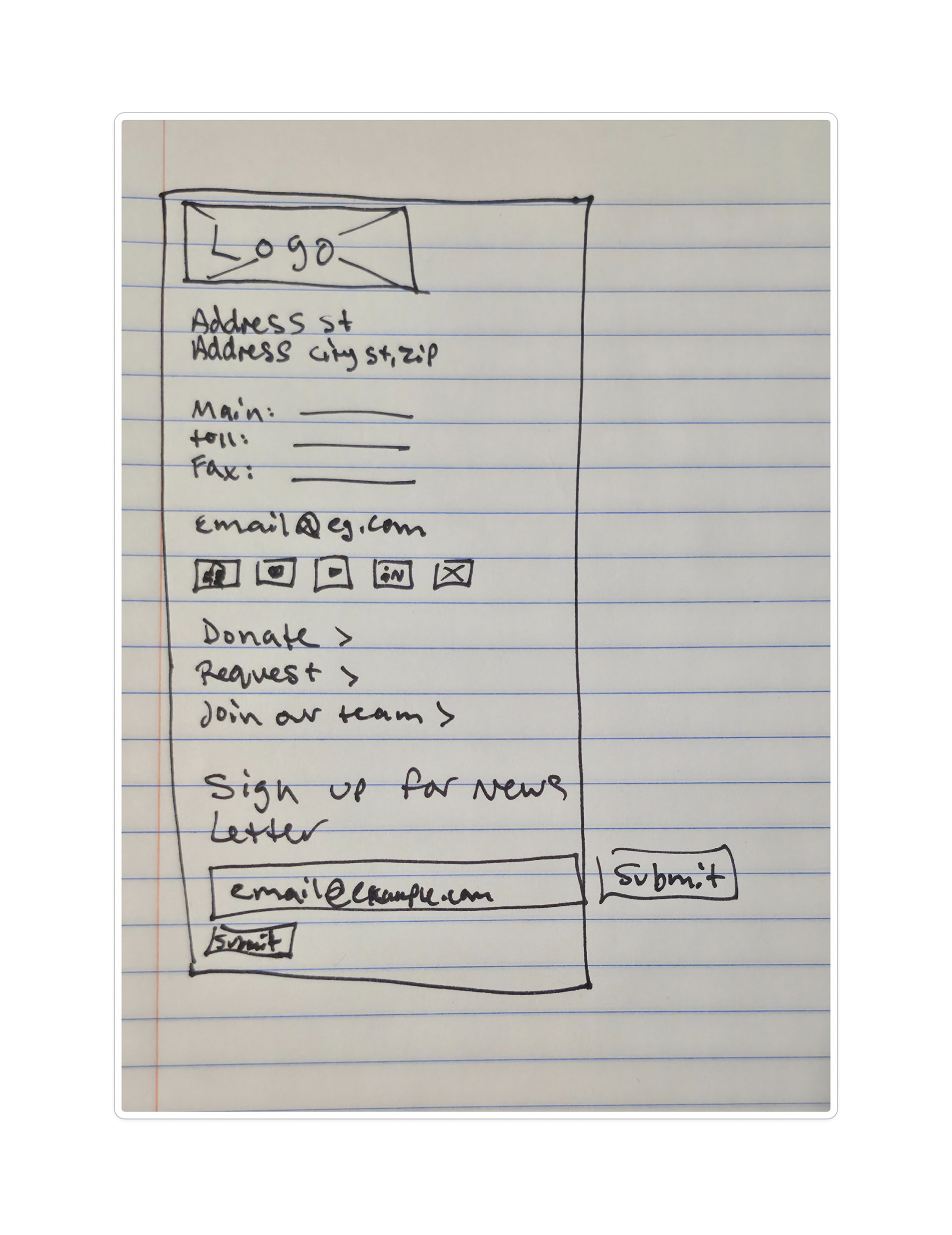
After narrowing down our ideas, we began creating a design system to bring more consistency to the site.
Homepage focus and contributions
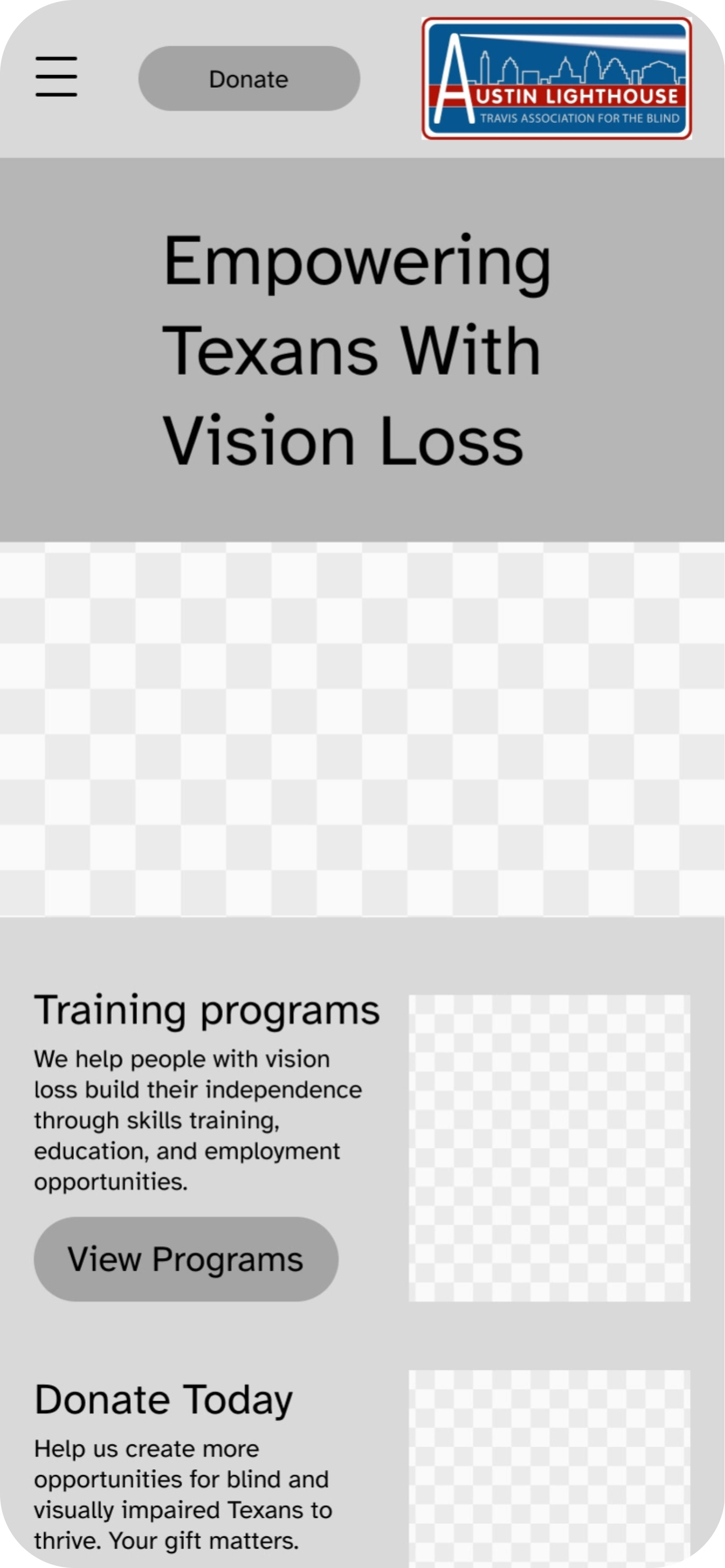
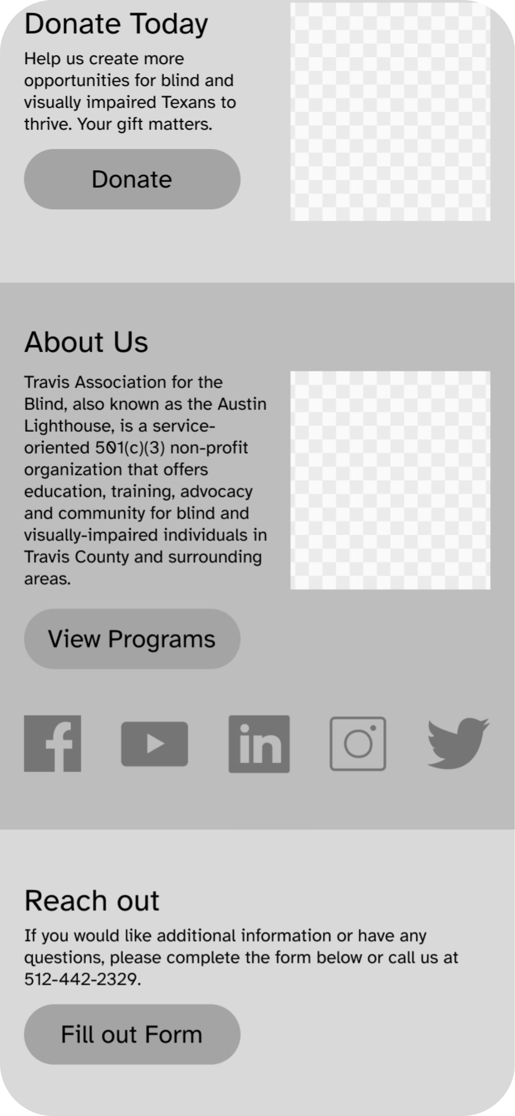
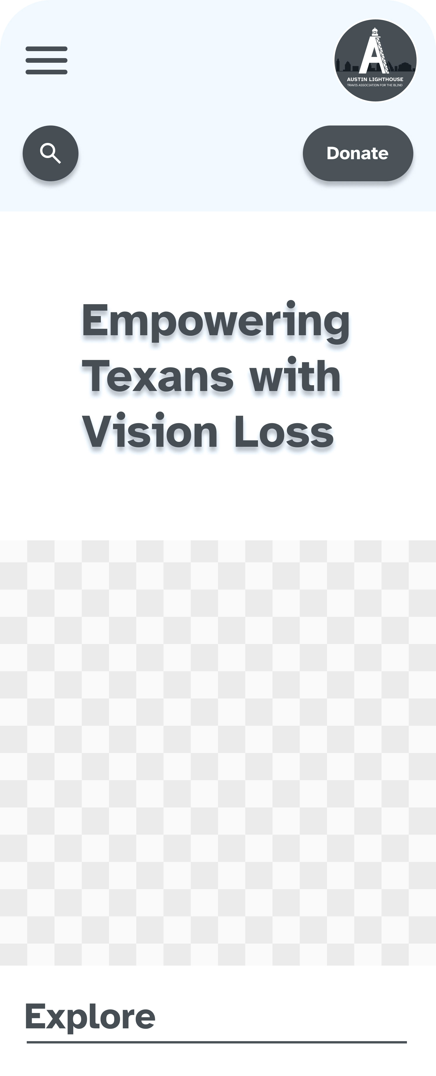
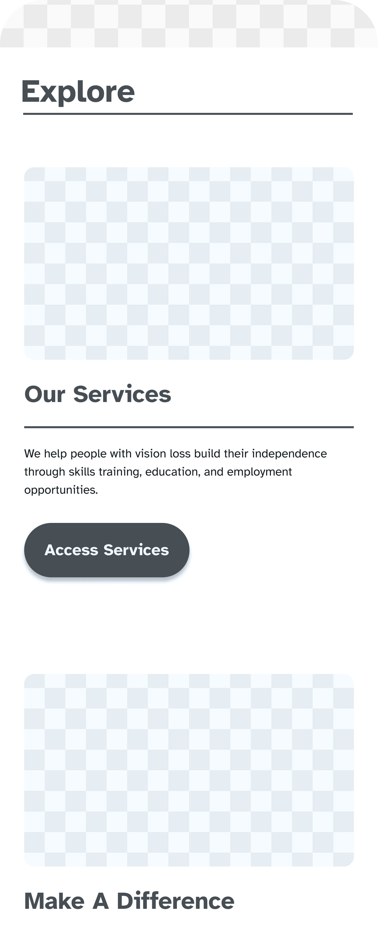
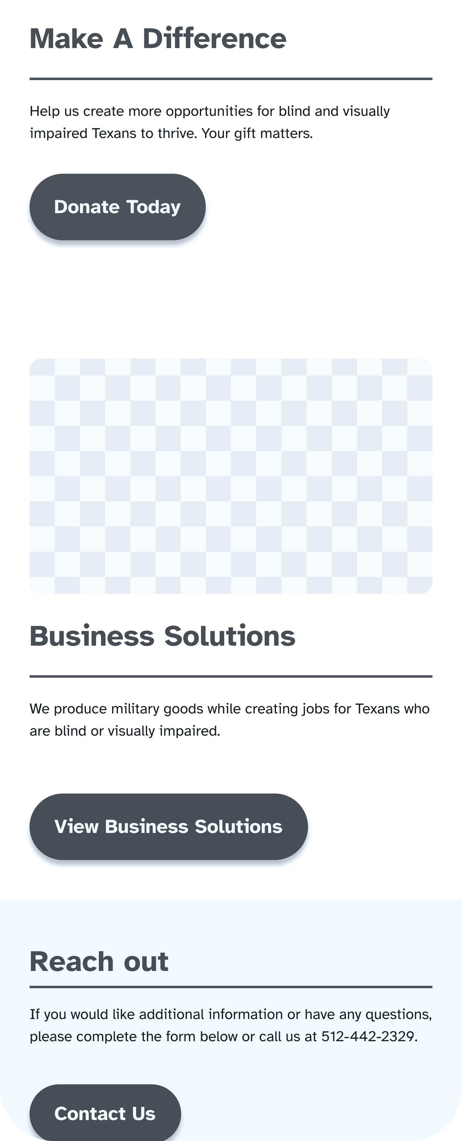
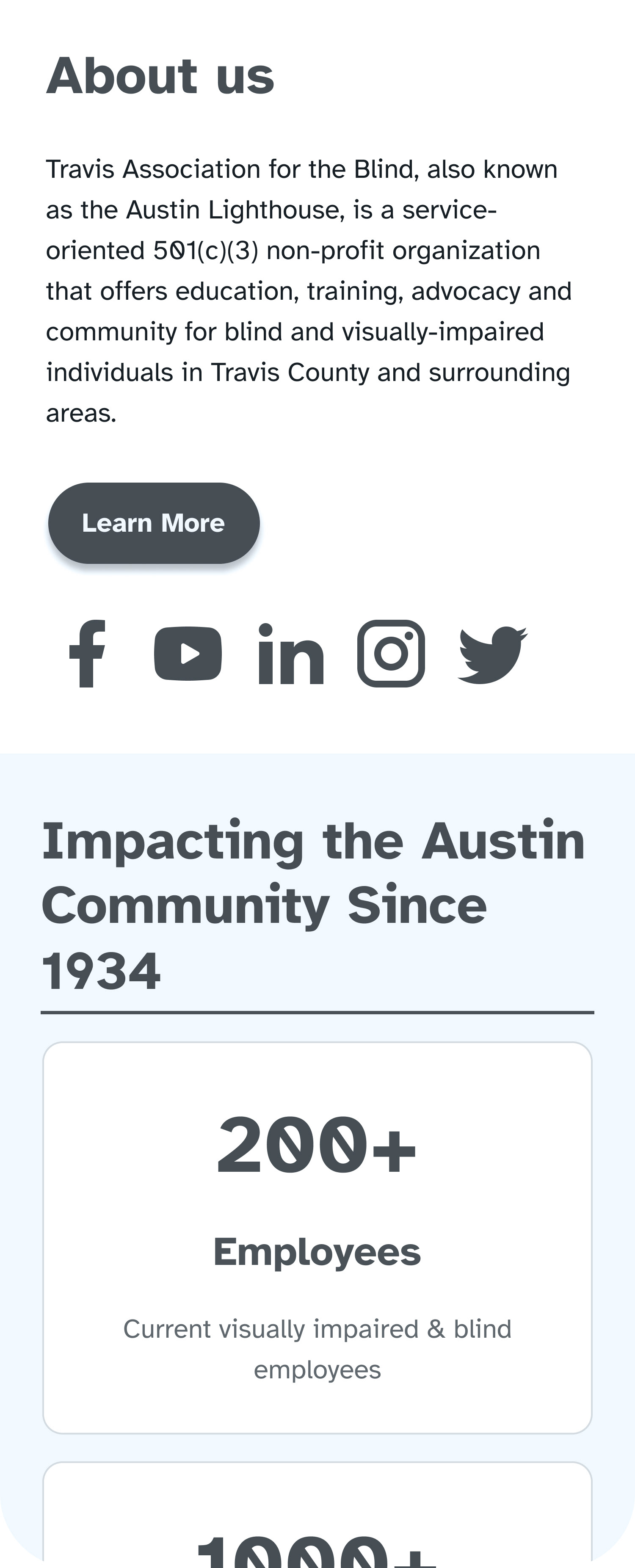
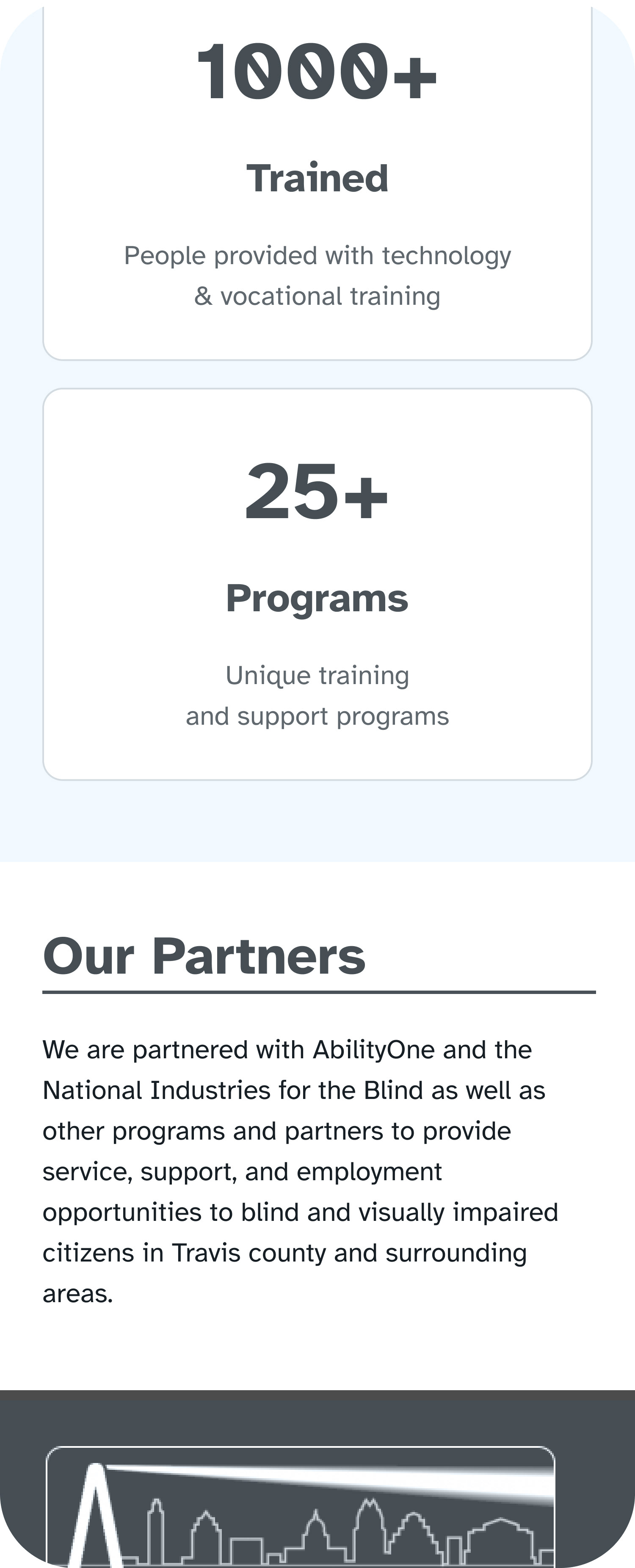
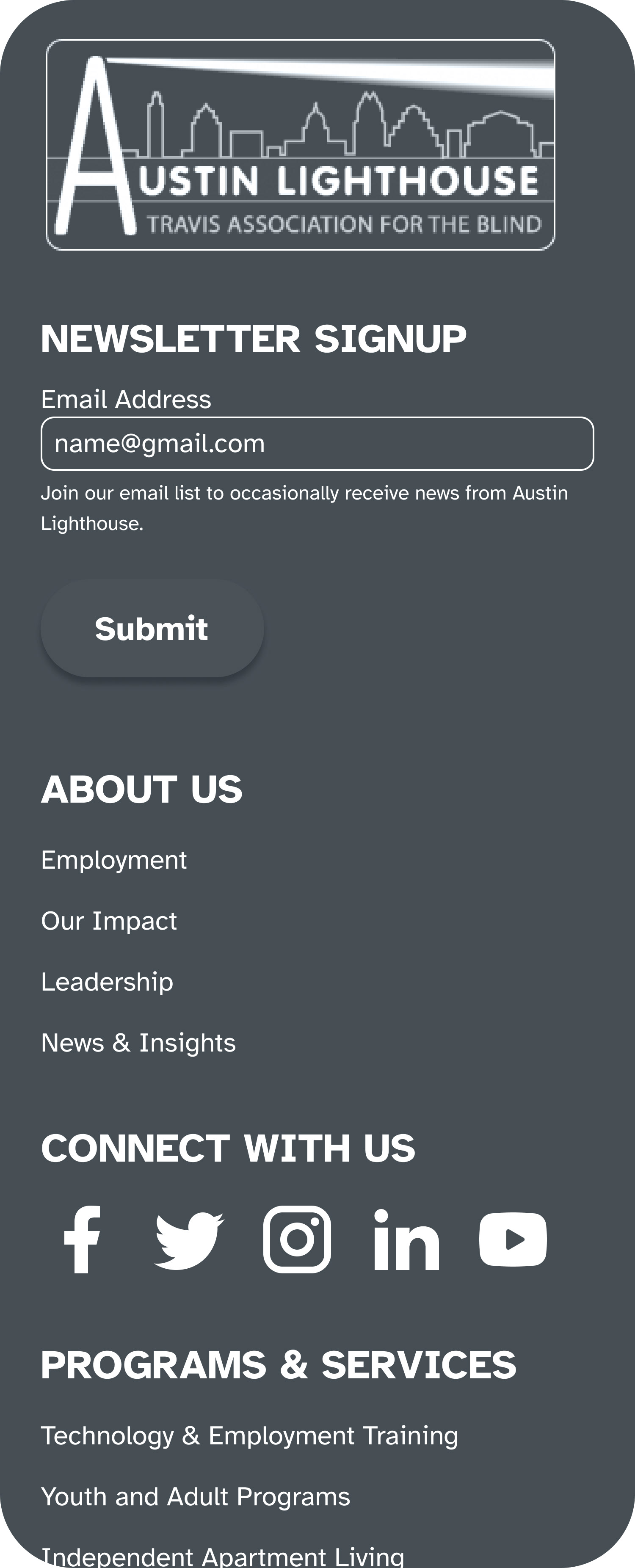
My primary focus was the homepage. I started by creating a mid-fidelity mobile wireframe to establish the page’s structure and overall direction. As the design evolved, my team contributed card designs for the mobile homepage, while I designed the cards for the desktop screen. I also organized the homepage’s content hierarchy to make the experience clearer, more structured, and easier for users to navigate. After the mid-fidelity homepage was completed, my teammates prototyped the wireframe, and I conducted a usability test to better understand how users interacted with the design.
Mid-Fidelity Wireframes
I contributed making mid-fi wireframes so each of us could conduct a usability test.
Usability Test Results
During usability testing, I found that the participant was able to successfully complete all tasks and navigate the homepage without major difficulty. They were able to find the information they needed, which suggested that the overall structure of the homepage was effective.
One usability issue did emerge with the form, however, as it appeared too large for the participant to easily exit out of, which created friction in the experience.
Visual Clarity on Donation Page
Although my main focus was the homepage, I also contributed visual direction on the donation page during the mid-fidelity stage. I identified areas where the design felt too text-heavy and less visually engaging, and I provided feedback aimed at improving hierarchy, clarity, and overall scanability.
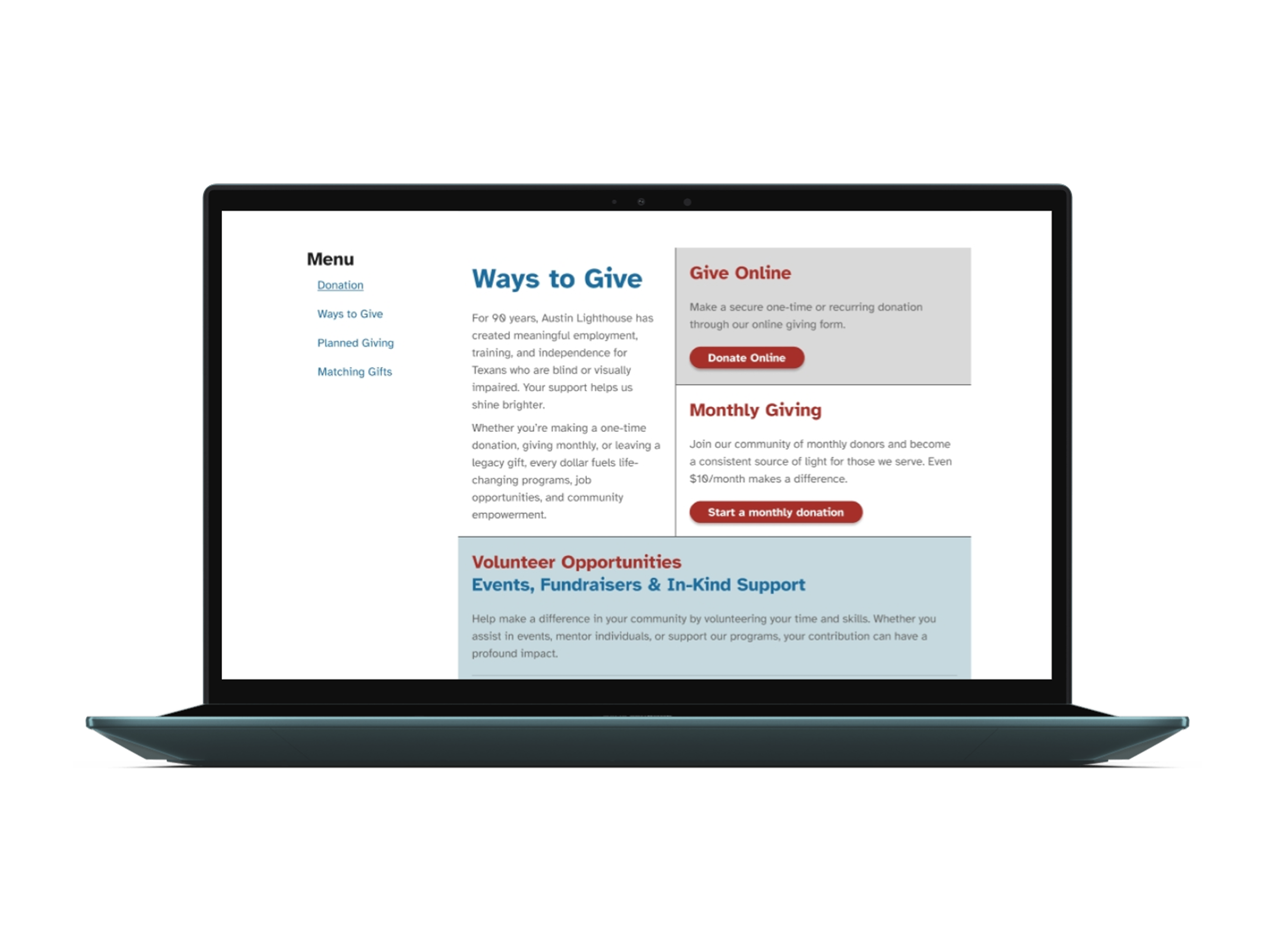
Before
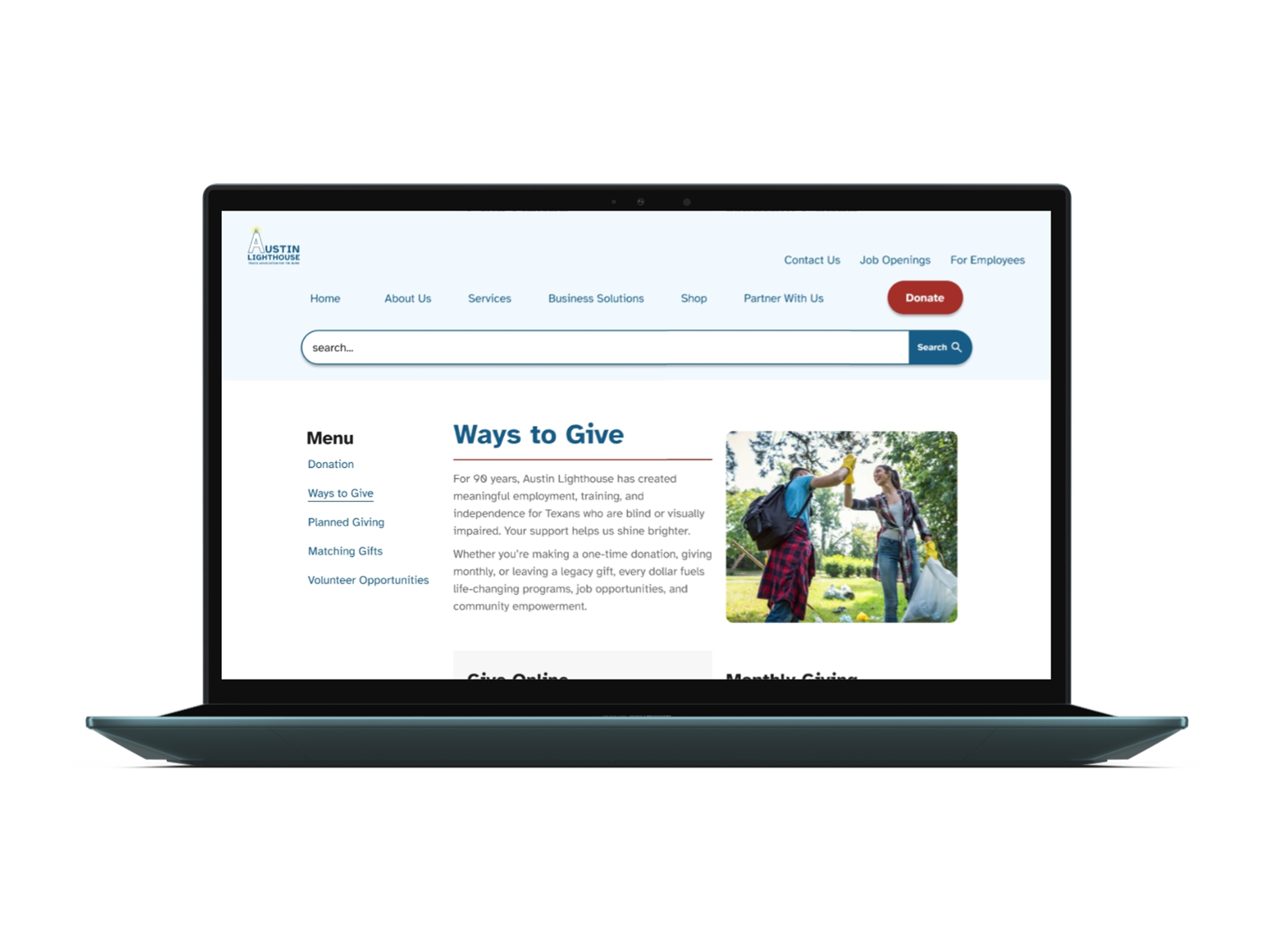
After
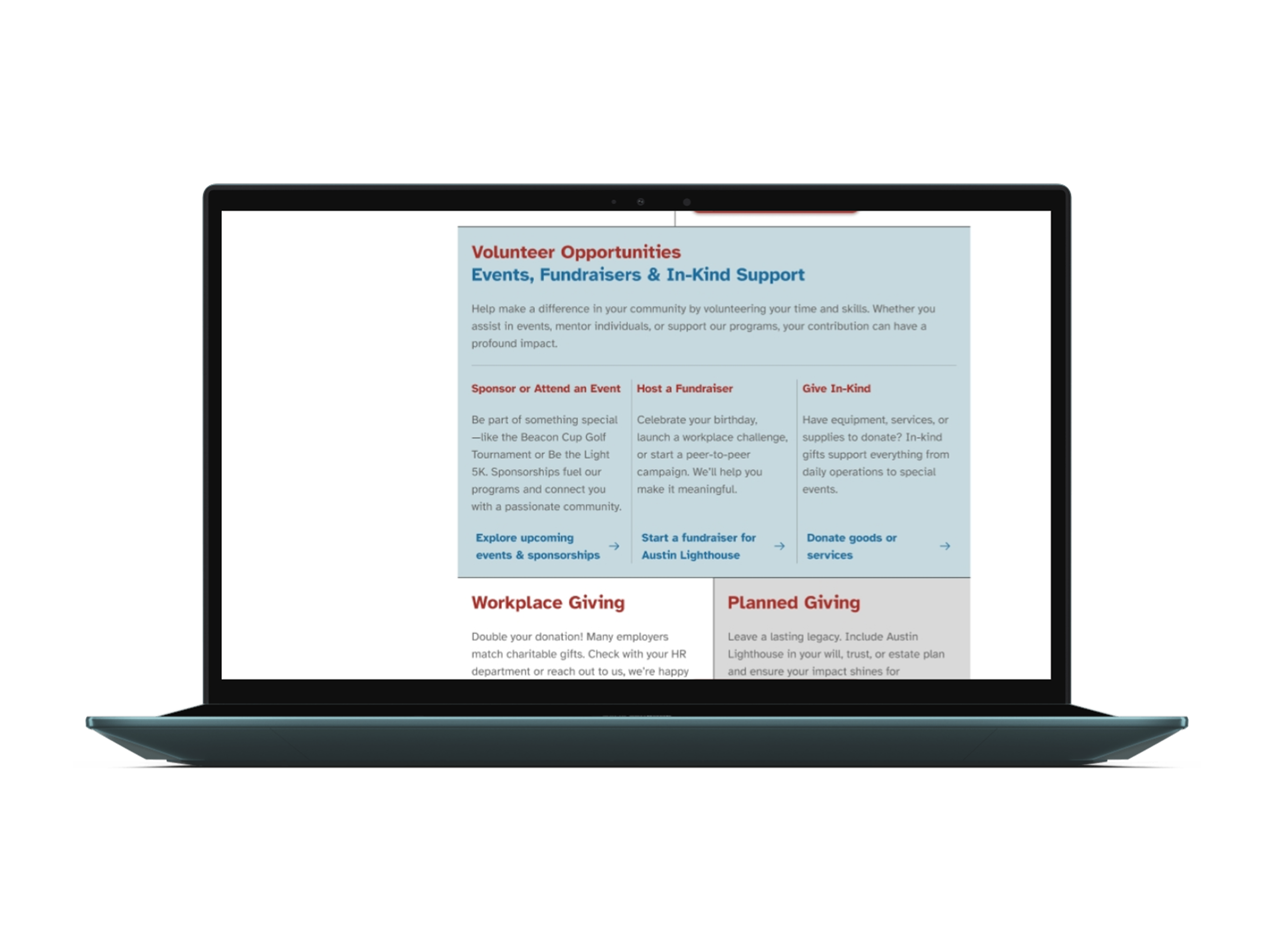
Before
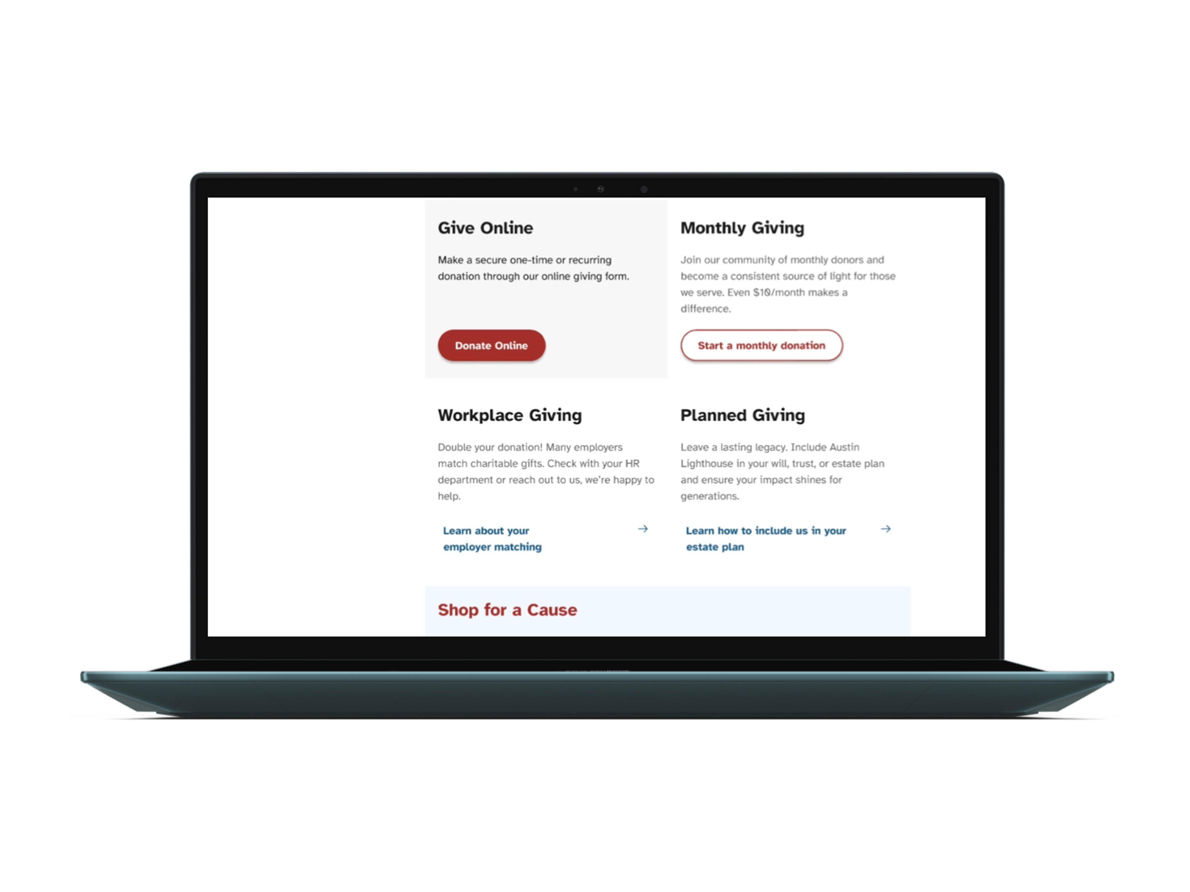
After
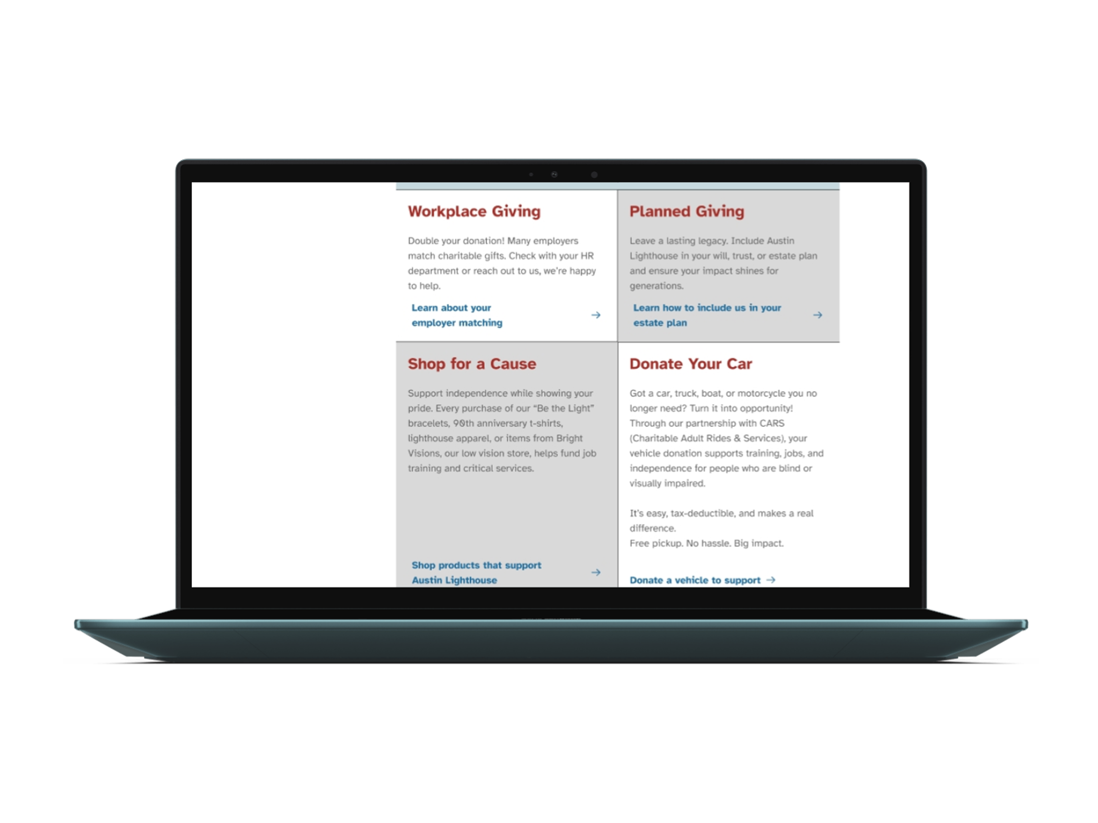
Before
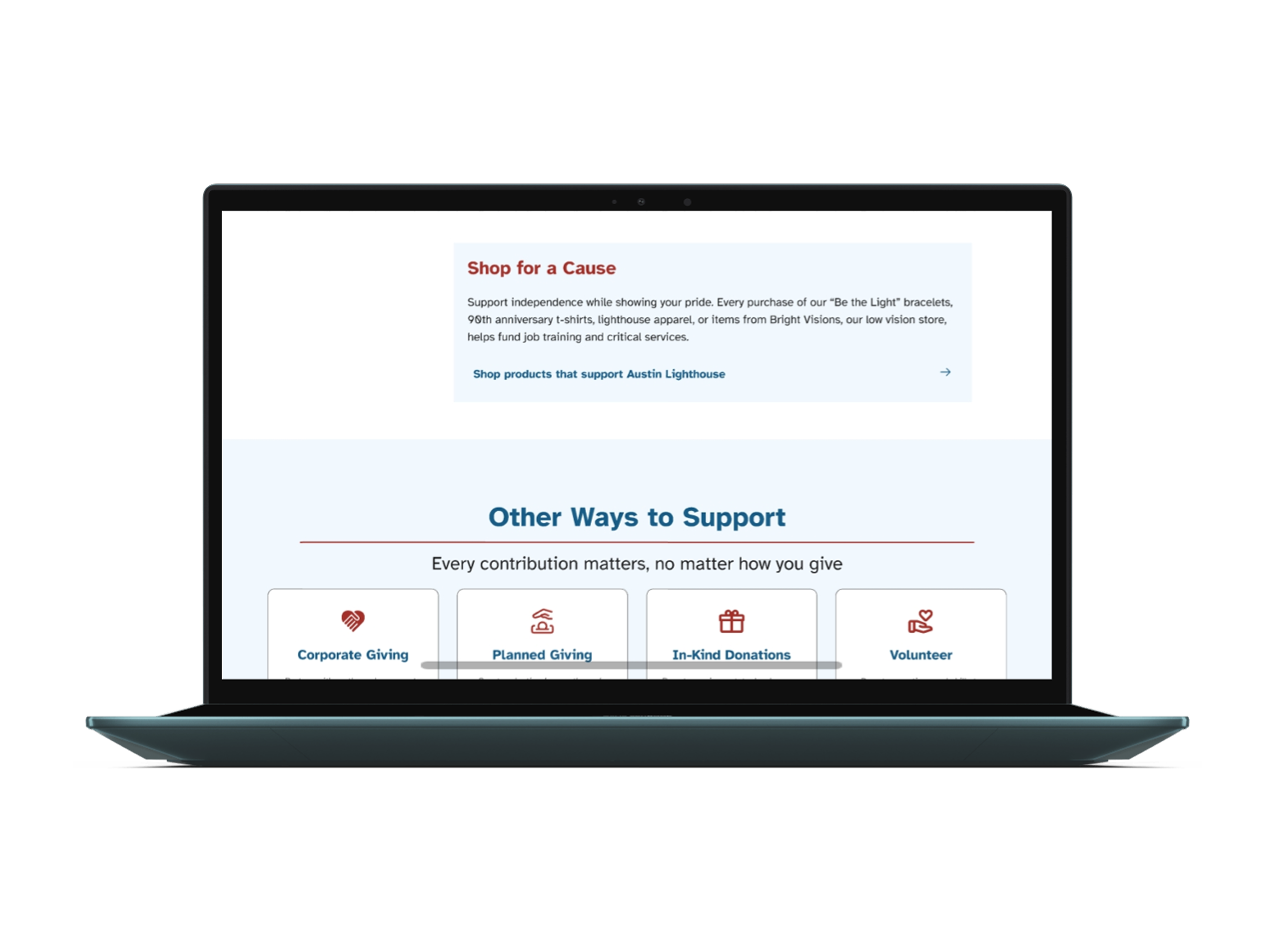
After
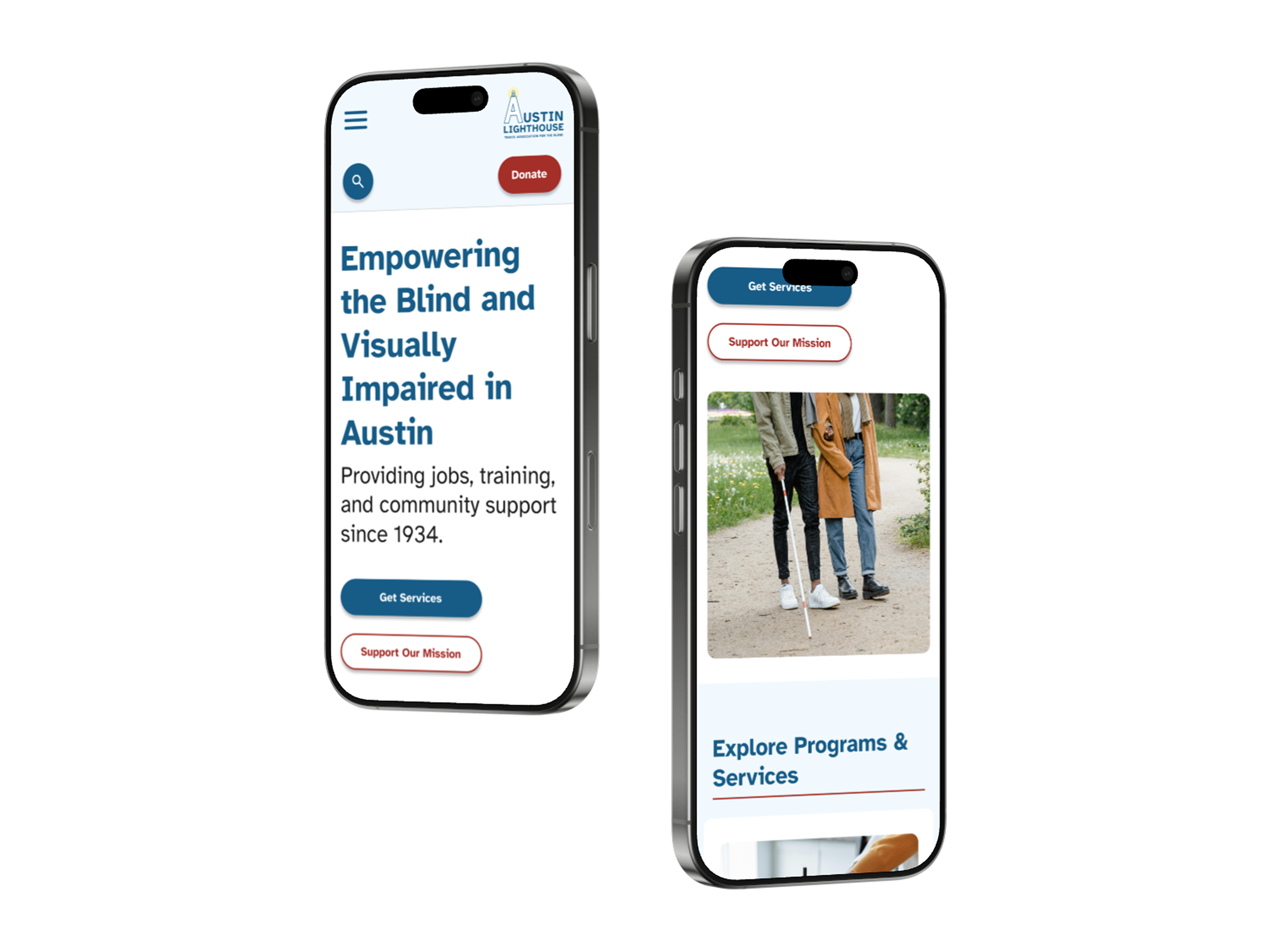
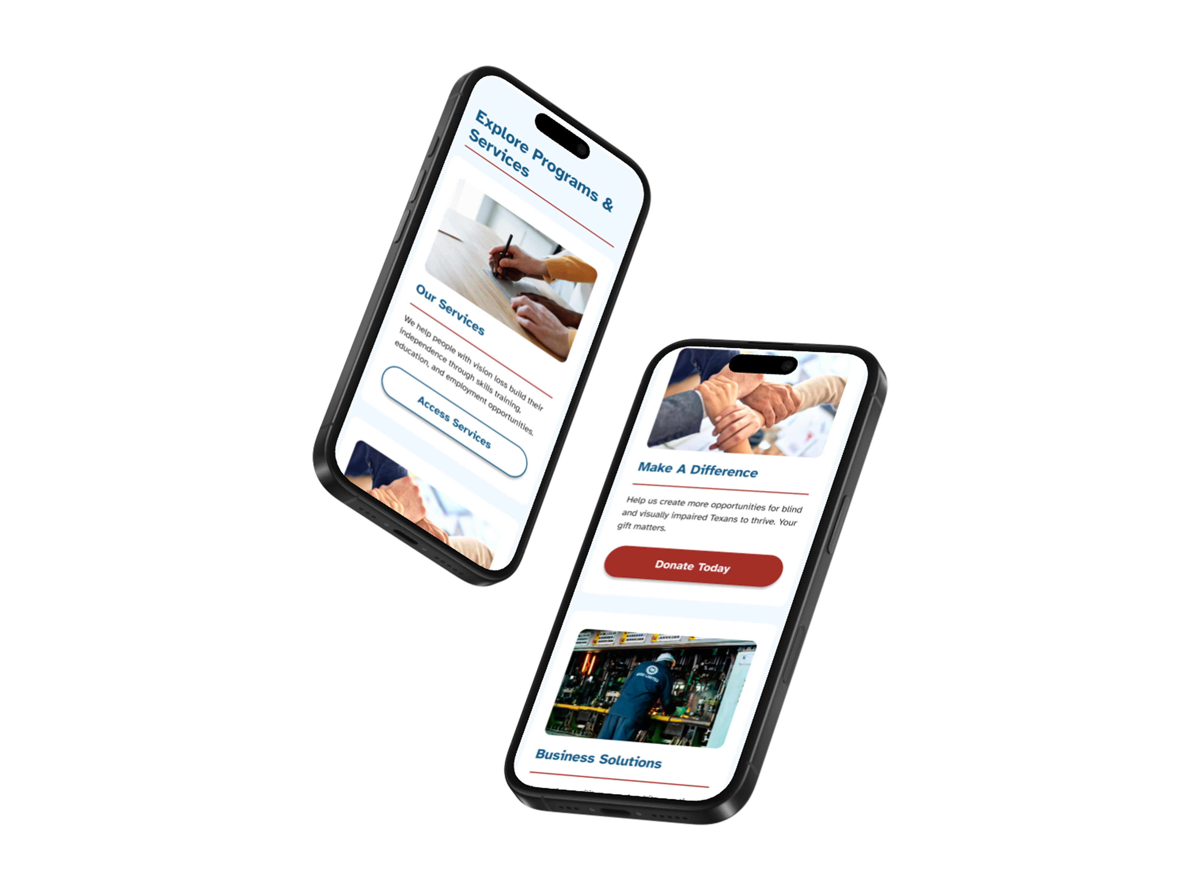
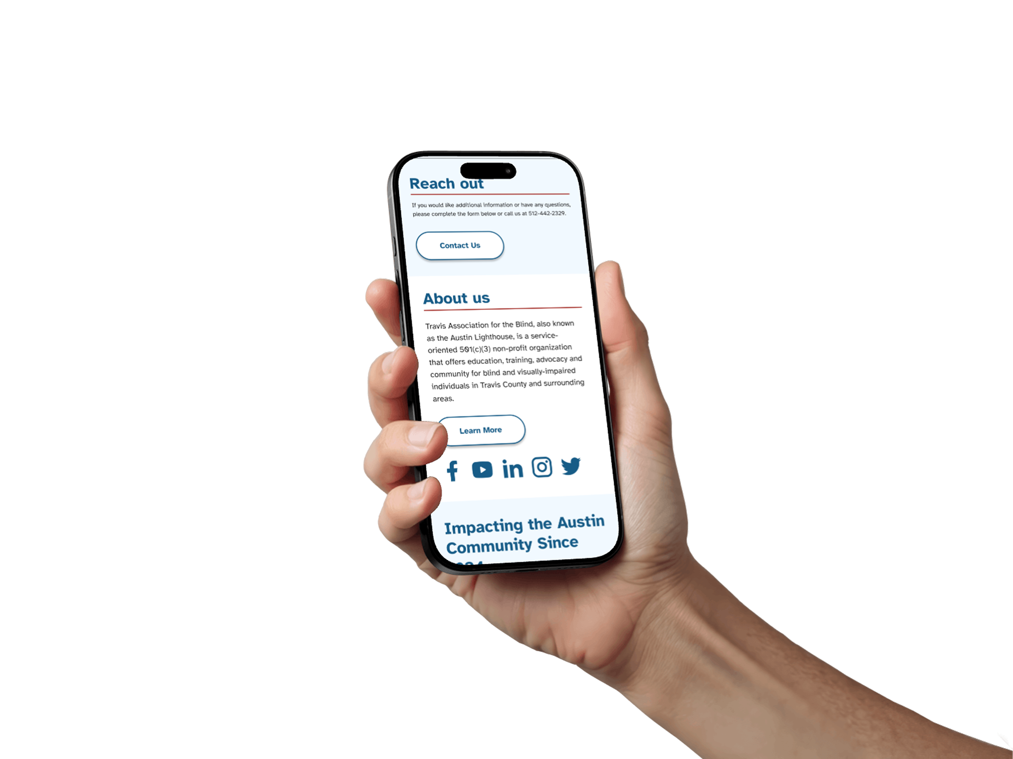
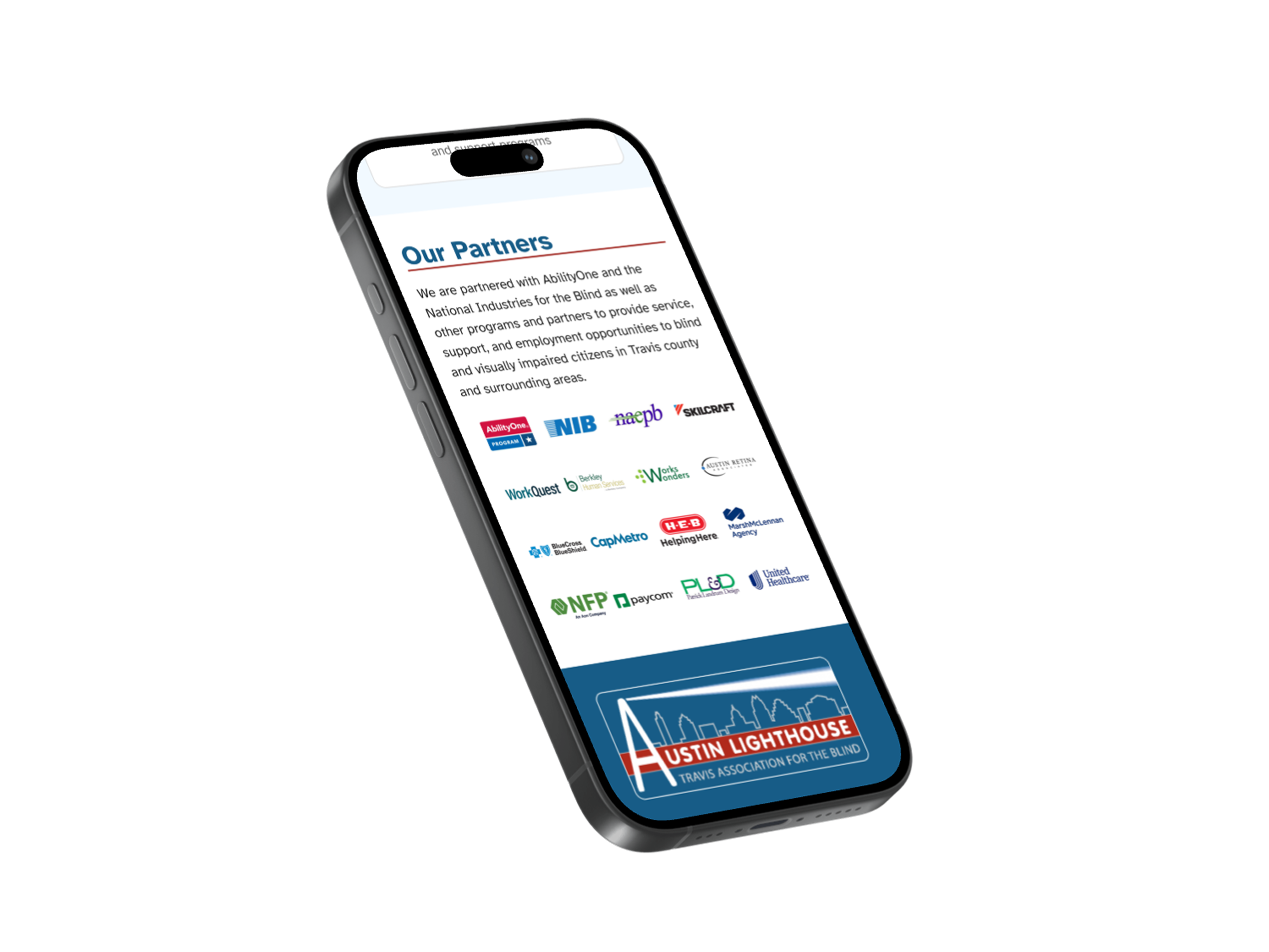
Final Design
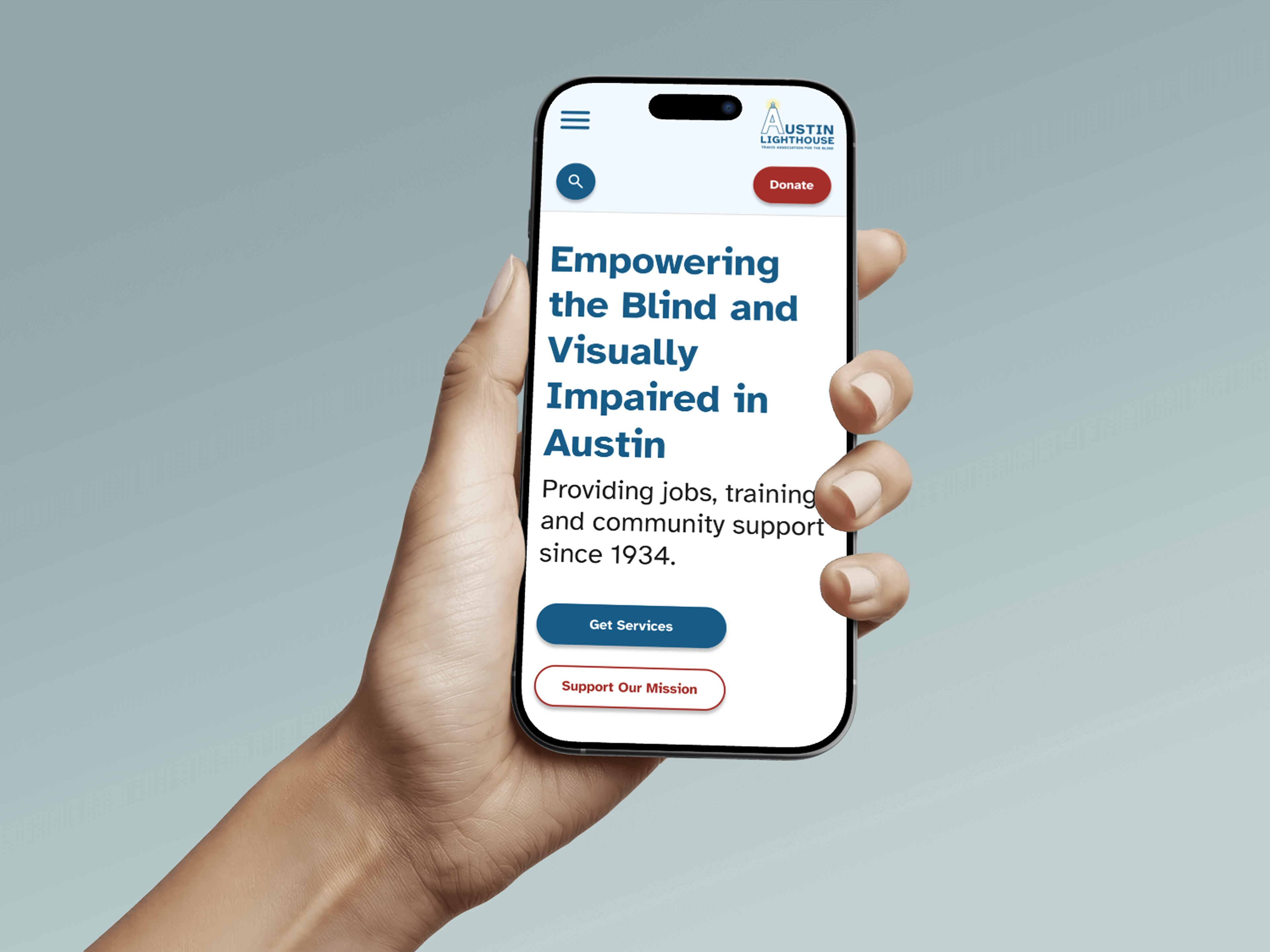
The final homepage design became more structured, with clearer hierarchy that helped users navigate the page more easily and find important information without confusion.
Learnings
I learned to not be so scared of accessibility anymore, since I had to have it in the front of my mind the whole time. I gained a deeper understanding why accessibility is so important for all users. It allows all users to engage with websites no matter their physical or cognitive ability.
I grew as a designer by collaborating on a team, sharing my ideas, and working with a real client, and dealing with a real accessible problems users face.