Overview
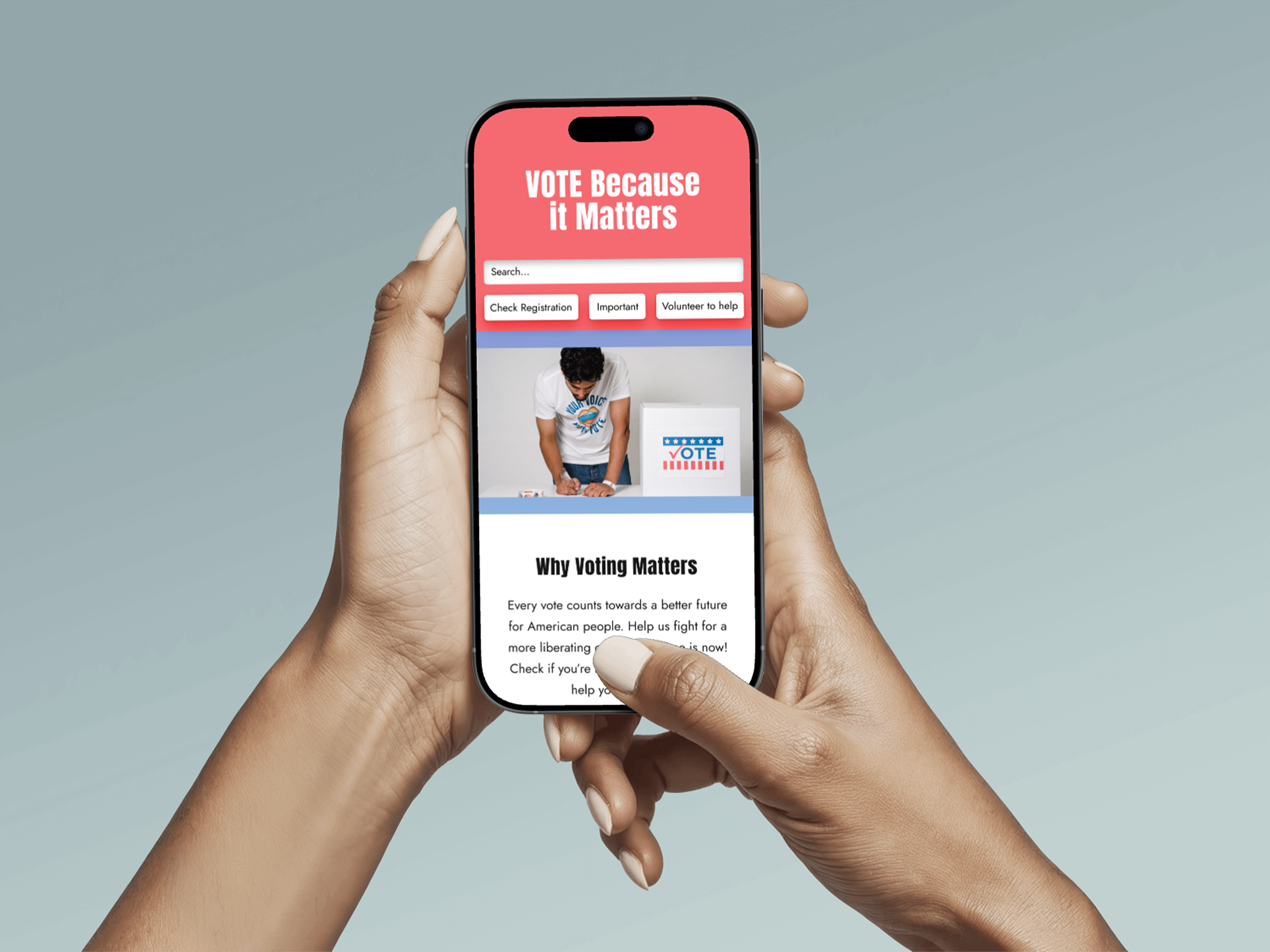
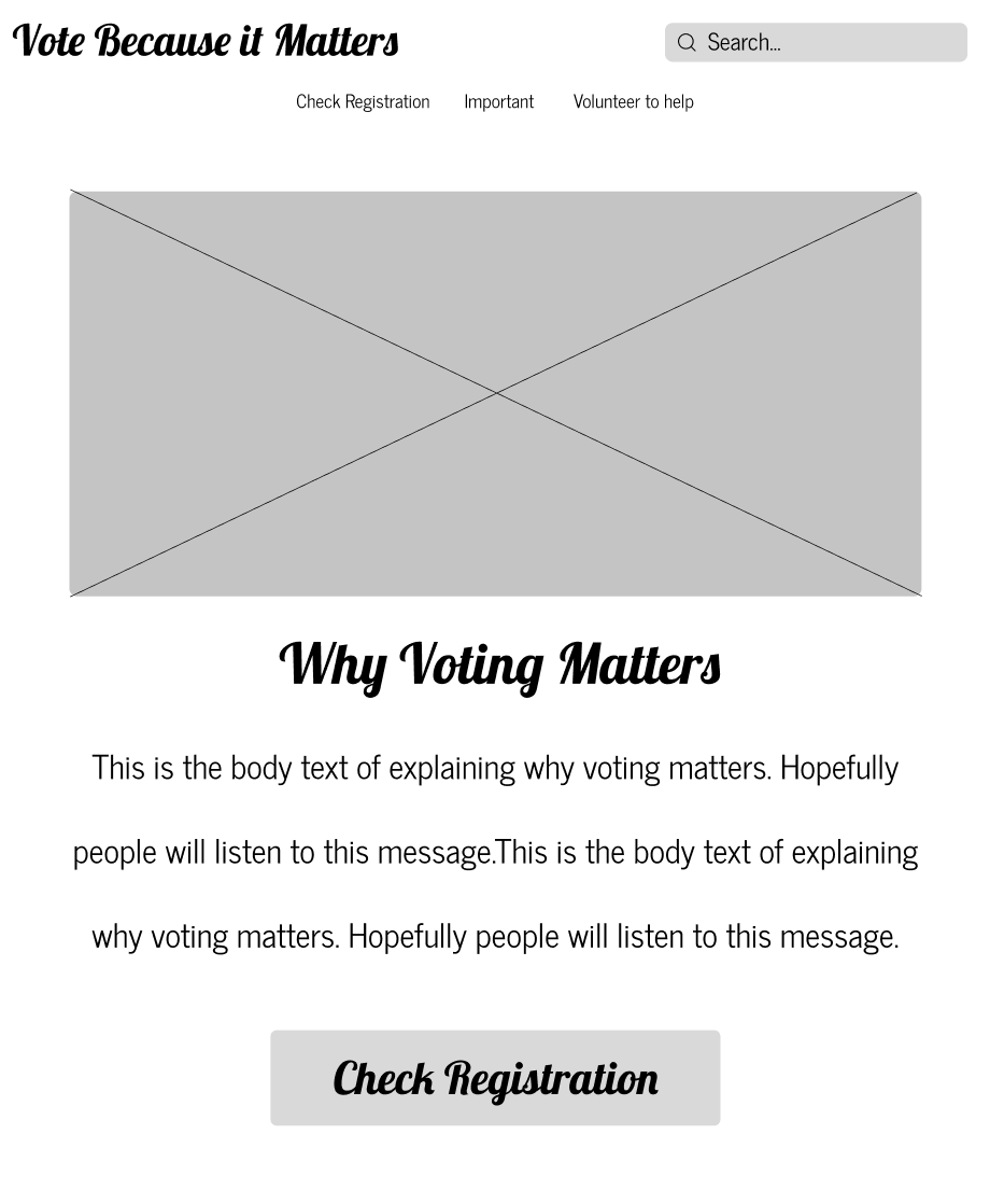
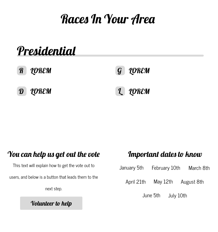
For this visual design project, I created a responsive voting campaign website based on existing wireframes. The goal was to transform the wireframes into polished, visually engaging mockups while maintaining consistency across multiple screen sizes.
Role
Visual Designer
Timeline
2 weeks
Goal
The goal of this project was to transform existing wireframes into a polished responsive voting campaign website that appealed to young voters. I focused on creating a visual direction that felt engaging, memorable, and easy to navigate while maintaining consistency across different screen sizes.
Process
I started by creating two style tiles to explore different visual directions. Each style tile experimented with color, imagery, and type choices for headers, subheaders, body text, buttons, and link
Style Tyle 1
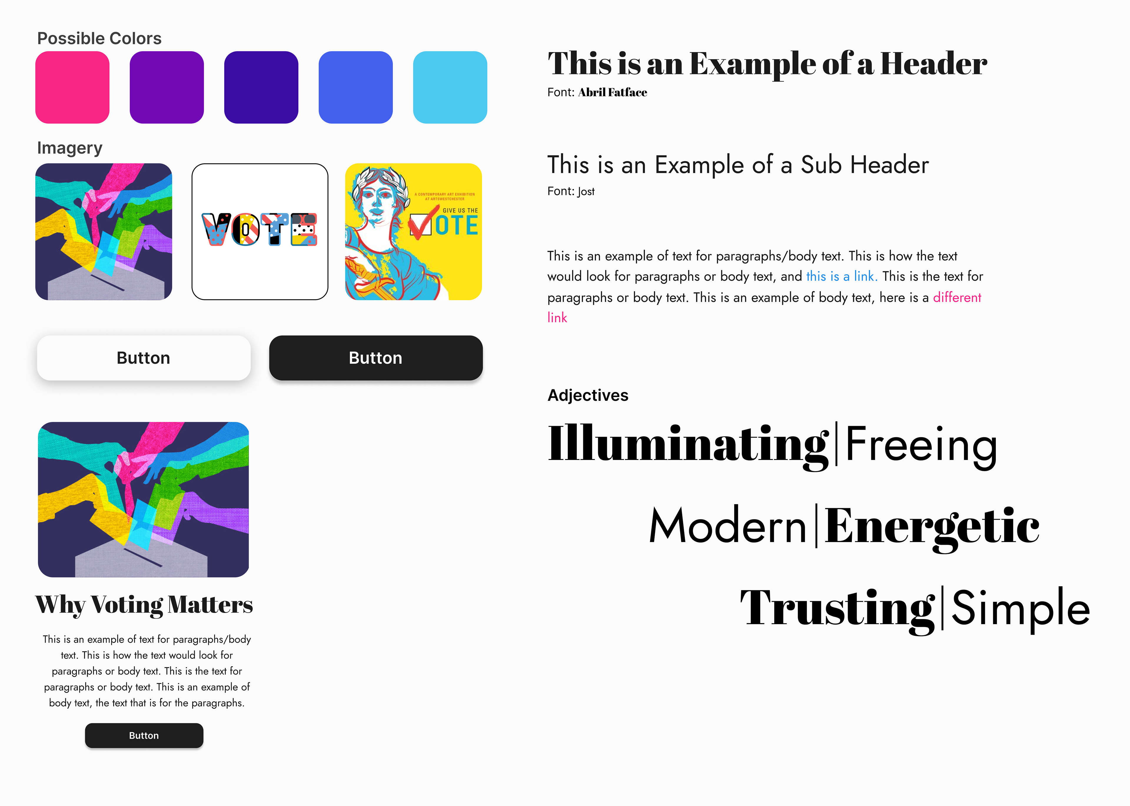
For my first style tile, I explored a bright and energetic visual direction to make the voting campaign feel more engaging for a younger audience. I chose bold colors, expressive imagery, and playful typography to move away from the feeling of a flat or traditional government website. My goal was to create a design that felt modern, lively, and approachable while still maintaining trust through readable typefaces, clear buttons, and a strong visual hierarchy.
Style Tile 2
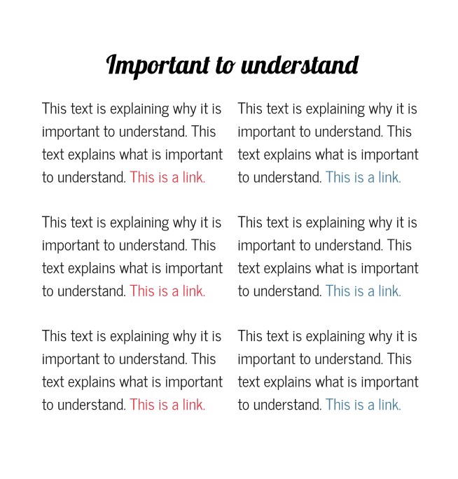
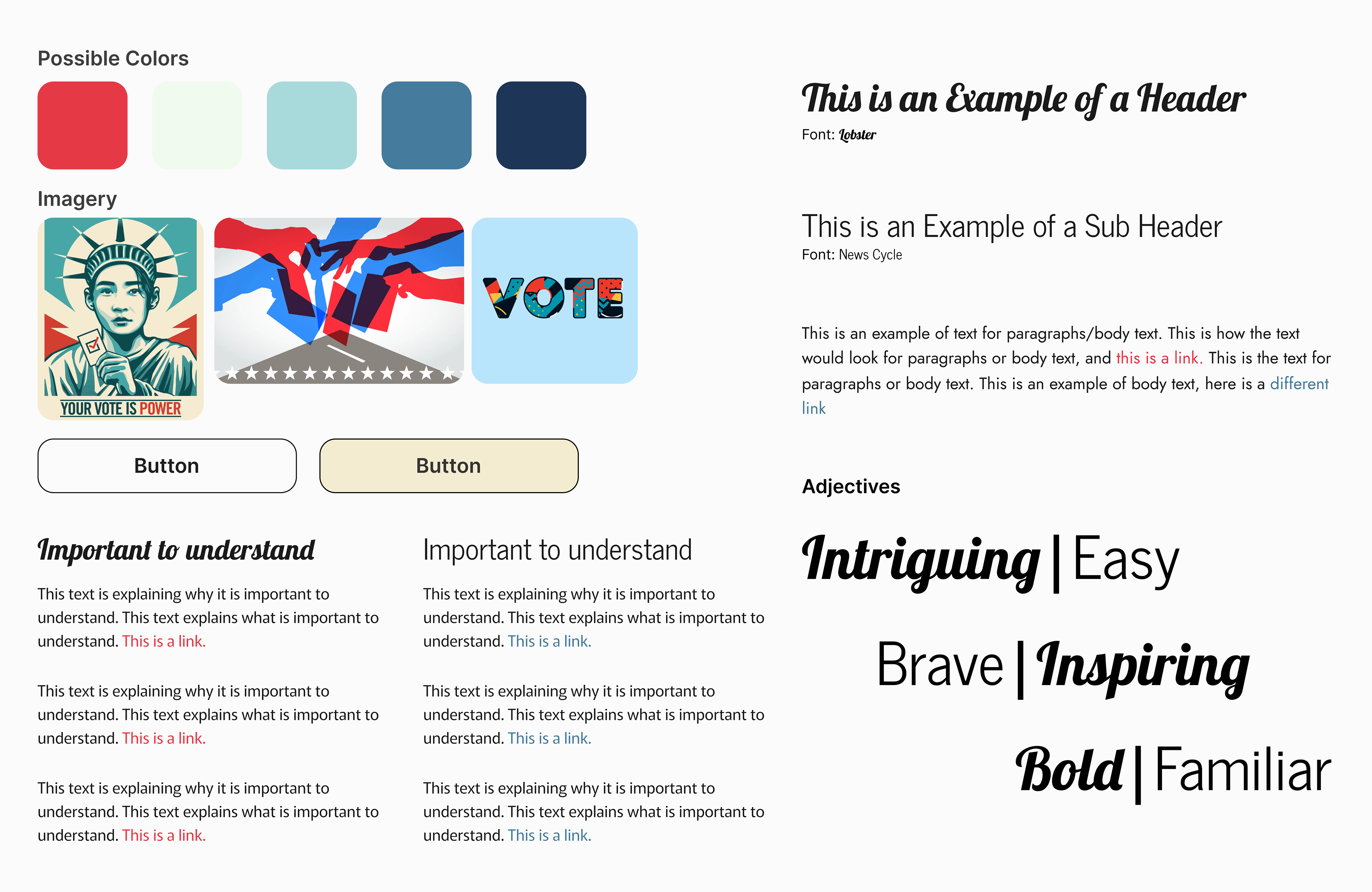
For the second style tile, I wanted to create a more traditional government-inspired look while still making the campaign feel fun, engaging, and trustworthy. I used familiar civic colors like red, blue, cream, and navy to connect the design to voting, then balanced those choices with bold imagery and expressive typography to keep the site approachable for a younger audience.
Style Tile Design Decision
I chose Style Tile 1 because I wanted the voting campaign site to feel different from a traditional political website. Instead of creating something that felt overly formal or disconnected, I wanted the design to feel energetic, approachable, and welcoming for young voters. My goal was to create a visual direction that helped the audience feel safe, heard, and encouraged to engage with the campaign.
Iteration and Critiques
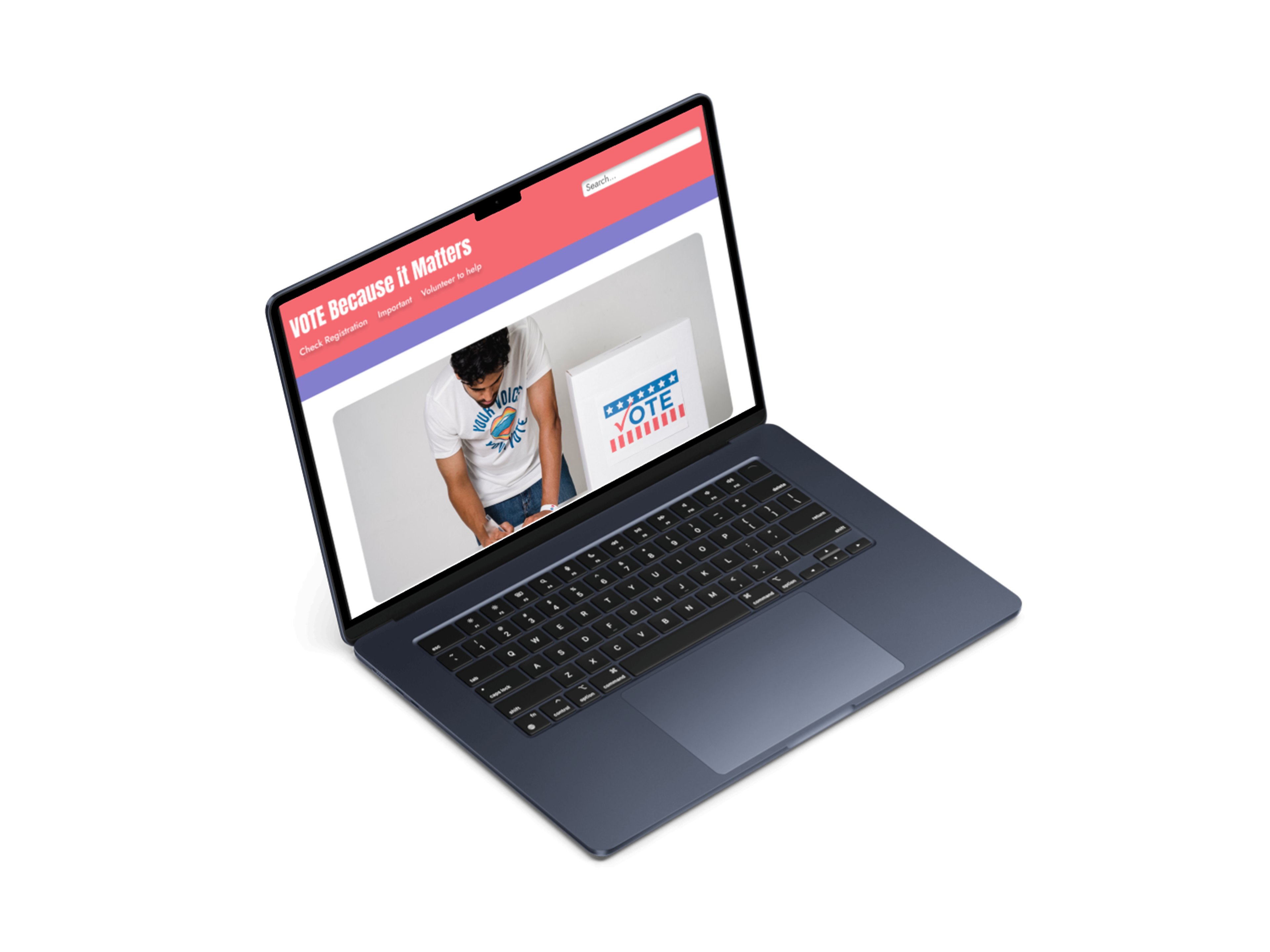
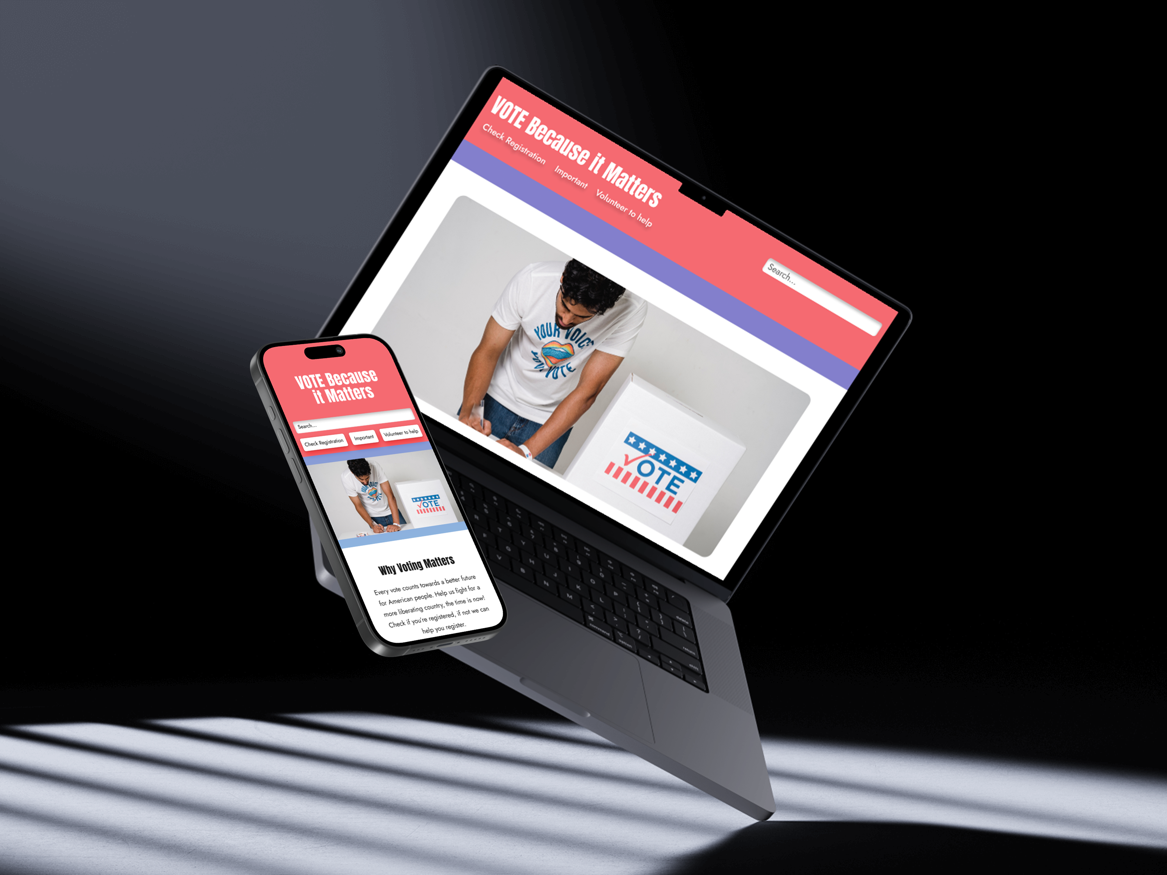
After choosing my visual direction, I created both desktop and mobile mockups to apply the style tile across different screen sizes. I then presented my designs during a class critique and used feedback from student designers to guide my next iterations. I went through two additional rounds of mockups and critiques
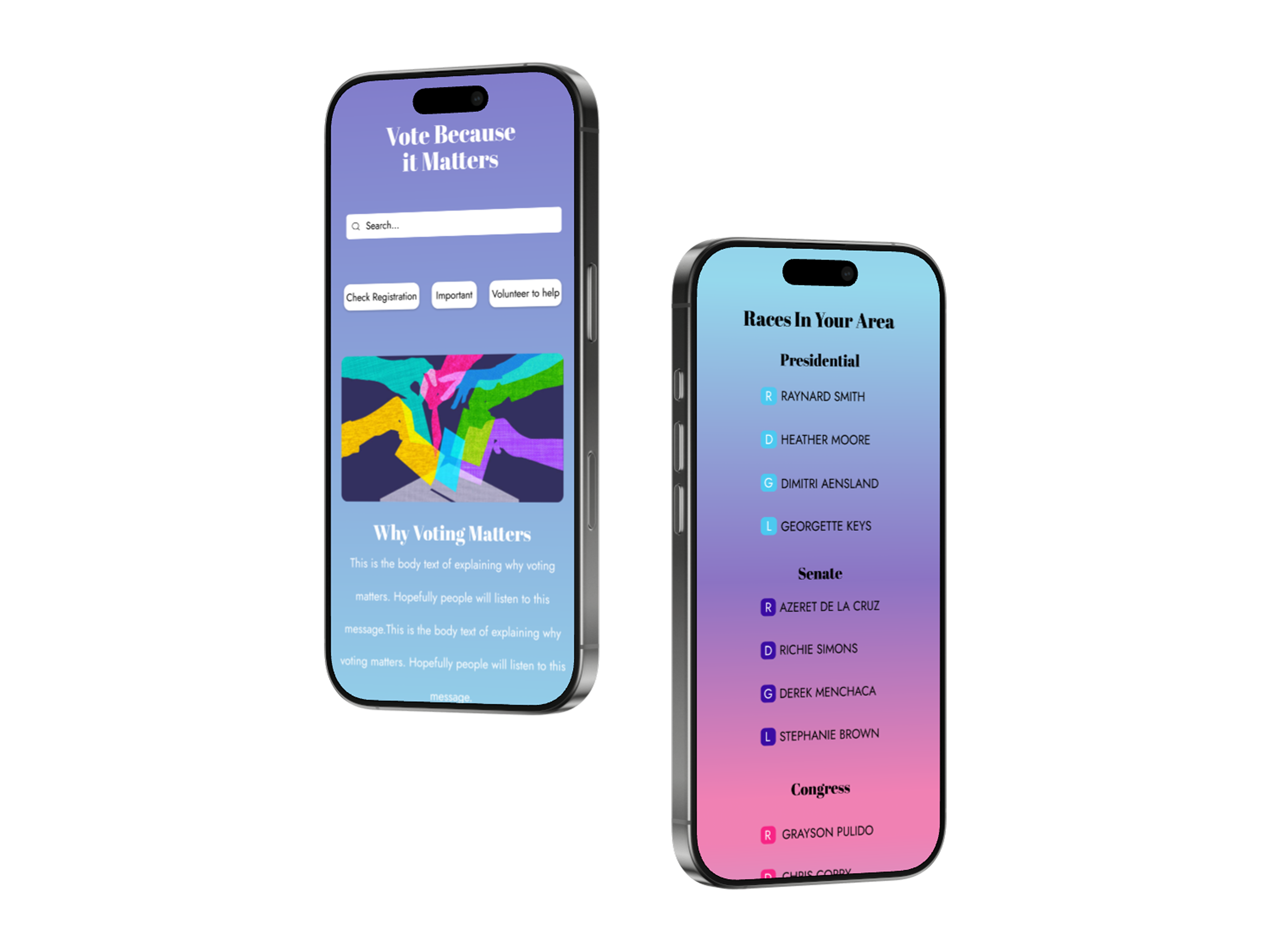
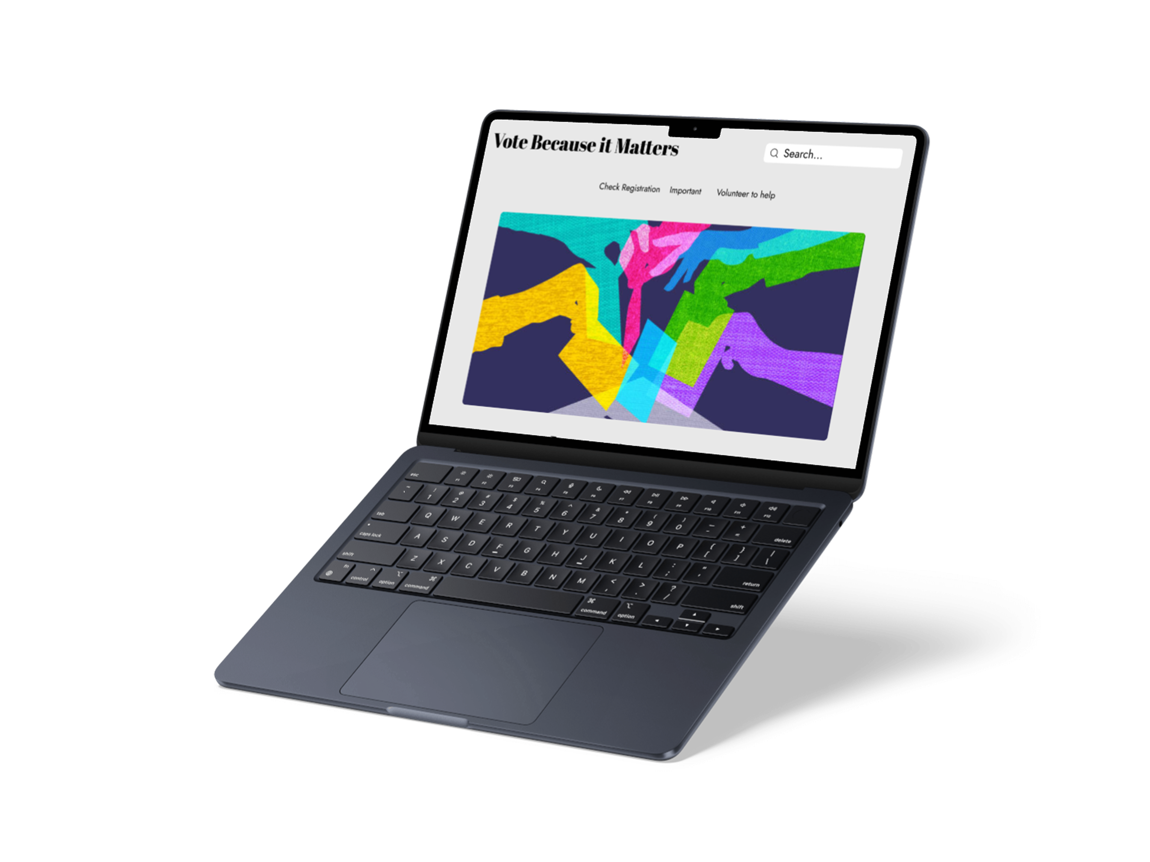
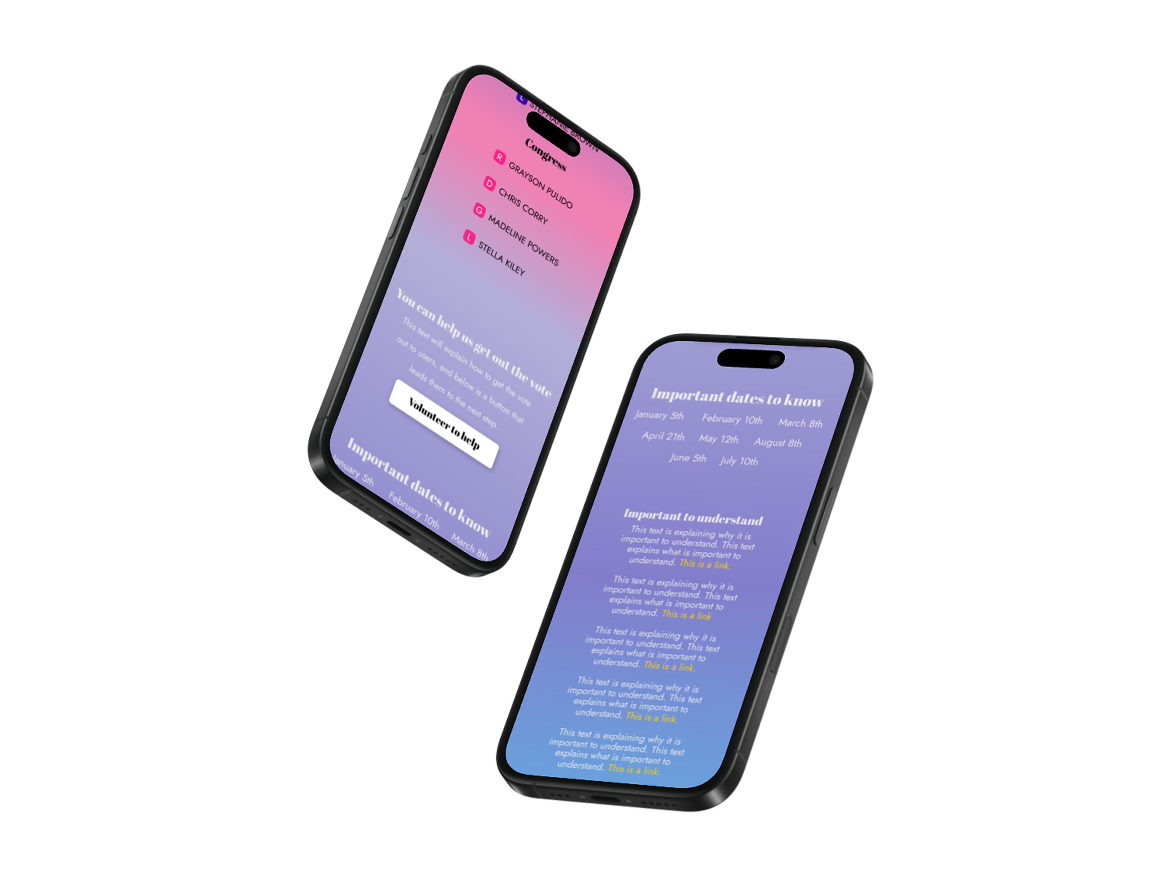
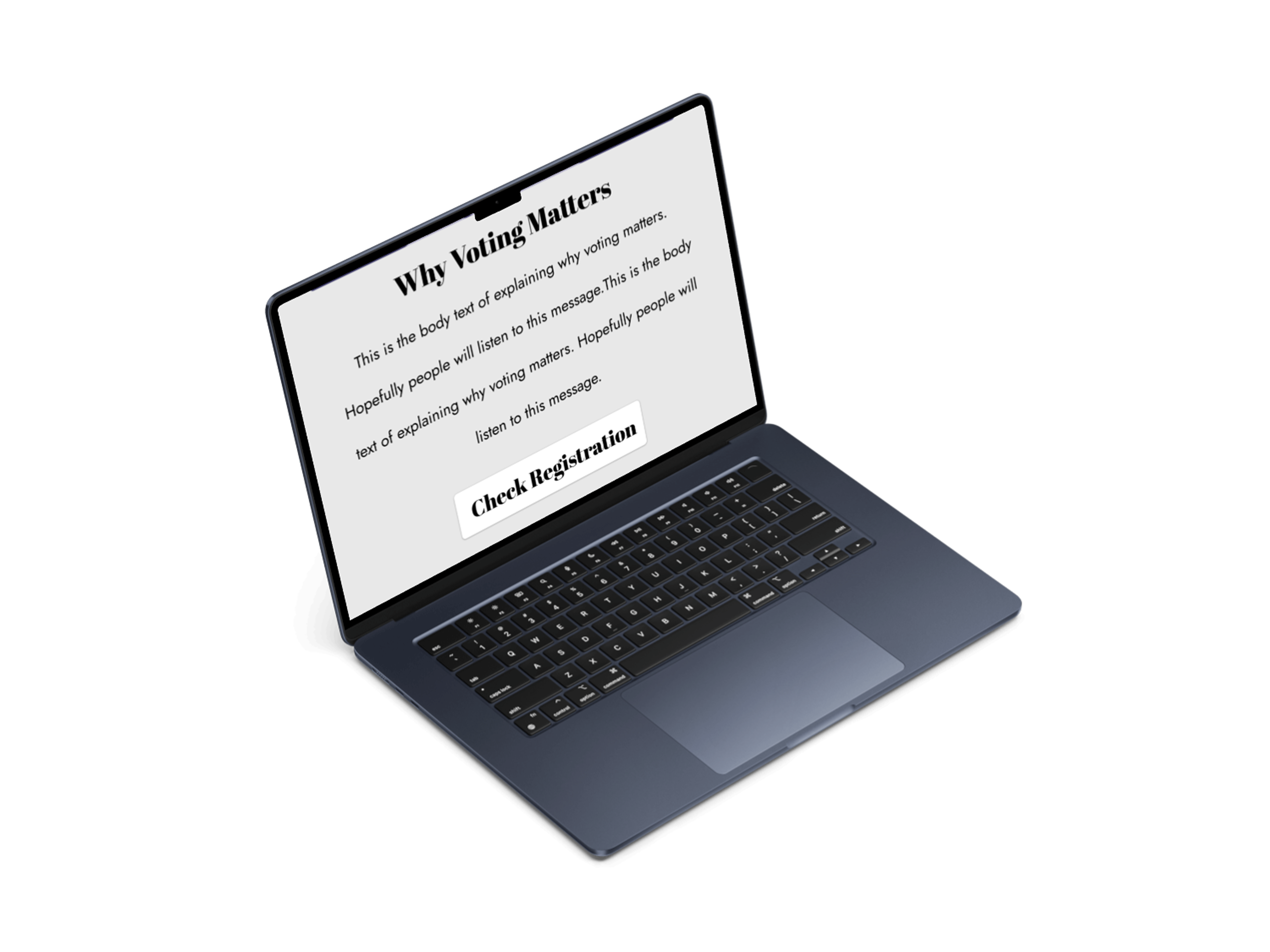
During critique, I received feedback that the spacing and sectioning made parts of the page difficult to follow, and that some of the headers were hard to read. This encouraged me to evaluate how smoothly each section transitioned into the next, whether the layout provided enough visual breathing room, and whether users could easily recognize when a new section began. In my next iterations, I improved the spacing, created clearer visual separation between sections, increased the readability of the headers, and refined the typography to make the page easier to scan across both desktop and mobile..
Final Design
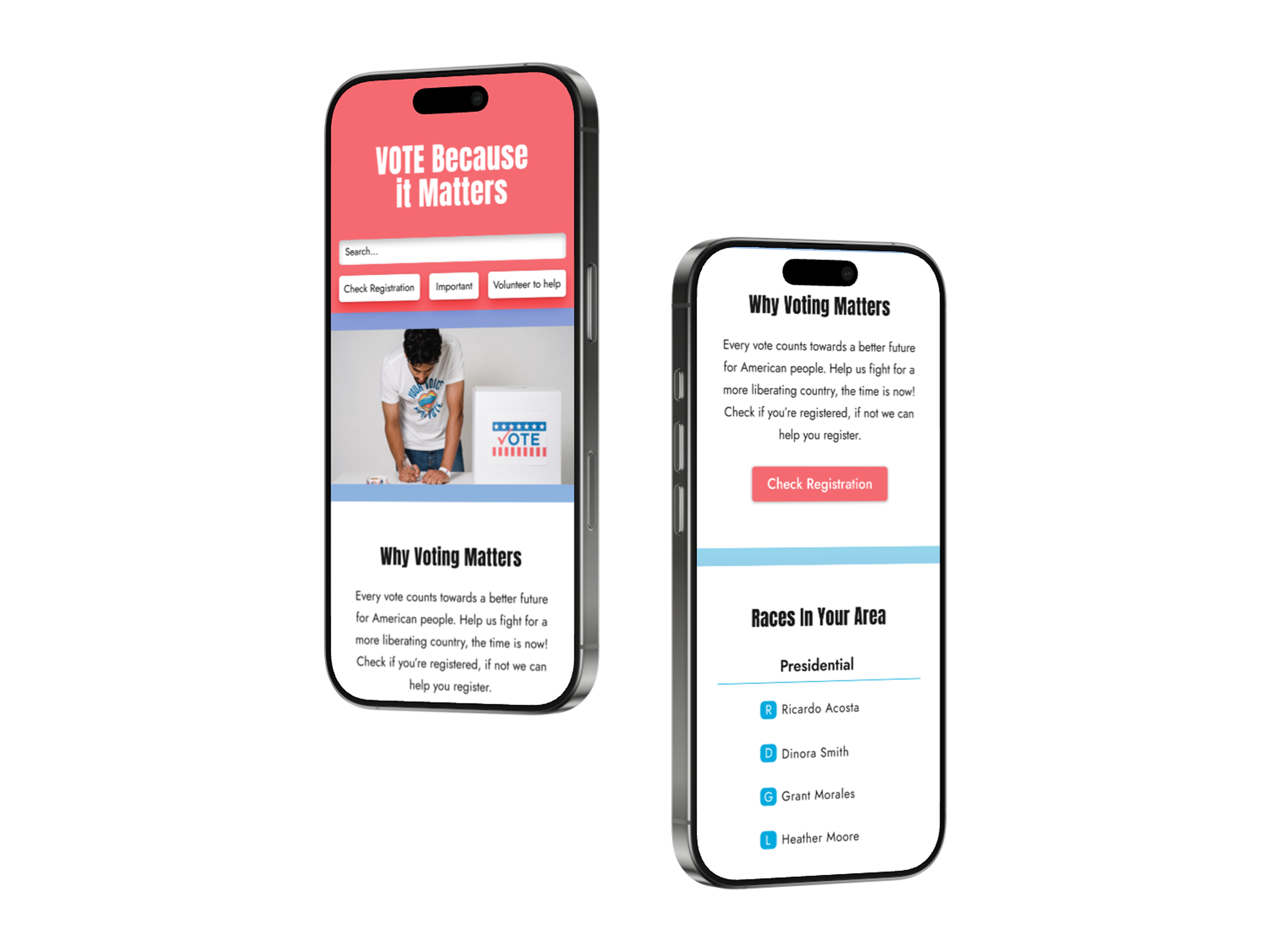
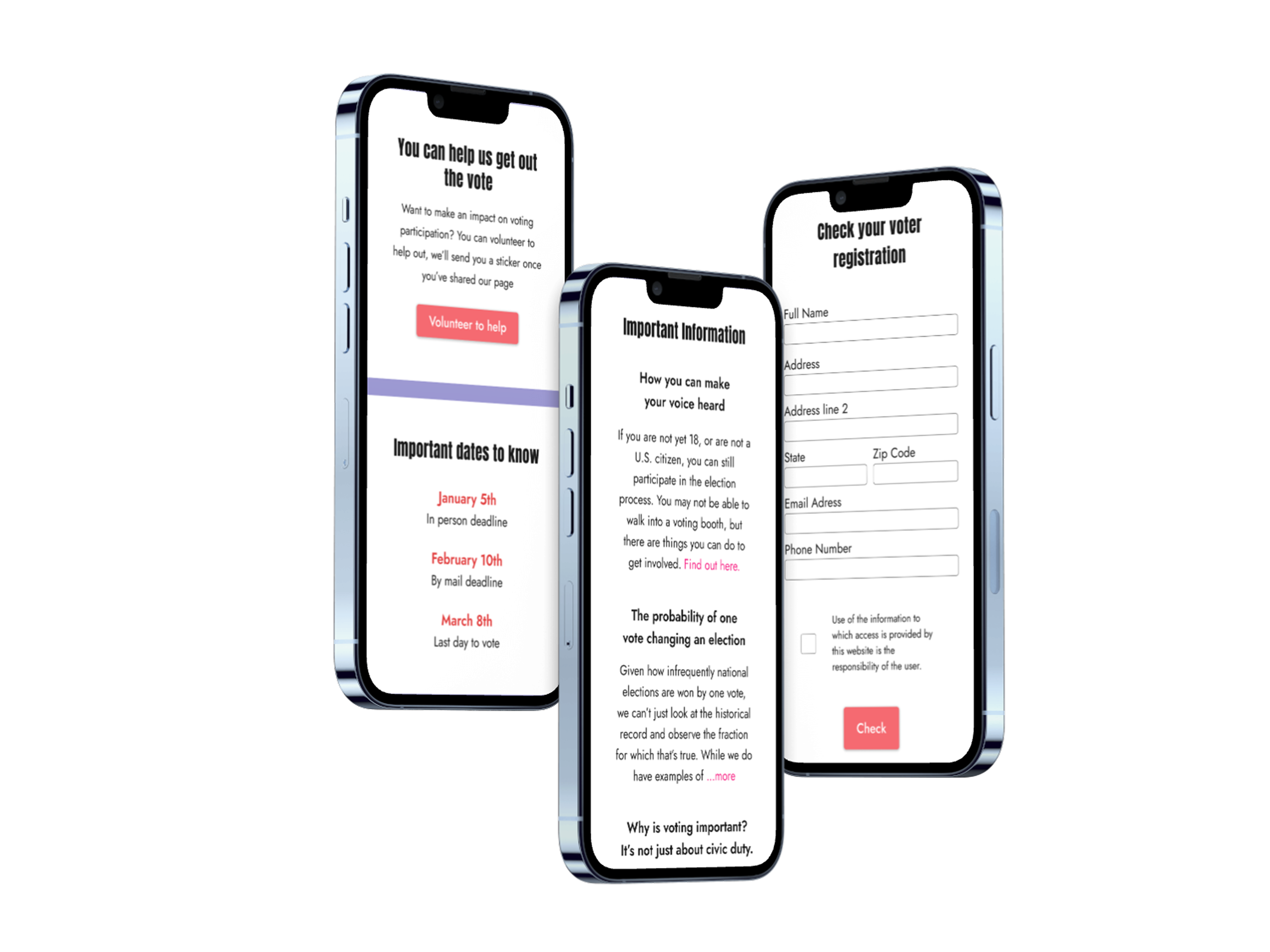
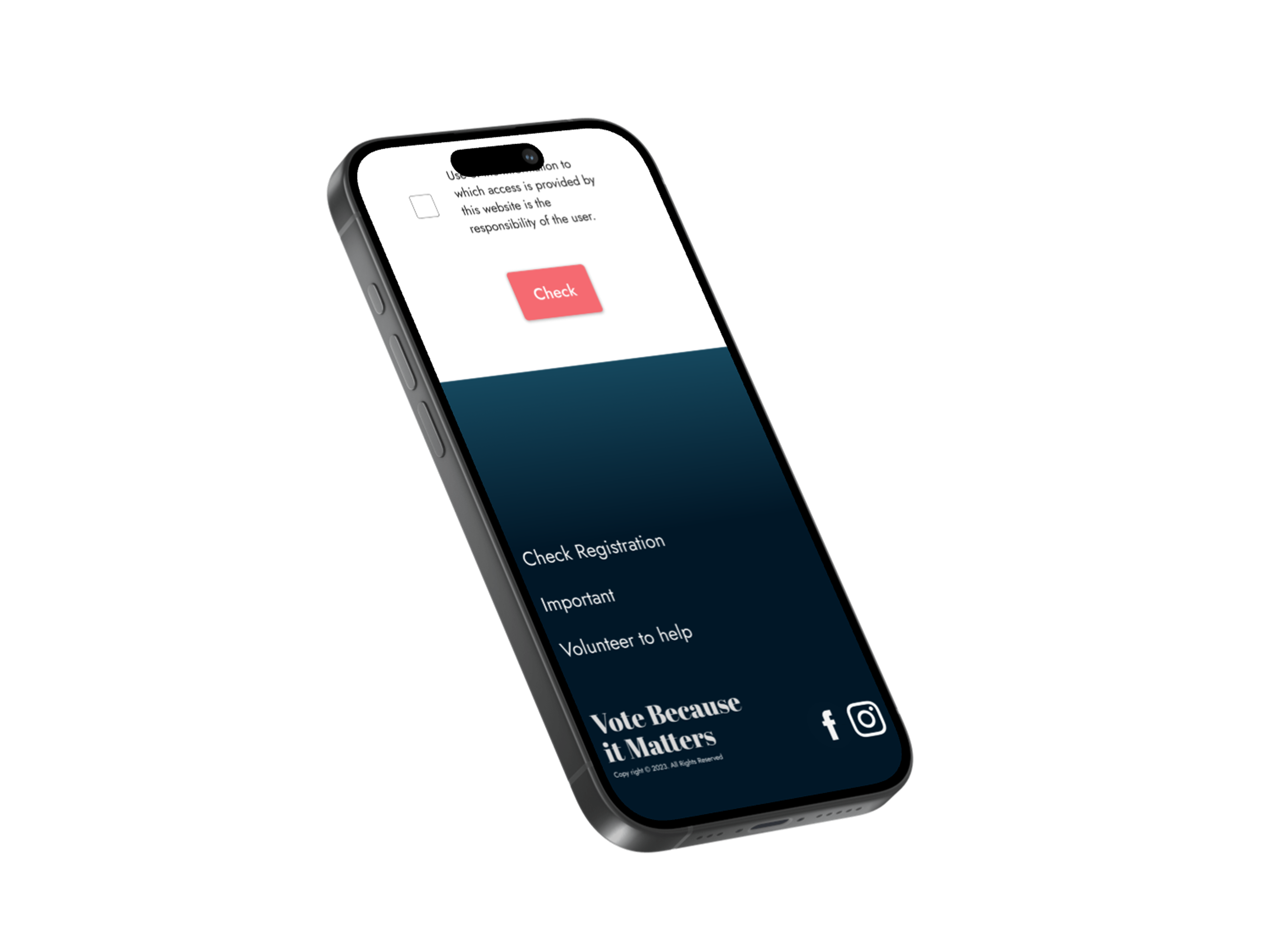
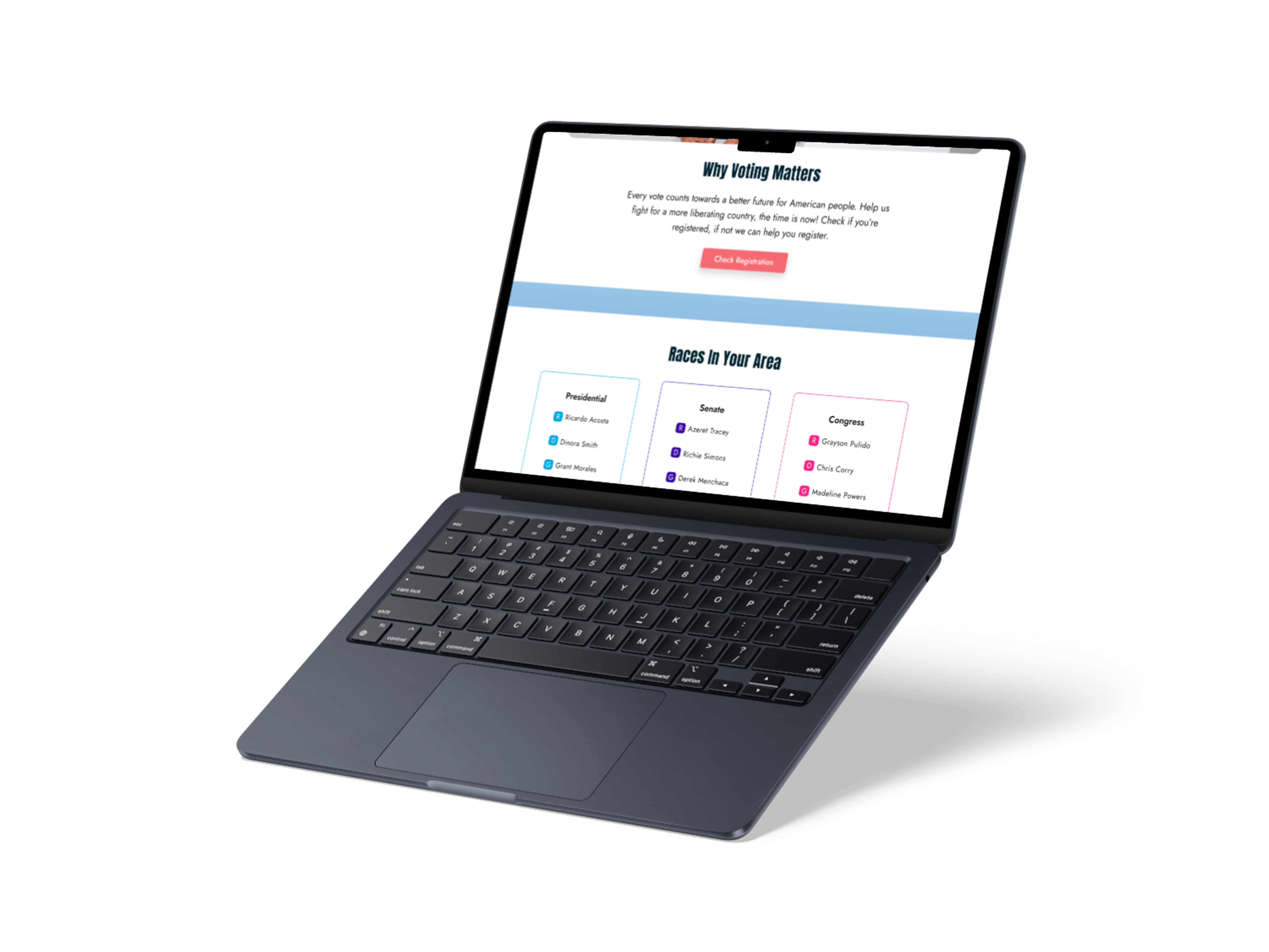
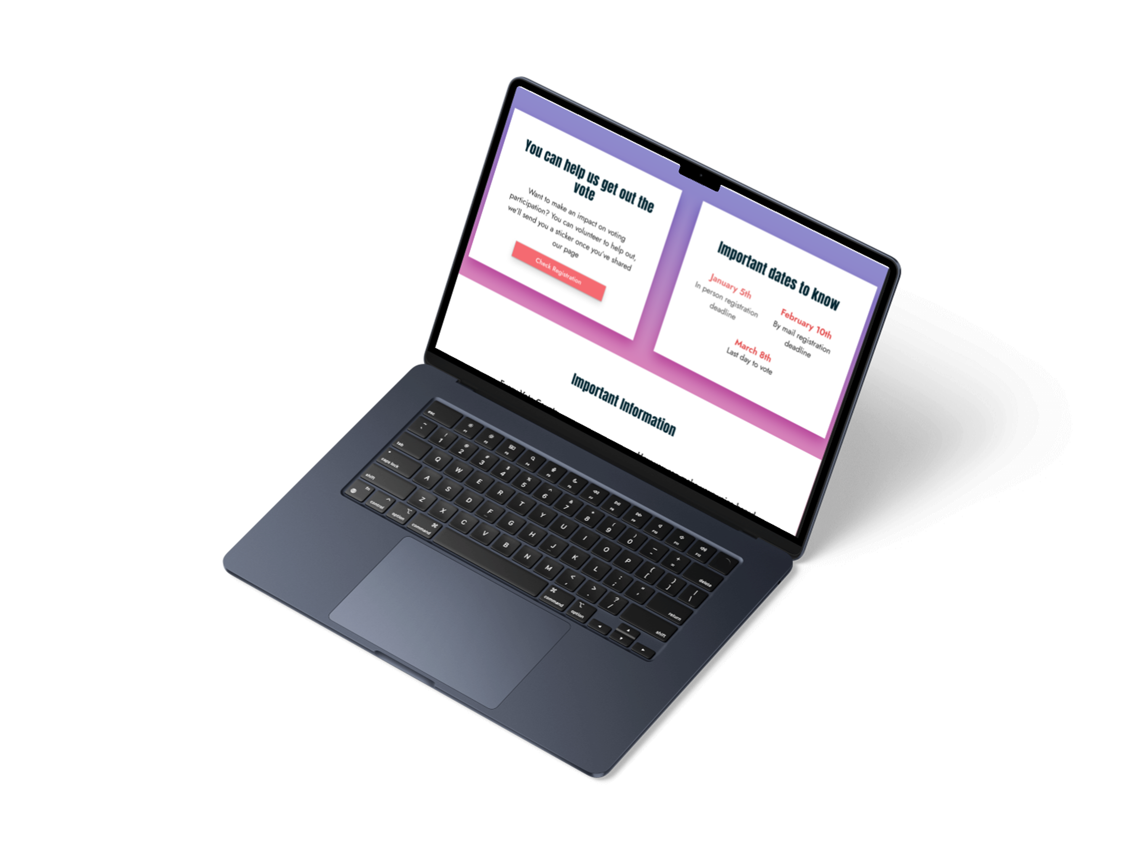
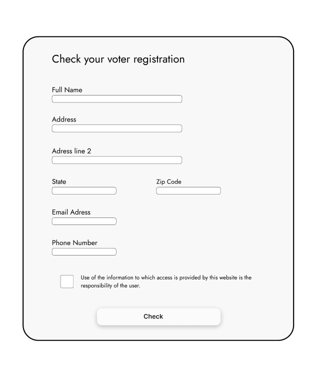
In the final design, I used card-style sections to create a clearer structure and make the page easier to scan. Each major area, including “Why Voting Matters,” “Races in Your Area,” “Important Information,” and the voter registration form, is placed within its own section. This helps users quickly recognize where one topic ends and another begins while giving the content more visual breathing room.
I also improved the header typography by changing the font to Abril Fatface to Anton for easier readability. These changes addressed critique feedback that some of the original headers were difficult to read and made the overall experience more accessible across desktop and mobile.
I also replaced the original hero image with one that felt more human and relatable, helping the campaign feel more personal to young voters rather than overly political or formal. Then pulled the light coral color from the image and used it throughout the navigation bar, buttons, and headers. This created visual consistency across the page while helping important calls to action stand out.
Finally, I used a colorful gradient background to maintain an energetic and youthful tone, while the white content cards provided contrast, readability, and balance. Overall, the final design feels approachable, organized, and engaging while supporting the campaign’s primary goal. Encouraging young voters to learn more, get involved, and check their voter registration.