Overview
Project Summary
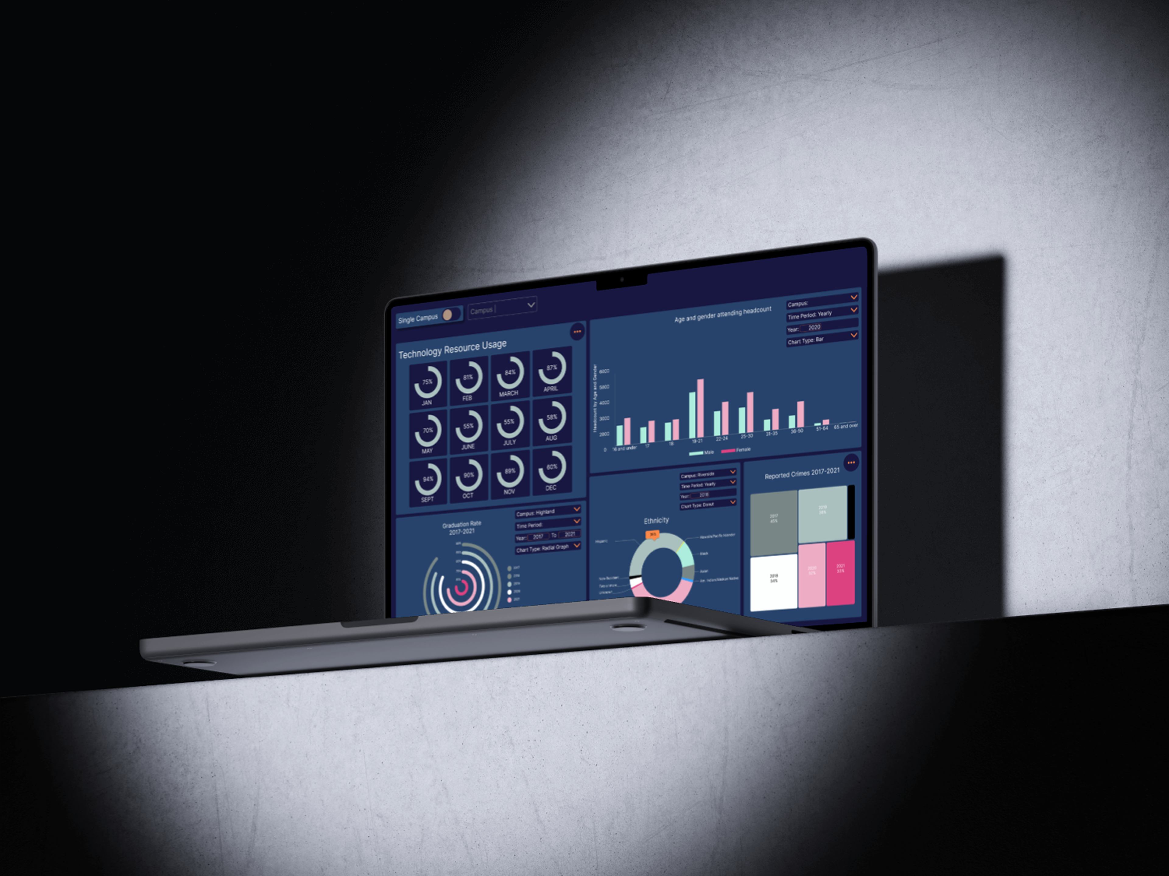
This project was completed during an early UI design course and challenged me to apply data visualization and dashboard design principles to a real-world dataset.
Project Type
UI Design / Data Visualization
Role
UI Designer
TImeline
2 weeks
Problem
How can data be presented in a way that is clear, accessible, and easy to interpret?
Challenge
Designing a data dashboard that is easy to understand, visually engaging, accessible, and allows users to quickly interpret key information.
Research
During the research phase, I explored different types of data visualizations and dashboard patterns to understand how information could be communicated effectively.
I researched:
• Bar charts
• Donut charts
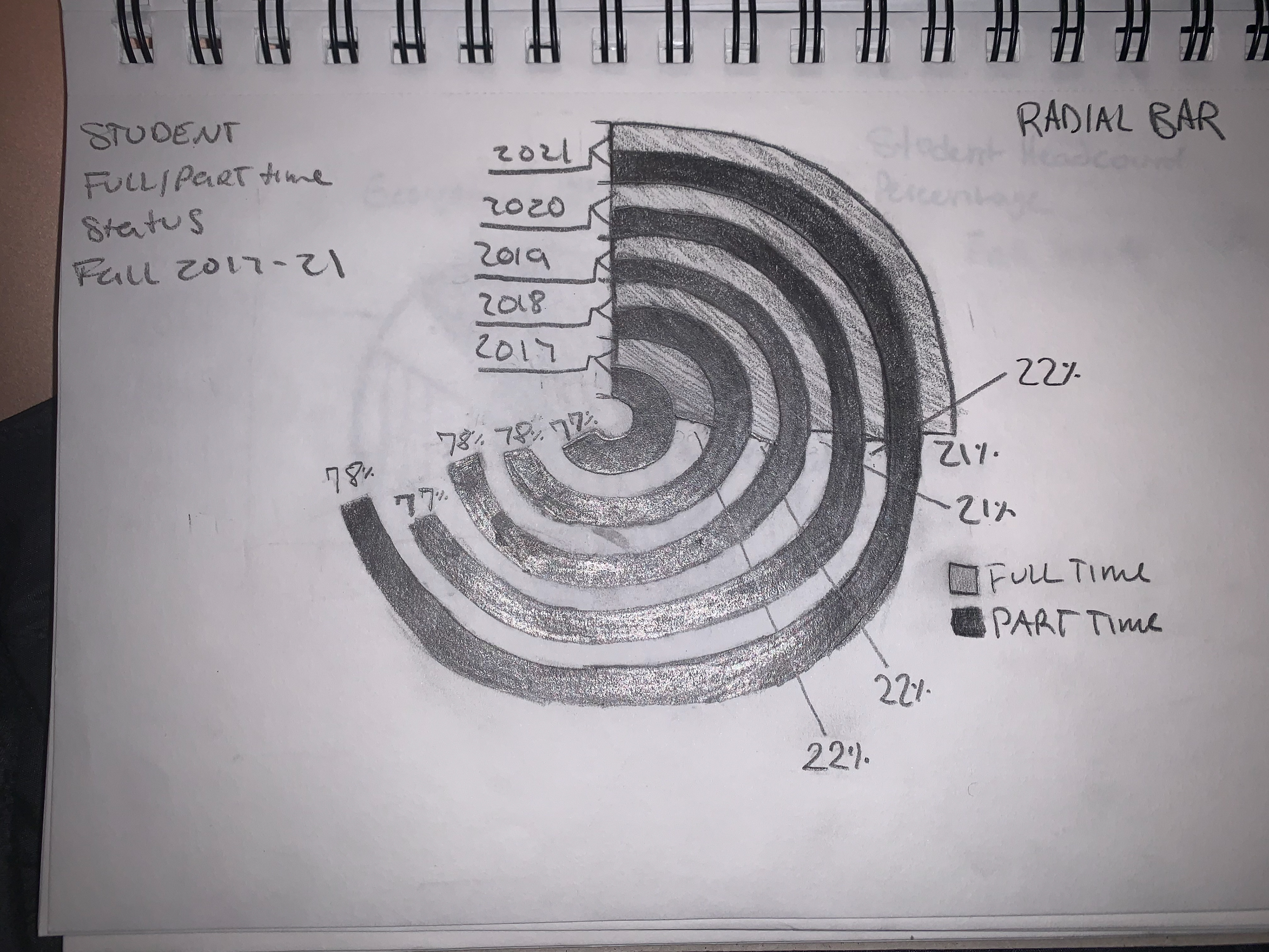
• Radial Bar charts
• Treemaps
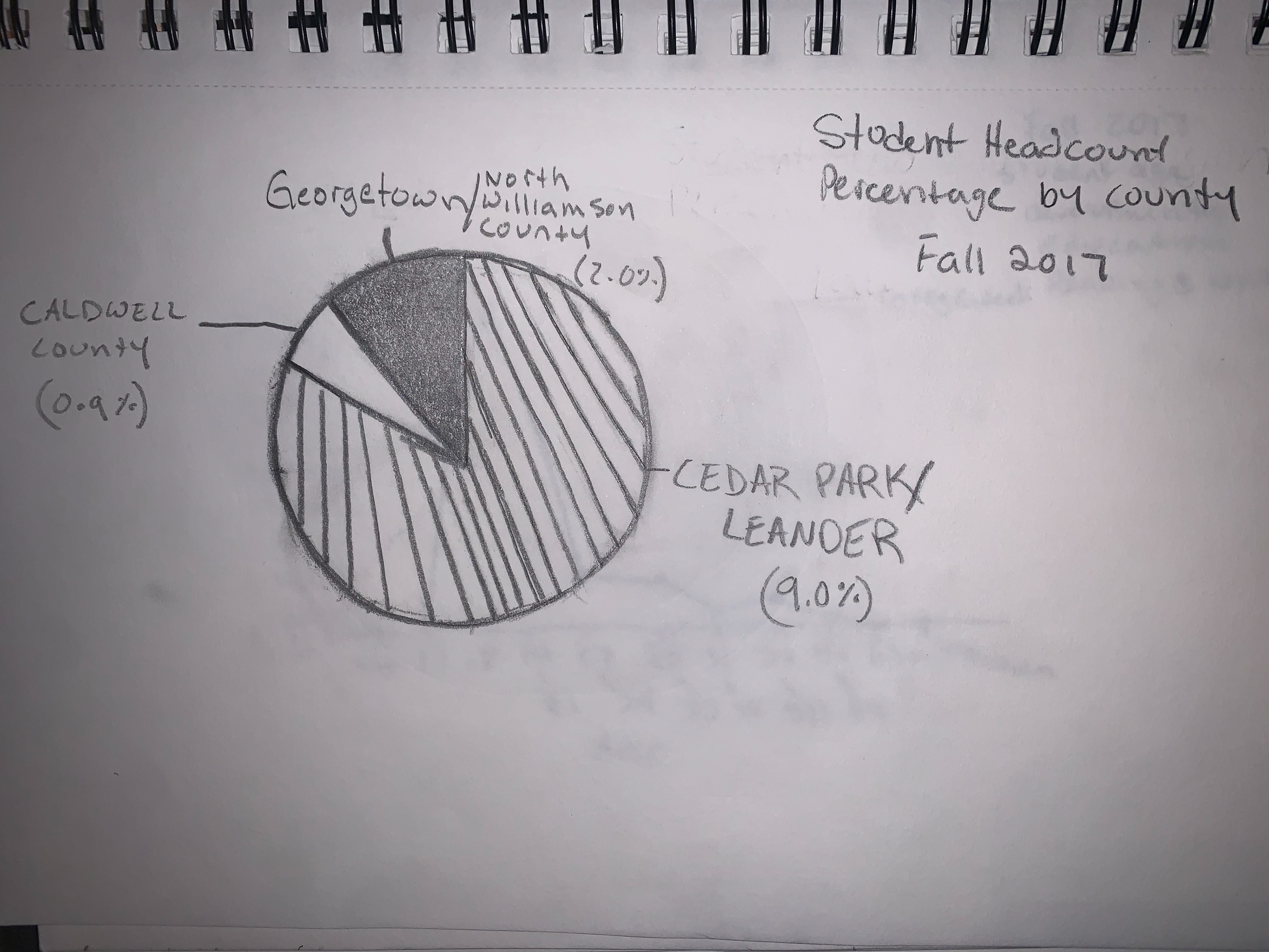
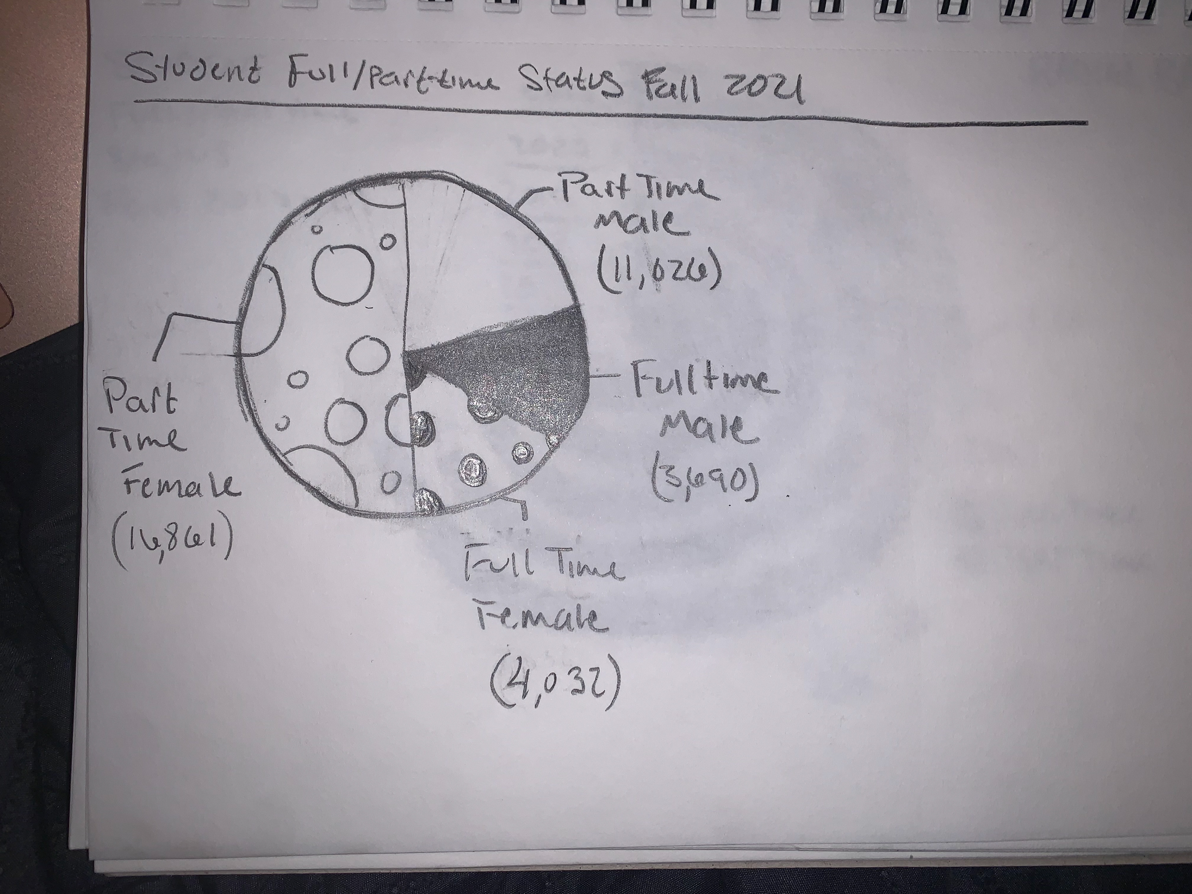
• Piecharts
Process
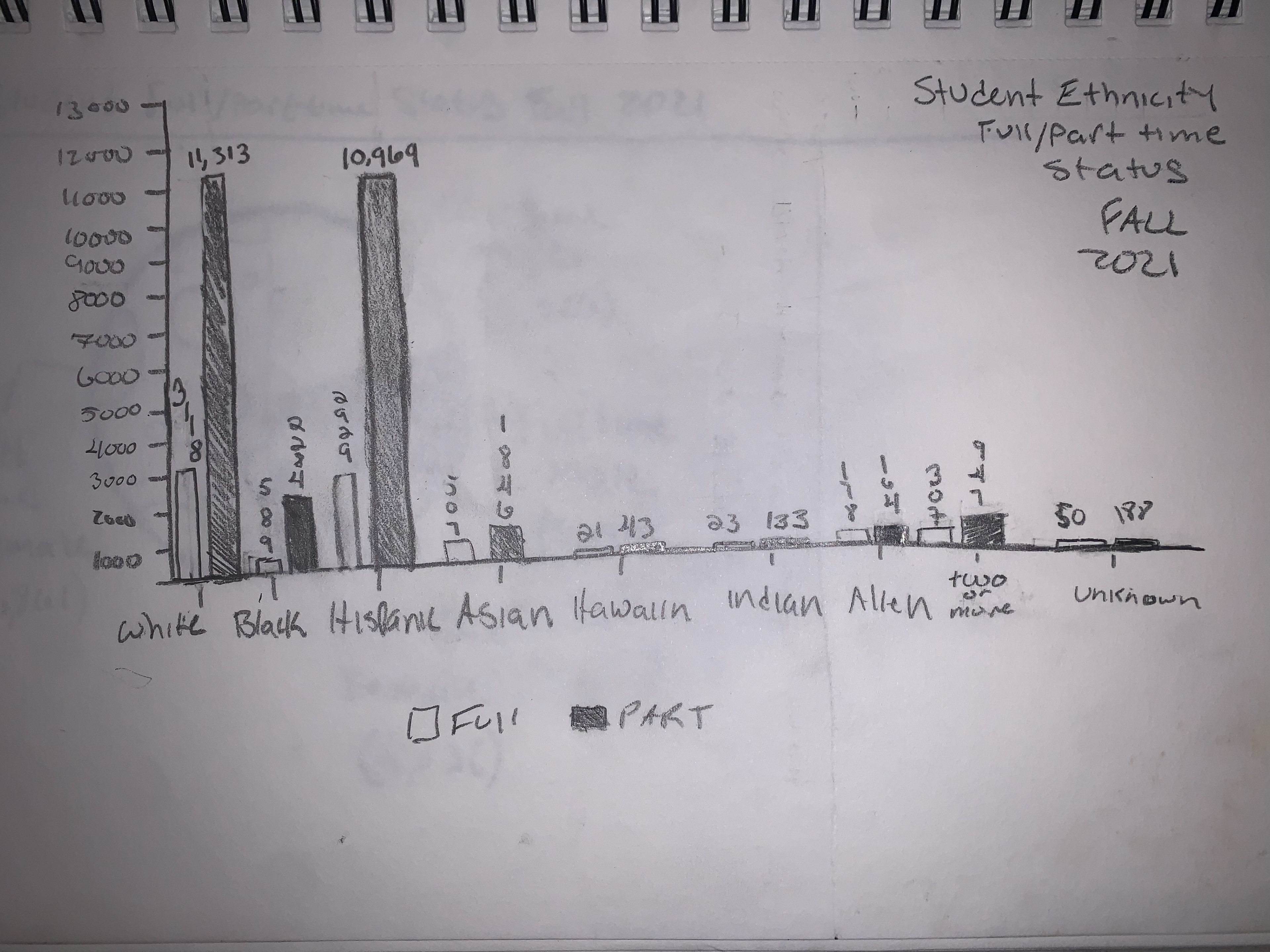
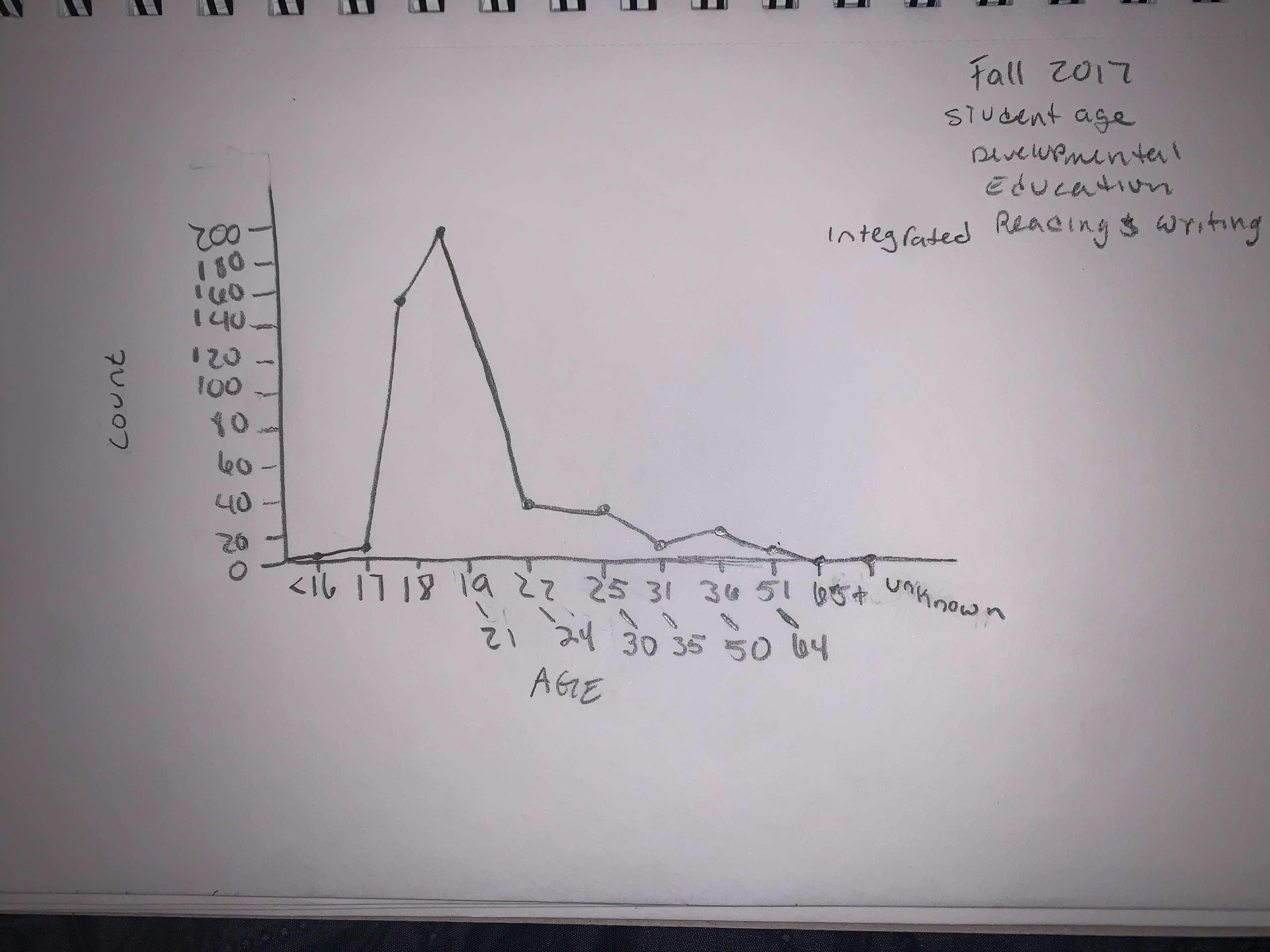
Low Fidelity Sketches
I began with low fi sketches to get an idea of how I wanted the data be presented. Once I got an idea, I started creating mid fi mockups of the dash board.
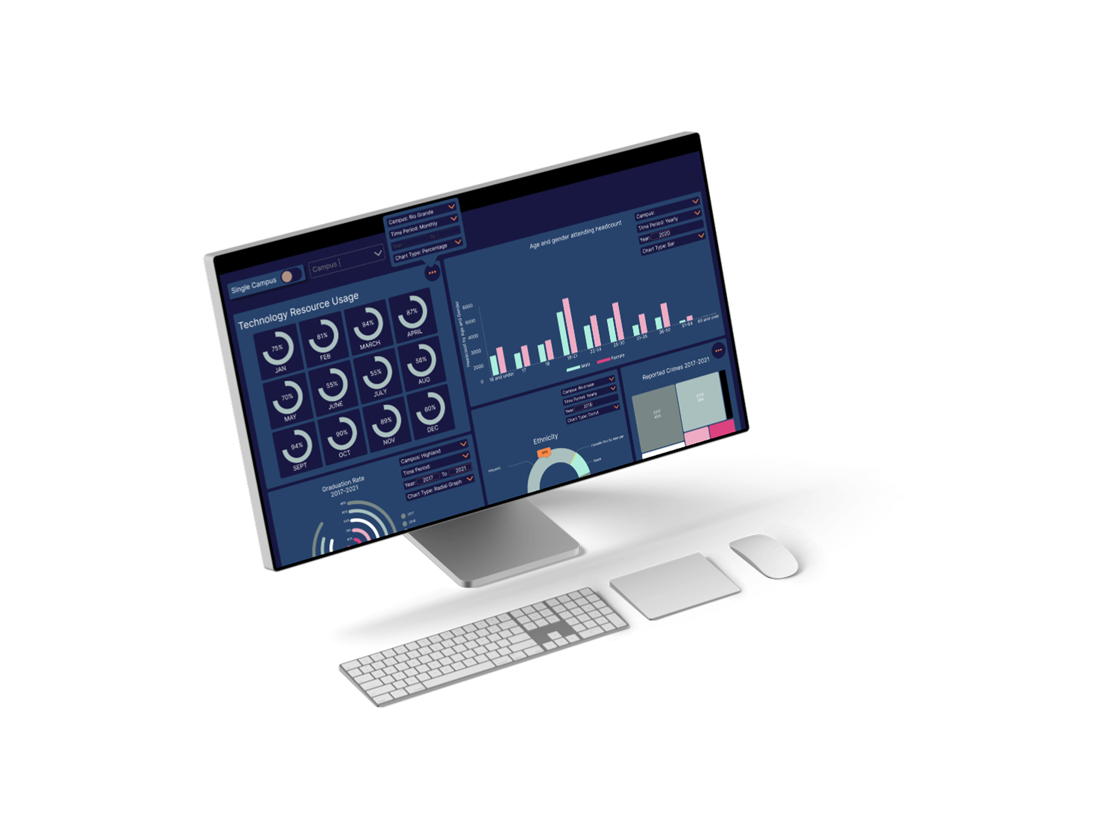
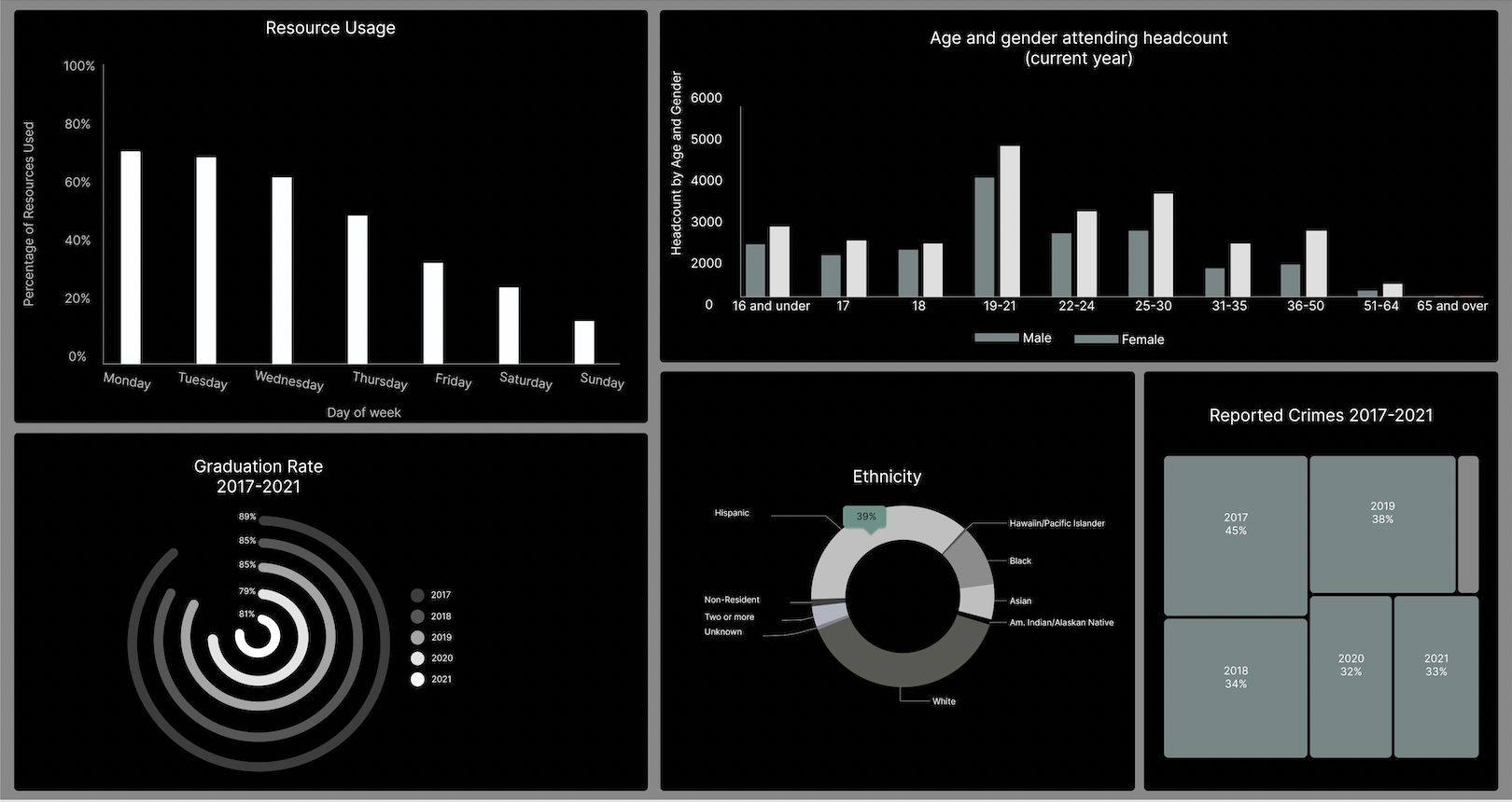
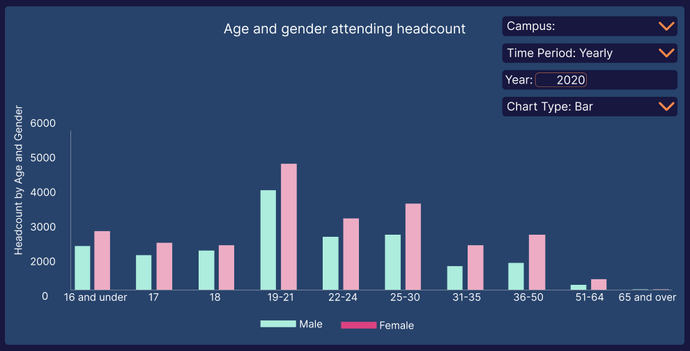
After I created the mid fi mockup, I started to experiment with color starting with the data on the percentage of age and gender attending the college.
I decided to use a pastel turquoise and pink to represent male (turquoise) and female (pink). I used a pallet generator using these colors to acquire contrasting colors.

Once I finished placing all the colors, I remembered we had to do an in class silent critique with our mid fi designs. I duplicated the design and changed the colors where it looked like a mid-fi mockup.
Silent Critique
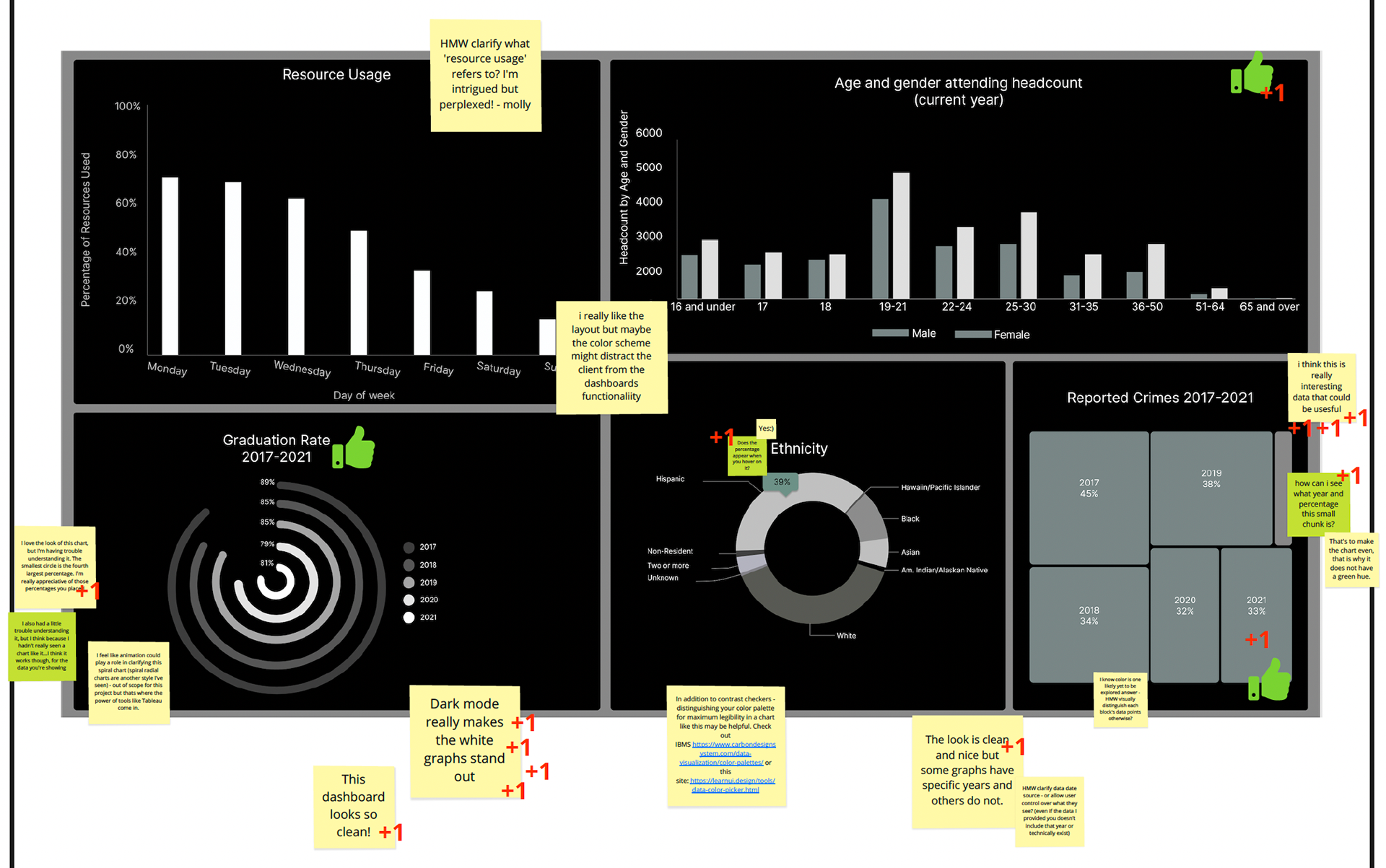
During the silent critique, my biggest take away and focus I received was how do users control what they see?
Solution
How I solved how people can control what they see is by giving the user the ability to change:
• Campus
• Time Period
• Chart type
Final Design
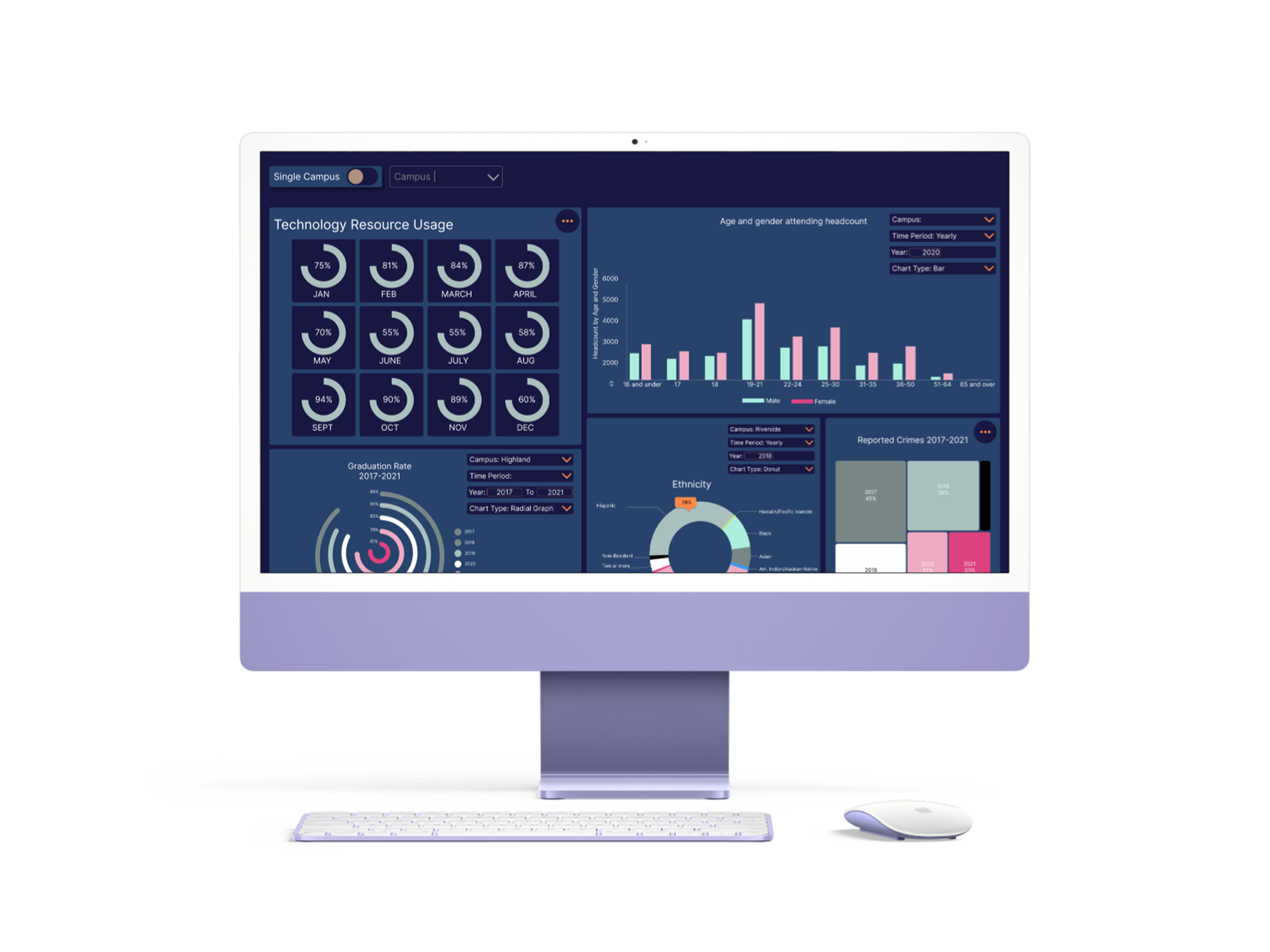
What I would change:
• The ability to compare campus' or years
• Better contrast in color
• Better accessibility
• Consistent control access
Reflections
Looking back, my biggest way is accessibility and interpretation.
Colors matter for people who are visually impaired. Just because a color looks pretty, doesn't mean it works for everyone. For example if someone was color blind, it would be hard for them to tell similar colors apart.
The control panel didn't have an option to change what data was being viewed. How can users compare the same data if there is no option for it? As well as consistency for how the control panel appears: Clicking the three dot icon to access it or having it appear by default.
Finally, I learned that not every data pattern would work, because some are hard to interpret.